Slide 1
Today: The Matplotlib python library
Slide 2
What is Matplotlib?
Note: This lecture only has a single piece that you might see on the final exam: pay attention to the discussion of the zip() function about 2/3 of the way through the slides
There are tens of thousands of Python libraries available for programmers to use. Today, we're going to talk about one libary that is used for drawing charts and for general visualization, called Matplotlib. There are many competing visualization libraries, but Matplotlib is one of the most widely used. There is a huge examples gallery of different types of visualizations that you can do with Matplotlib. All of the examples have the code used to produce the visualization, so you can often use that as a reference to create similar plots with your own data. Let's take a look at some of them…
Using Matplotlib
To use Matplotlib, you need to install a couple of libraries. You can do it as follows:
% python3 -m pip install matplotlib
Collecting matplotlib
  Downloading matplotlib-3.4.3-cp39-cp39-macosx_10_9_x86_64.whl (7.2 MB)
     |████████████████████████████████| 7.2 MB 5.3 MB/s
Collecting cycler>=0.10
  Using cached cycler-0.10.0-py2.py3-none-any.whl (6.5 kB)
Requirement already satisfied: python-dateutil>=2.7 in /Library/Frameworks/Python.framework/Versions/3.9/lib/python3.9/site-packages (from matplotlib) (2.8.1)
Collecting kiwisolver>=1.0.1
  Downloading kiwisolver-1.3.1-cp39-cp39-macosx_10_9_x86_64.whl (61 kB)
     |████████████████████████████████| 61 kB 565 kB/s
Requirement already satisfied: pillow>=6.2.0 in /Library/Frameworks/Python.framework/Versions/3.9/lib/python3.9/site-packages (from matplotlib) (8.2.0)
Requirement already satisfied: numpy>=1.16 in /Library/Frameworks/Python.framework/Versions/3.9/lib/python3.9/site-packages (from matplotlib) (1.21.0)
Collecting pyparsing>=2.2.1
  Using cached pyparsing-2.4.7-py2.py3-none-any.whl (67 kB)
Requirement already satisfied: six in /Library/Frameworks/Python.framework/Versions/3.9/lib/python3.9/site-packages (from cycler>=0.10->matplotlib) (1.16.0)
Installing collected packages: pyparsing, kiwisolver, cycler, matplotlib
Successfully installed cycler-0.10.0 kiwisolver-1.3.1 matplotlib-3.4.3 pyparsing-2.4.7
Often when you are using Matplotlib, you will also want another number-crunching library, called numpy, so you should probably install that, too:
% python3 -m pip install numpy
A note on open source libraries and applications
One of the most exciting aspects of computing in today's world is the idea of free and often "open source" programs. There are literally millions of free programs available today, and many are extremely high quality. Matplotlib is one example of a free and open source programming library. The open source moniker means that you can literally go look at the source code, and you could, if you wanted to, modify the actual library to do new things. This is incredibly powerful, and the open source movement has gained a great deal of traction over the last couple of decades.
Some of the most notable open source programs:
- The Linux operating system
- Linux is a completely free and open source operating system. You can download it and load it onto your computer (Mac or PC), and never have to buy an operating system again. Most webservers and processing servers (e.g., Amazon AWS) use Linux these days, and all of the Top 500 most powerful supercomputers use Linux as their operating system.
- GIMP (GNU Image Manipulation Program), and other GNU tools
- GIMP is a Photoshop clone that is completely free and open source.
-
The Python language! Python is a completely free programming language. Many languages have compilers that are completely free, and this has enabled millions of people around the world to take up coding.
- Firefox
- Firefox is an open source web browser that has been more and less popular over the years
- LibreOffice
- LibreOffice is a Microsoft Office Suites / Google Office open source rival. It has some incredibly powerful tools.
- VLC
- VLC is an open source video player that is capable of playing just about any video format you can find. I have often used it to play videos that don't play normally on a Mac with the regular player.
Let's see some Matplotlib examples
Some of the examples we'll look at were inspired by the Matplotlib tutorials, which you should check out to get up to speed on using the library.
Here is one of most simple plots – x and y coordinates on a chart:
import matplotlib.pyplot as plt
import numpy as np
fig, ax = plt.subplots()  # Create a figure containing a single axes.
ax.plot([1, 2, 3, 4], [1, 4, 2, 3])  # Plot some data on the axes.
plt.show()
This shows the following plot:

You can pan and zoom, and save the image from the window that shows the image. You can also programatically save a plot:
# should do this _before_ showing
plt.savefig('my-plot.png')
A more detailed plot
Let's look at a plot with multiple lines
Here is the numpy array way of doing it (using the numpy.linspace function):
    x = np.linspace(0, 2, 100)
    # numpy array with 100 numbers evenly
    # spaced from 0 to 2. Kind of equivalent to
    # [2 * x / 99 for x in range(100)]
    # except that numpy arrays allow you to do math
    # directly on them

    plt.plot(x, x, label='linear')  # Plot some data on the (implicit) axes.
    plt.plot(x, x ** 2, label='quadratic')  # etc.
    plt.plot(x, x ** 3, label='cubic')
    plt.xlabel('x label')
    plt.ylabel('y label')
    plt.title("Simple Plot")
    plt.legend()
    plt.show()
This is the figure we get:

Using numpy arrays is a good idea, once you understand them. We could have used regular Python lists, but we would have to use some fancy list comprehensions to get the same results:
def multiple_plots_no_numpy():
    x = [2 * x / 99 for x in range(100)]

    plt.plot(x, x, label='linear')  # Plot some data on the (implicit) axes.
    plt.plot(x, [n ** 2 for n in x], label='quadratic')  # etc.
    plt.plot(x, [n ** 3 for n in x], label='cubic')
    plt.xlabel('x label')
    plt.ylabel('y label')
    plt.title("Simple Plot")
    plt.legend()
    plt.show()
Oh, and by the way: numpy is much faster than using regular Python lists.
Using real data
We have looked briefly at some real data sets from Kaggle before. We can use Matplotlib to plot data we find in real data sets if we want.
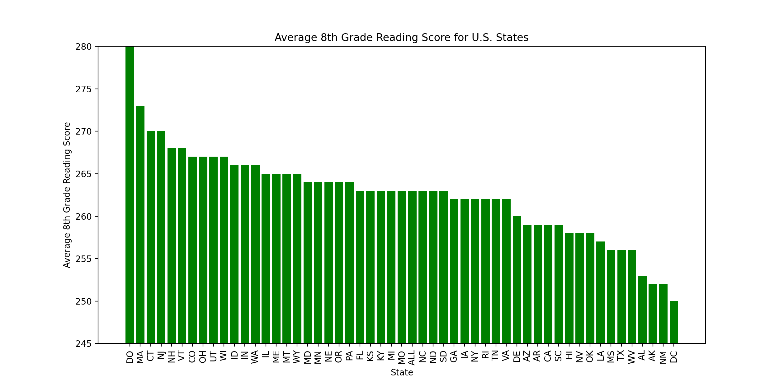
I found the following data set: U.S. Education Datasets: Unification Project. It has data on US math and reading scores, broken down by U.S. States (and Washington, D.C.).
Here is a Matplotlib function to analyze the data:
def eighth_grade_reading_scores_2019():
    fig, ax = plt.subplots()
    with open('states_all.csv') as f:
        lines = f.readlines()[1:]

    lines = [x for x in lines if x.startswith('2019')]
    # state is index 1
    # AVG_READING_8_SCORE is the last column
    x_values = [x.split(',')[1].replace('_', ' ') for x in lines]

    # convert to abbrev
    x_values = [STATE_ABBR[x] for x in x_values]
    y_values = [int(float(x.split(',')[-1].strip())) for x in lines]

    # sort (using a new function, zip!)
    all_values = sorted(zip(x_values, y_values), key=lambda x: x[1],
                        reverse=True)

    # extract again
    x_values = [x[0] for x in all_values]
    y_values = [x[1] for x in all_values]

    x_pos = [i for i in range(len(x_values))]

    plt.bar(x_pos, y_values, color='green')
    plt.xlabel("State")
    plt.ylabel("Average 8th Grade Reading Score")
    plt.title("Average 8th Grade Reading Score for U.S. States")

    plt.xticks(x_pos, x_values, rotation=90)
    # scale the y-axis so the bars aren't so huge
    ax.set(ylim=[min(y_values) - 5, max(y_values)])
    plt.show()
The plot that comes out is this:
At first, when I produced the chart, it was sorted by state name, which led to data that was pretty terrible to read. So, I added the following sorting code:
    # sort (using a new function, zip!)
    all_values = sorted(zip(x_values, y_values), key=lambda x: x[1],
                        reverse=True)

    # extract again
    x_values = [x[0] for x in all_values]
    y_values = [x[1] for x in all_values]
This uses our lambda functions and a new function, zip(). The zip() function takes two lists and allows you to get individual values from the same index from both lists (and it works for more than two lists, as well). Here is an example:
>>> a = [1, 2, 3]
>>> b = [4, 5, 6]
>>> for v1, v2 in zip(a, b):
...   print(v1, v2)
...
1 4
2 5
3 6
>>>
Understanding how to zip lists is a nice way to save time.
Mulitple bar series graphs
Finally, let's modify our code from above to visualize both reading and math scores.
- What we need to do is to gather together values for reading and math and plot them together for each state.
- I had to look this up – using the
numpy.arangefunction to get the bars into the correct location (see this discussion aboutnumpy.linspaceto see what the difference betweenarangeandlinspaceare). This function is used to "return evenly spaced values within a given interval."
def eighth_grade_reading_and_math_scores_2019():
    fig, ax = plt.subplots()
    with open('states_all.csv') as f:
        lines = f.readlines()[1:]

    lines = [x for x in lines if x.startswith('2019')]
    # state is index 1
    # AVG_READING_8_SCORE is the last column
    # AVG_MATH_8_SCORE is the -3rd column
    x_values = [x.split(',')[1].replace('_', ' ') for x in lines]

    # convert to abbrev
    x_values = [STATE_ABBR[x] for x in x_values]
    y_values_reading = [int(float(x.split(',')[-1].strip())) for x in lines]
    y_values_math = [int(float(x.split(',')[-3].strip())) for x in lines]

    # sort by math
    all_values = [(x[0], x[1], x[2]) for x in zip(x_values, y_values_reading,
                                                  y_values_math)]
    all_values = sorted(all_values, key=lambda x: x[2], reverse=True)

    x_values = [x[0] for x in all_values]
    y_values_reading = [x[1] for x in all_values]
    y_values_math = [x[2] for x in all_values]

    x_pos_math = [i for i in range(len(x_values))]

    width = 0.3
    plt.bar(np.arange(len(y_values_math)), y_values_math,
            width=width, color='green')
    plt.bar(np.arange(len(y_values_reading)) + width, y_values_reading,
            width=width, color='orange')
    # plt.bar(x_pos_reading, y_values_reading, color='orange')
    plt.xlabel("State")
    plt.ylabel("Average 8th Grade Math and Reading Scores")
    plt.title("Average 8th Grade Math and Reading Scores for U.S. States")

    plt.xticks(x_pos_math, x_values, rotation=90)
    # scale the y-axis so the bars aren't so huge
    ax.set(ylim=[min(y_values_math + y_values_reading) - 5,
                 max(y_values_math + y_values_reading)])

    # set the legend
    plt.legend(['Math', 'Reading'], loc=1)
This is the chart we get:

Final thoughts about Matplotlib
- Matplotlib is one widely used library for visualizations based on data
- It can be very complicated to get the exact graph you want (trust me – I spent countless hours in graduate school fine-tuning my Matplotlib charts for my Ph.D. dissertation!)
- With that compexity comes great power, too, and with enough work, you can get professional charts out of Matplotlib.
- There are many other competetors to Matplotlib. A couple that I've used and like:
- If you do any sort of data science, you'll eventually want to visualize your data, and understanding the visualization tools available to you is important.