
This is relatively small project, but with memorable output. For this project you take in a data series of floating point numbers and create visualization of the data. Looking at graphs, you have seen many data visualizations where the height of a line or rectangle increases proportionately to represent a value. For this project, your code will use position and computed-color to reflect the underlying data.
Download the data-stripes.zip folder to get started.
We have several interesting data sets for this project, formatted in what we will call "frac" format, geared for this computed-color approach. We'll call each number in the data set a "frac", and the fracs have all been scaled to be in the range -1.0 .. +1.0 inclusive.
For this project, you need to write code for the draw_stripes() function. The code for main() is already done. The starter code creates a canvas of the requested size. The function takes in a fracs list list [0.5, -0.7, 0.23, ...] and draws a series of colored rectangles filling up the canvas, one for each frac number, as a way of visualizing the data.
All the rectangles should be the same width and should completely cover the canvas. Divide the canvas width by the number of fracs to figure out how wide each rectangle should be.
We have the constants BASE and DELTA to feed into the color math as follows.
BASE = 127
DELTA = 127
For each rectangle, we want to figure out a color based on the frac value which is -1.0 .. +1.0. For this milestone, set blue and green to the value BASE, and below we'll discuss computing the value of red, 0..254, based on the value of frac.
We want the red value to vary so that when frac is low, red is low, and when frac is high, red is high. Specifically:
frac is  1.0  -> red is 254
frac is  0.0  -> red is 127 (BASE)
frac is -1.0  -> red is 0
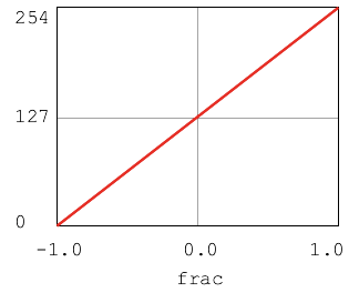
In the code, BASE, is the default, neutral value used when the frac value is 0.0. So when frac is 0.0, red should be BASE, aka 127. DELTA is the maximum amount to add or subtract from BASE. For example, when frac is 0.5, red should be BASE + 0.5 * DELTA. Work out code to compute red from frac.
Use the canvas.fill_rect() function, where the first 4 numbers give the location and size of the rectangle to draw.
canvas.fill_rect(left, top, rect_width, rect_height, color=(r, g, b))
The color= parameter, has a novel feature where it can be assigned to three numbers like this:
canvas.fill_rect(0, 0, 10, 200, color=(200, 127, 127))
The syntax (200, 127, 127) above is a "tuple" in Python, which we will study in more detail later. For now, the tuple simply contains three numbers within parenthesis - a red number, a green number, and a blue number, each must be in the range 0..255 (float values are ok). The fill_rect() function uses those RGB color numbers to set the color of the rectangle.
For this milestone, the blue and green numbers can stay at BASE, while your code computes a red variable based on the frac. The call to fill_rect() would look like:
red = ????
canvas.fill_rect( ...    color=(red, BASE, BASE))
For testing we have the following data-test.txt file of frac values from 1.0 to -1.0. The first line of the file is the data set title, and the rest is the floating point values. The provided function read_fracs() reads these numbers into a list.
Test Data Red to Blue
1.0
0.9
0.8
0.7
0.6
0.5
0.4
0.3
0.2
0.1
0.0
-0.1
-0.2
-0.3
-0.4
-0.5
-0.6
-0.7
-0.8
-0.9
-1.0
Try running your program with this data. You should see 21 rectangles. The far left rectangle should be quite red. The middle rectangle should be grayish. Towards the right the rectangles are an indistinct dusky blue/green color. We'll fix them in the next milestone.
$ python3 data-stripes.py data-test.txt

The main() code is provided for this project. It allows you to optionally supply a width and height number of the command line to change the canvas size:
$ python3 data-stripes.py data-test.txt 1200 500
Programming aside: here we've hand-constructed this small data-test.txt file with a very clear pattern in it for testing purposes. If we jumped straight to real data with all its complexities, it would be hard to spot if the code was correct or not. This is also an advantage of text files as a data format - you can just go to your editor and type the data up.
Now add color computation for blue as a function of each frac value. We want blue to move in the opposite direction as red: when frac is high, blue is low; when frac is low, blue is high:
frac is  1.0  -> blue is 0
frac is  0.0  -> blue is 127  (BASE)
frac is -1.0  -> blue is 254
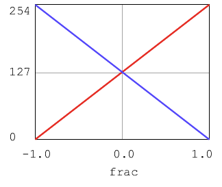
The result is that when frac is high, we get redish stripes since red is high and blue is low. When frac is low, we get blueish stripes, since blue is high and red is low. When frac is near 0.0, the color is grayish, since red, green, and blue will all be around 127 which makes gray.
After drawing the rectangles, call draw_string() like this to draw the title on top of the colored rectangles.
canvas.draw_string(5, 5, title, color='white')
With the blue color computation in, try the data-test.txt data file again.

At the left it's bright red, at the right it's bright blue. In the middle it should be grayish.
You've got this computed-color visualization machinery. Let's take it for a spin. We'll take a variety of data from the real world and run it through your color-visualization code.
Here is an idea to keep in mind when looking at these data sets or reading the news. Very often the news is depressing. Literally depressing. It's natural for the media to report on injustice and disasters in the world. However, the result is that gradual human progress is underreported. In reality, most measures of human wellbeing have improved hugely over recent decades. Pick a data set - child mortality, starvation, illiteracy .. they are all much better over the last 50 years. (For an interesting anecdote about the gradual progress of humanity, see the Simon-Ehrlich Wager.)
data-child-mortality.txt - global percentage of children dying before the age of five. The amount of human misery in the left part of this graph is breathtaking. I trimmed the data to start at 1960 as that's when there is data for every year. Data from https://ourworldindata.org/child-mortality
We'll include this graph in the assignment handout, but the rest you should bring to life through your own code. Not many people can say they've built their own numeric-color visualization like this.
$ python3 data-stripes.py data-child-mortality.txt

data-illiteracy.txt - global illiteracy rate. https://data.unicef.org/topic/education/literacy/
$ python3 data-stripes.py data-illiteracy.txt
data-homicides.txt - US homicide data. This data has a dramatic peak around 1991 in it. Show the graph to your parents and ask them what they remember. There was a significant increase in crime in the US from the late 1970's to the early 1990's, peaking in 1991. Since then there has been an equally dramatic decline. There are many theories about this peak, including the effect of leaded-gasoline on brain development, or the rise and fall of crack cocaine. Data from https://www.kaggle.com/marshallproject/crime-rates/version/1 although in retrospect there were perhaps simpler sources for this data.
$ python3 data-stripes.py data-homicides.txt
Side question: Art reflects life. There must be movies or other works of art that embody the sense of decay and criminality around that historic 1991 crime peak. Perhaps the movie Trainspotting or the show The Wire, or perhaps Escape from New York.
data-climate.txt - this data is quite dramatic. We are a clever and resilient species, and I'm sure we will figure this out eventually.
$ python3 data-stripes.py data-climate.txt
$ python3 data-stripes.py data-climate.txt 1200 600
Climate scientists measure temperature again a "0" point which is a historical global average temperature. Each year is measured as the "anomaly" from the historical average, so -1.5 C for a cold year or +1.5 C for a hot year. I scaled the climate data to fit in the -1.0 .. +1.0 format, but kept the 0 point intact, so when you see gray years, those were around the long-term average temperature, with red years above average and blue years below. This data set is from https://gmao.gsfc.nasa.gov/reanalysis/MERRA-2/
Terminal protip: The data file names all begin with data-, so in the terminal you can type data-, hit the tab key, and the auto-complete will show you the candidate file names. Then type in 1 more letter and hit tab again to complete the filename. This is why people with a lot of data often name the files according to some pattern, helping to keep things organized and accessible from the command line.
That's a neat bit of real world data visualized with applied math - a spatial dimension of time combined with a dimension in color. Your program should be able to draw any of these frac data sets at various sizes. When your code is all cleaned up and correct, please turn in your quilt.py and your data-stripes.py files on paperless as hw 5.2.
This assignment was created by Nick Parlante in 2019 for the revised Stanford CS106A in Python. The inspiration for the project was this Vox climate stripes article about how the color-stripe representation of climate data was showing up on plates and leggings as a sort of graphic-of-the-moment. The assignment uses the color dimension idea, but feeds through all sorts of data about the world in an effort to not be too depressing.