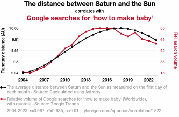
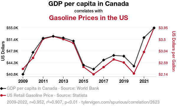
A spurious correlation chart showing the relationship between Canadian GDP and US gasoline prices.
Correlation and causation
These last two examples above were found by searching through many variables: they clearly demonstrate correlation is not causation.
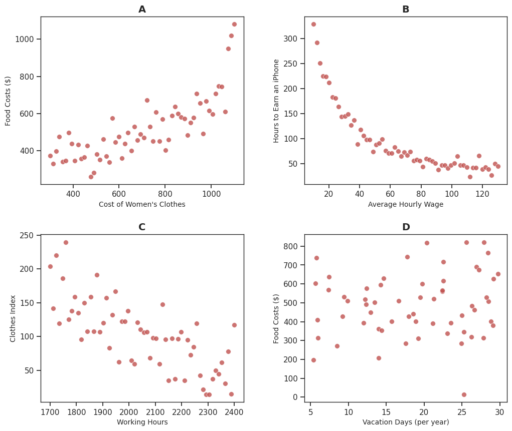
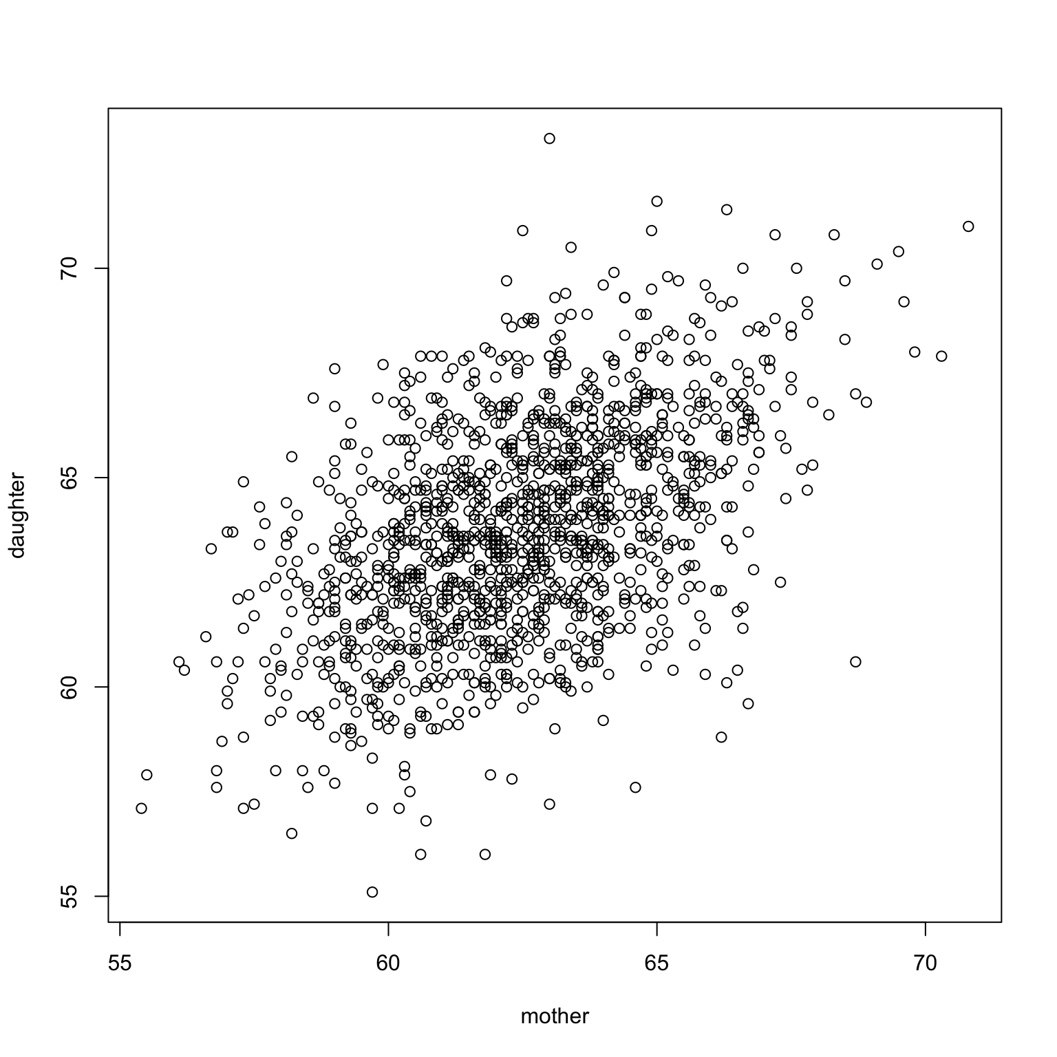
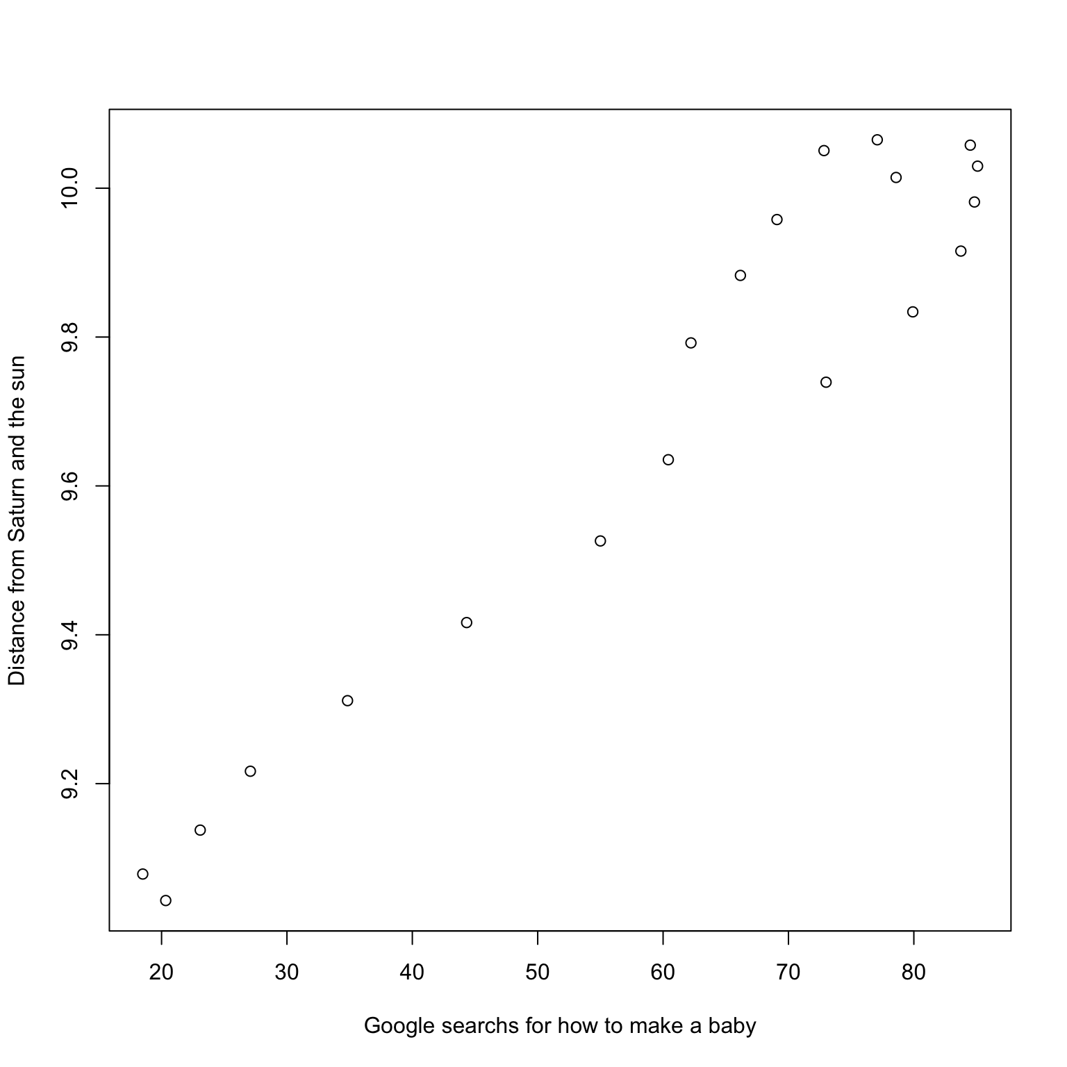
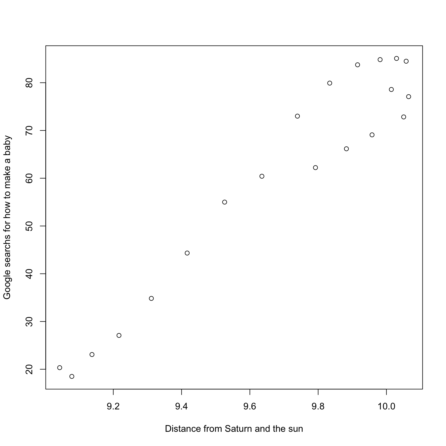
Example Shoe Size and Reading Ability
Within schools in a large school district, researchers collected students’ reading ability as measured by some standardized test. They also collected their shoe size.
Do we expect Shoe Size and Reading Ability to be uncorrelated? positively correlated? negatively correlated?
Explain.
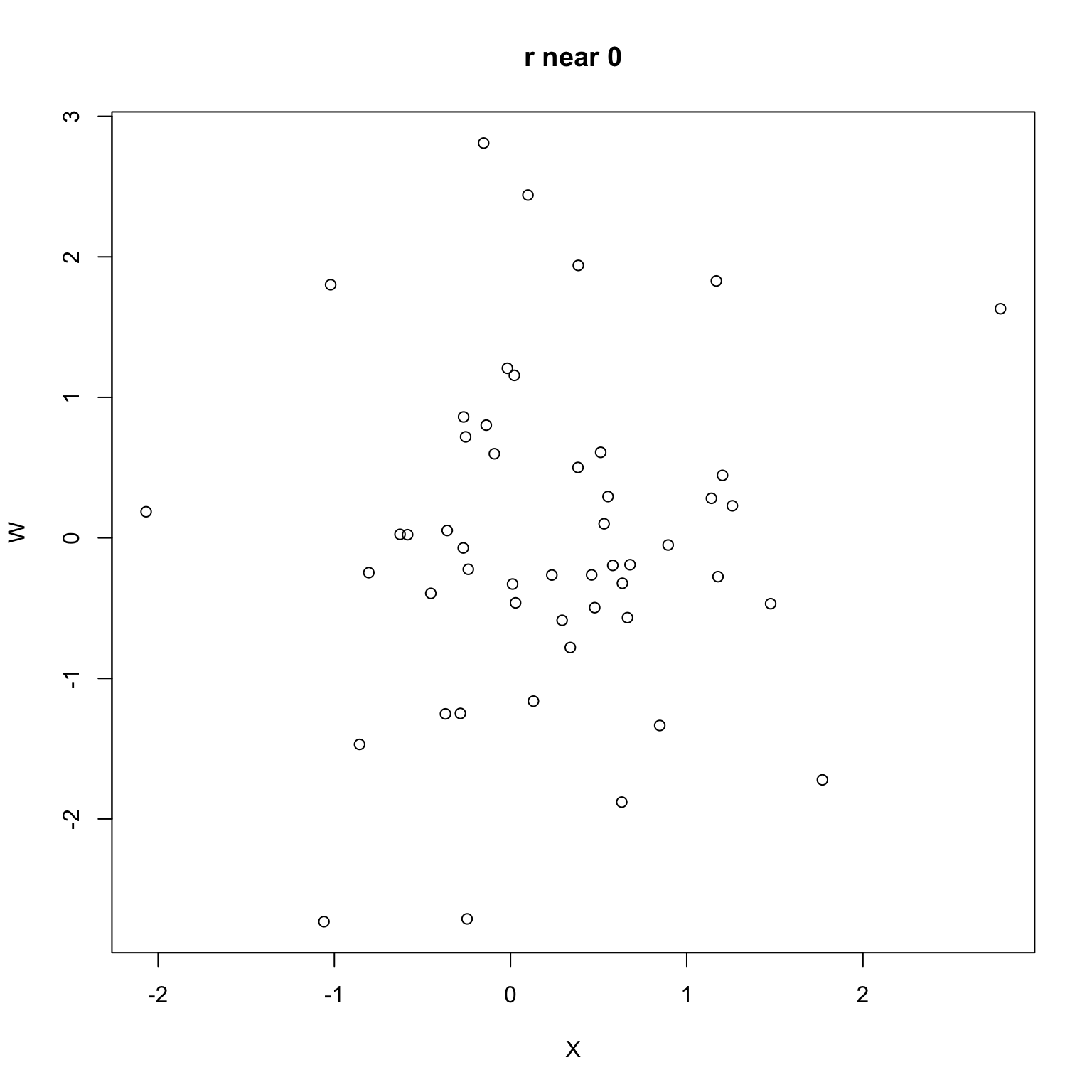
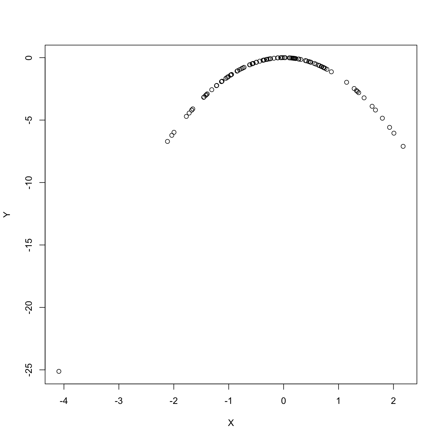
Correlation captures linear behavior
Variables can be associated without being linearly associated.
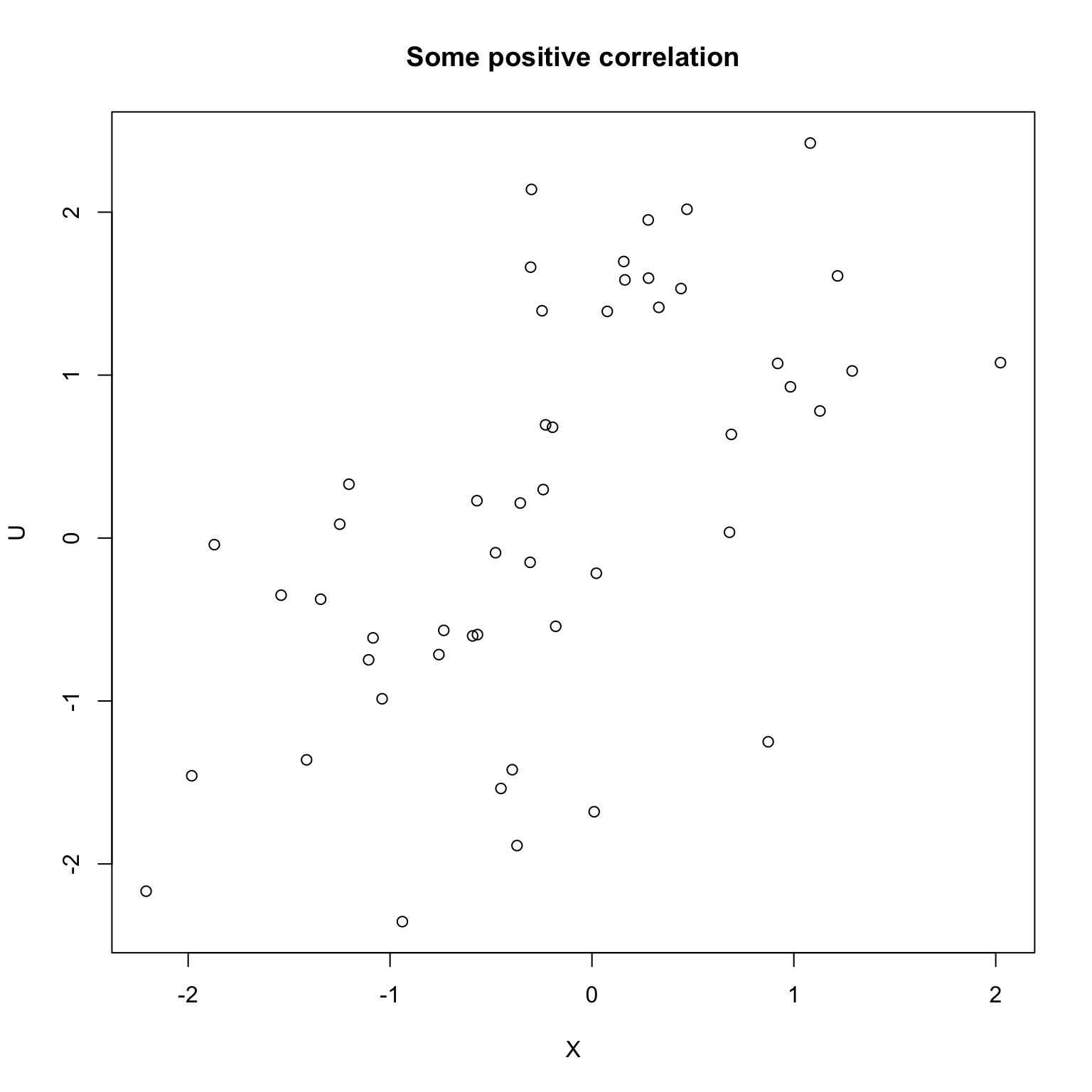
cor(X, Y)
[1] 0.35
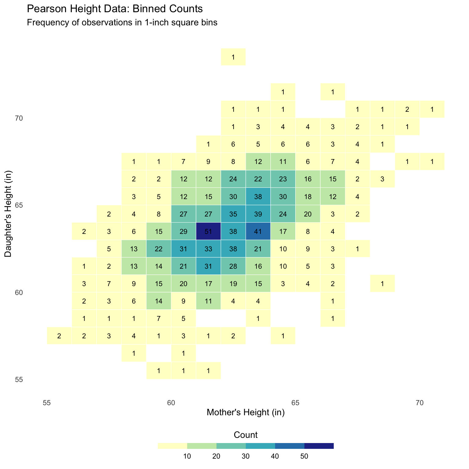
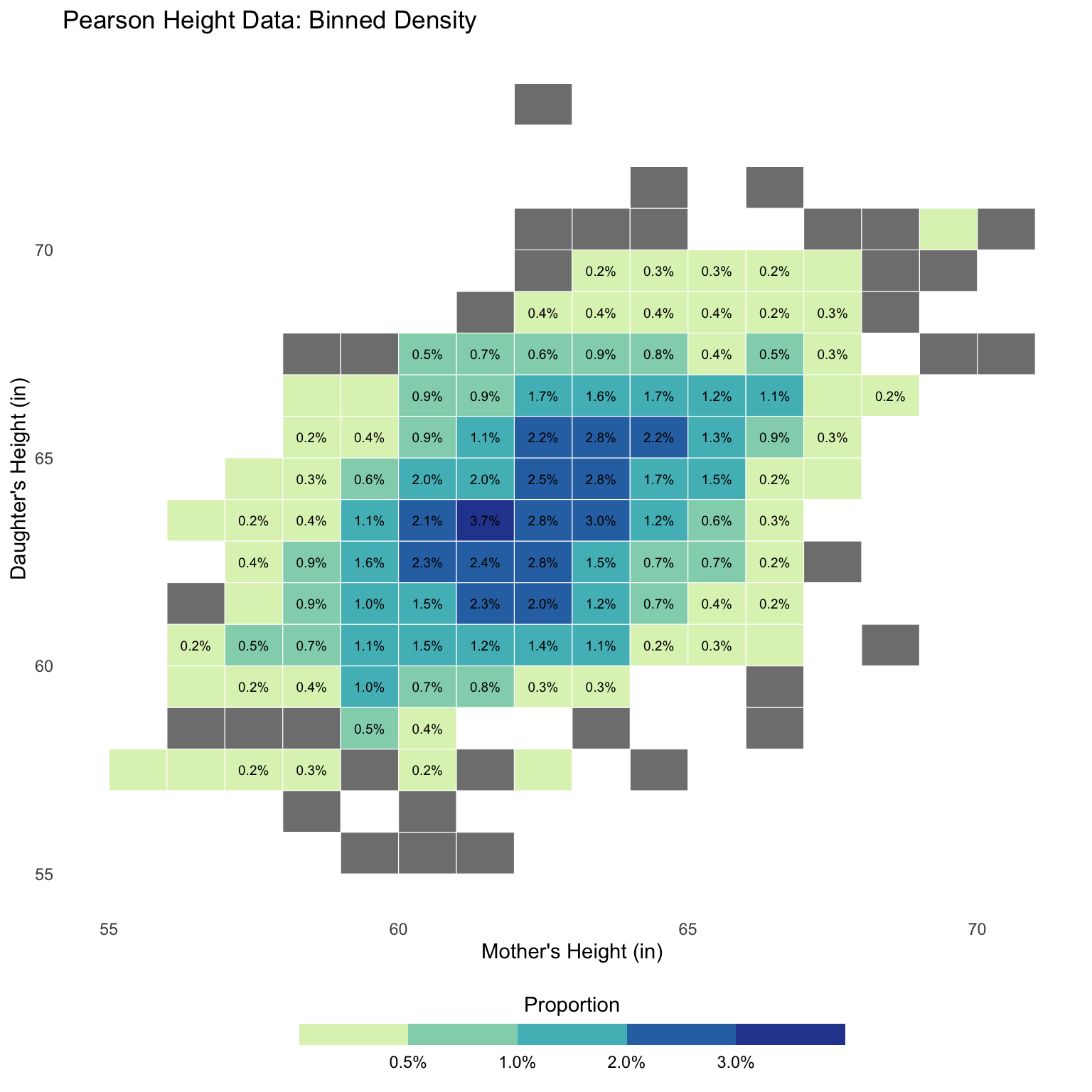
Bivariate histogram
All of our numeric summaries so far can be computed on datasets OR histograms
Correlation is no different, but we need to define a bivariate histogram.
Bivariate histogram: breaking the plane into bins
Bivariate histogram: assign proportions to bins
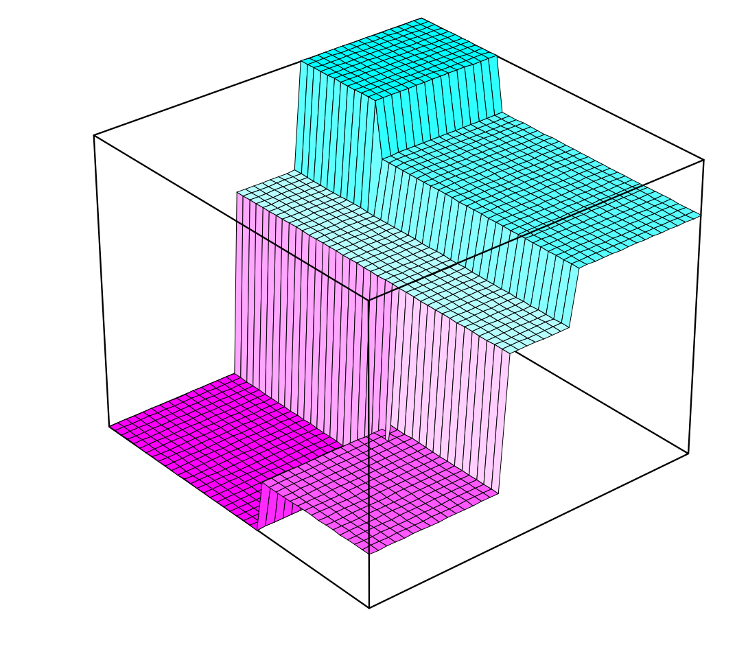
Bivariate histogram: volumes vs. areas
A 3D visualization of a bivariate histogram where column volumes represent proportions.
Replace bars with columns
\(\implies\)volumes are proportions now…
Correlation of a (bivariate) histogram
Just like mean, median, sd, quantile we could compute cor from such a bivariate histogram…
We will not dwell on the details (multivariate calculus…)
Moral: yet again, a histogram captures a lot of interesting things about the data…
Summary
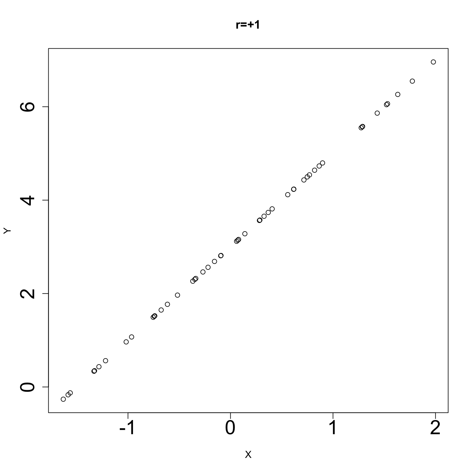
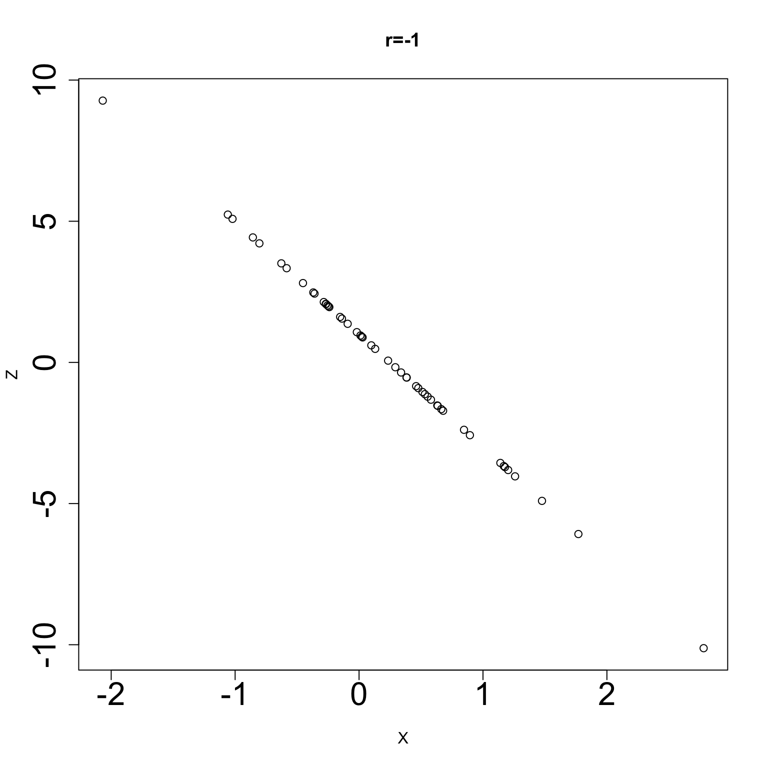
We introduced correlation, a unitless numerical summary of a scatterplot of X and Y.
When the two variables X and Y are linearly related, their correlation quantifies the strength of this linear association.
Can be computed based on the standardized variablesscale(X) and scale(Y).