means = c(1, 3)
sds = c(0.5, 0.5)
values = rnorm(length(coinflips),
mean = ifelse(coinflips, means[1], means[2]),
sd = ifelse(coinflips, sds[1], sds[2]))4 Mixture Models

One of the main challenges of biological data analysis is dealing with heterogeneity. The quantities we are interested in often do not show a simple, unimodal “textbook distribution”. For example, in the last part of Chapter 2 we saw how the histogram of sequence scores in Figure 2.27 had two separate modes, one for CpG-islands and one for non-islands. We can see the data as a simple mixture of a few (in this case: two) components. We call these finite mixtures. Other mixtures can involve almost as many components as we have observations. These we call infinite mixtures1.
1 We will see that—as for so many modeling choices–the right complexity of the mixture is in the eye of the beholder and often depends on the amount of data and the resolution and smoothness we want to attain.
In Chapter 1 we saw how a simple generative model with a Poisson distribution led us to make useful inference in the detection of an epitope. Unfortunately, a satisfactory fit to real data with such a simple model is often out of reach. However, simple models such as the normal or Poisson distributions can serve as building blocks for more realistic models using the mixing framework that we cover in this chapter. Mixtures occur naturally for flow cytometry data, biometric measurements, RNA-Seq, ChIP-Seq, microbiome and many other types of data collected using modern biotechnologies. In this chapter we will learn from simple examples how to build more realistic models of distributions using mixtures.
4.1 Goals for this chapter
In this chapter we will:
Generate our own mixture model data from distributions composed of two normal populations.
See how the Expectation-Maximization (EM) algorithm enables us to “reverse engineer” the underlying mixtures in dataset.
Use a special type of mixture called zero-inflation for data such as ChIP-Seq data that have many extra zeros.
Discover the empirical cumulative distribution: a special mixture that we can build from observed data. This will enable us to see how we can simulate the variability of our estimates using the bootstrap.
Build the Laplace distribution as an instance of an infinite mixture model with many components. We will use it to model promoter lengths and microarray intensities.
Have our first encounter with the gamma-Poisson distribution, a hierarchical model useful for RNA-Seq data. We will see it comes naturally from mixing different Poisson distributed sources.
See how mixture models enable us to choose data transformations.
4.2 Finite mixtures
4.2.1 Simple examples and computer experiments
Here is a first example of a mixture model with two equal-sized components. The generating process has two steps:
Flip a fair coin.
If it comes up heads: Generate a random number from a normal distribution with mean 1 and variance 0.25.
If it comes up tails: Generate a random number from a normal distribution with mean 3 and variance 0.25. The histogram shown in Figure 4.1 was produced by repeating these two steps 10000 times using the following code.
coinflips = (runif(10000) > 0.5)
table(coinflips)
coinflips
FALSE TRUE
5018 4982 oneFlip = function(fl, mean1 = 1, mean2 = 3, sd1 = 0.5, sd2 = 0.5) {
if (fl) {
rnorm(1, mean1, sd1)
} else {
rnorm(1, mean2, sd2)
}
}
fairmix = vapply(coinflips, oneFlip, numeric(1))
library("ggplot2")
library("dplyr")
ggplot(tibble(value = fairmix), aes(x = value)) +
geom_histogram(fill = "purple", binwidth = 0.1)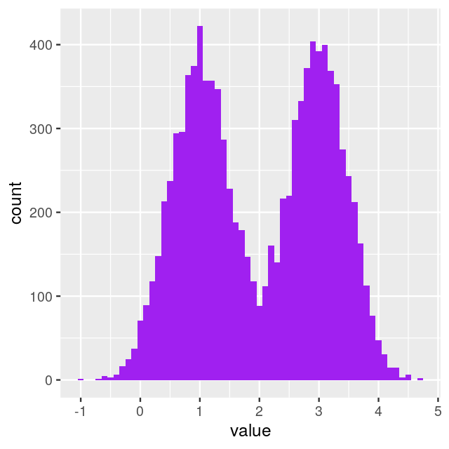
fair = tibble(
  coinflips = (runif(1e6) > 0.5),
  values = rnorm(length(coinflips),
                 mean = ifelse(coinflips, means[1], means[2]),
                 sd   = ifelse(coinflips, sds[1],   sds[2])))
ggplot(fair, aes(x = values)) +
     geom_histogram(fill = "purple", bins = 200)
Figure 4.2 illustrates that as we increase the number of bins and the number of observations per bin, the histogram approaches a smooth curve. This smooth limiting curve is called the density function of the random variable fair$values.
The density function for a normal \(N(\mu,\sigma)\) random variable can be written explicitly. We usually call it
\[ \phi(x)=\frac{1}{\sigma \sqrt{2\pi}}e^{-\frac{1}{2}(\frac{x-\mu}{\sigma})^2}. \]
ggplot(dplyr::filter(fair, coinflips), aes(x = values)) +
  geom_histogram(aes(y = after_stat(density)), fill = "purple", binwidth = 0.01) +
  stat_function(fun = dnorm, color = "red",
                args = list(mean = means[1], sd = sds[1]))
dnorm.In fact we can write the mathematical formula for the density of all of fair$values (the limiting curve that the histograms tend to look like) as a sum of the two densities.
\[ f(x)=\frac{1}{2}\phi_1(x)+\frac{1}{2}\phi_2(x), \tag{4.1}\]
where \(\phi_1\) is the density of the normal \(N(\mu_1=1,\sigma^2=0.25)\) and \(\phi_2\) is the density of the normal \(N(\mu_2=3,\sigma^2=0.25)\). Figure 4.4 was generated by the following code.
fairtheory = tibble(
  x = seq(-1, 5, length.out = 1000),
  f = 0.5 * dnorm(x, mean = means[1], sd = sds[1]) +
      0.5 * dnorm(x, mean = means[2], sd = sds[2]))
ggplot(fairtheory, aes(x = x, y = f)) +
  geom_line(color = "red", linewidth = 1.5) + ylab("mixture density")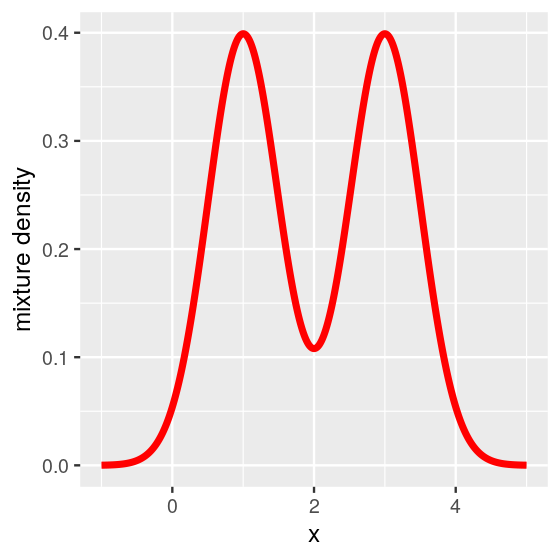
In this case, the mixture model is extremely visible as the two component distributions have little overlap. Figure 4.4 shows two distinct peaks: we call this a bimodal distribution. In practice, in many cases the separation between the mixture components is not so obvious—but nevertheless relevant.

The following code colors in red the points that were generated from the heads coin flips and in blue those from the tails. Its output, in Figure 4.6, shows the two underlying distributions.
head(mystery, 3)# A tibble: 3 × 2
coinflips values
<lgl> <dbl>
1 FALSE 1.97
2 FALSE 3.00
3 FALSE 1.60br = with(mystery, seq(min(values), max(values), length.out = 30))
ggplot(mystery, aes(x = values)) +
geom_histogram(data = dplyr::filter(mystery, coinflips),
fill = "red", alpha = 0.2, breaks = br) +
geom_histogram(data = dplyr::filter(mystery, !coinflips),
fill = "darkblue", alpha = 0.2, breaks = br) 
In Figure 4.6, the bars from the two component distributions are plotted on top of each other. A different way of showing the components is Figure 4.7, produced by the code below.
ggplot(mystery, aes(x = values, fill = coinflips)) +
  geom_histogram(data = dplyr::filter(mystery, coinflips),
     fill = "red", alpha = 0.2, breaks = br) +
  geom_histogram(data = dplyr::filter(mystery, !coinflips),
     fill = "darkblue", alpha = 0.2, breaks = br) +
  geom_histogram(fill = "purple", breaks = br, alpha = 0.2)
In Figures 4.6 and 4.7, we were able to use the coinflips column in the data to disentangle the components. In real data, this information is missing.
![]()
4.2.3 Models for zero inflated data
Ecological and molecular data often come in the form of counts. For instance, this may be the number of individuals from each of several species at each of several locations. Such data can often be seen as a mixture of two scenarios: if the species is not present, the count is necessarily zero, but if the species is present, the number of individuals we observe varies, with a random sampling distribution; this distribution may also include zeros. We model this as a mixture:
\[ f_{\text{zi}}(x) = \lambda \, \delta(x) + (1-\lambda) \, f_{\text{count}}(x), \tag{4.10}\]
where \(\delta\) is Dirac’s delta function, which represents a probability distribution that has all its mass at 0. The zeros from the first mixture component are called “structural”: in our example, they occur because certain species do not live in certain habitats. The second component, \(f_{\text{count}}\) may also include zeros and other small numbers, simply due to random sampling. The R packages pscl (Zeileis, Kleiber, and Jackman 2008) and zicounts provide many examples and functions for working with zero inflated counts.
Example: ChIP-Seq data
Let’s consider the example of ChIP-Seq data. These data are sequences of pieces of DNA that are obtained from chromatin immunoprecipitation (ChIP). This technology enables the mapping of the locations along genomic DNA of transcription factors, nucleosomes, histone modifications, chromatin remodeling enzymes, chaperones, polymerases and other protein. It was the main technology used by the Encyclopedia of DNA Elements (ENCODE) Project. Here we use an example (Kuan et al. 2011) from the mosaicsExample package, which shows data measured on chromosome 22 from ChIP-Seq of antibodies for the STAT1 protein and the H3K4me3 histone modification applied to the GM12878 cell line. Here we do not show the code to construct the binTFBS object; it is shown in the source code file for this chapter and follows the vignette of the mosaics package.
binTFBSSummary: bin-level data (class: BinData)
----------------------------------------
- # of chromosomes in the data: 1
- total effective tag counts: 462479
(sum of ChIP tag counts of all bins)
- control sample is incorporated
- mappability score is NOT incorporated
- GC content score is NOT incorporated
- uni-reads are assumed
----------------------------------------From this object, we can create the histogram of per-bin counts.
bincts = print(binTFBS)
ggplot(bincts, aes(x = tagCount)) +
  geom_histogram(binwidth = 1, fill = "forestgreen")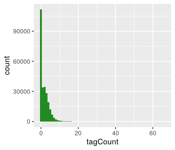
We see in Figure 4.8 that there are many zeros, although from this plot it is not immediately obvious whether the number of zeros is really extraordinary, given the frequencies of the other small numbers (\(1,2,...\)).
ggplot(bincts, aes(x = tagCount)) + scale_y_log10() +
   geom_histogram(binwidth = 1, fill = "forestgreen")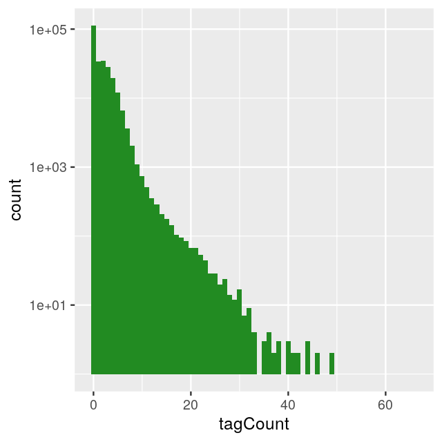
4.2.4 More than two components
So far we have looked at mixtures of two components. We can extend our description to cases where there may be more. For instance, when weighing N=7,000 nucleotides obtained from mixtures of deoxyribonucleotide monophosphates (each type has a different weight, measured with the same standard deviation sd=3), we might observe the histogram (shown in Figure 4.10) generated by the following code.
masses = c(A =  331, C =  307, G =  347, T =  322)
probs  = c(A = 0.12, C = 0.38, G = 0.36, T = 0.14)
N  = 7000
sd = 3
nuclt   = sample(length(probs), N, replace = TRUE, prob = probs)
quadwts = rnorm(length(nuclt),
                mean = masses[nuclt],
                sd   = sd)
ggplot(tibble(quadwts = quadwts), aes(x = quadwts)) +
  geom_histogram(bins = 100, fill = "purple")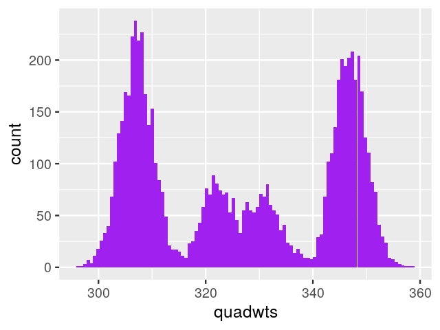
In this case, as we have enough measurements with good enough precision, we are able to distinguish the four nucleotides and decompose the distribution shown in Figure 4.10. With fewer data and/or more noisy measurements, the four modes and the distribution component might be less clear.
4.3 Empirical distributions and the nonparametric bootstrap
In this section, we will consider an extreme case of mixture models, where we model our sample of \(n\) data points as a mixture of \(n\) point masses. We could use almost any set of data here; to be concrete, we use Darwin’s Zea Mays data3 in which he compared the heights of 15 pairs of Zea Mays plants (15 self-hybridized versus 15 crossed). The data are available in the HistData package, and we plot the distribution of the 15 differences in height:
3 They were collected by Darwin who asked his cousin, Francis Galton to analyse them. R.A. Fisher re-analysed the same data using a paired t-test (Bulmer 2003). We will get back to this example in Chapter 13.
library("HistData")
ZeaMays$diff
[1] 6.125 -8.375 1.000 2.000 0.750 2.875 3.500 5.125 1.750 3.625
[11] 7.000 3.000 9.375 7.500 -6.000ggplot(ZeaMays, aes(x = diff, ymax = 1/15, ymin = 0)) +
geom_linerange(linewidth = 1, col = "forestgreen") + ylim(0, 0.1)
In Section 3.6.7 we saw that the empirical cumulative distribution function (ECDF) for a sample of size \(n\) is
\[ \hat{F}_n(x)= \frac{1}{n}\sum_{i=1}^n {\mathbb 1}_{x \leq x_i}, \tag{4.11}\]
and we saw ECDF plots in Figure 3.24. We can also write the density of our sample as
\[ \hat{f}_n(x) =\frac{1}{n}\sum_{i=1}^n \delta_{x_i}(x) \tag{4.12}\]
In general, the density of a probability distribution is the derivative (if it exists) of the distribution function. We have applied this principle here: the density of the distribution defined by Equation 4.11 is Equation 4.12. We could do this since one can consider the function \(\delta_a\) the “derivative” of the step function \({\mathbb 1}_{x \leq a}\): it is completely flat almost everywhere, except at the one point \(a\) where there is the step, and where its value is “infinite” . Equation 4.12 highlights that our data sample can be considered a mixture of \(n\) point masses at the observed values \(x_1,x_2,..., x_{n}\), such as in Figure 4.11.
There is a bit of advanced mathematics (beyond standard calculus) required for this to make sense, which is however beyond the scope of our treatment here.

Statistics of our sample, such as the mean, minimum or median, can now be written as a function of the ECDF, for instance, \(\bar{x} = \int \delta_{x_i}(x)\,\text{d}x\). As another instance, if \(n\) is an odd number, the median is \(x_{(\frac{n+1}{2})}\), the value right in the middle of the ordered list.
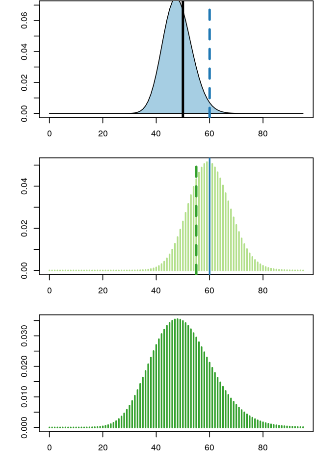
The true sampling distribution of a statistic \(\hat{\tau}\) is often hard to know as it requires many different data samples from which to compute the statistic; this is shown in Figure 4.12.
The bootstrap principle approximates the true sampling distribution of \(\hat{\tau}\) by creating new samples drawn from the empirical distribution built from the original sample (Figure 4.13). We reuse the data (by considering it a mixture distribution of \(\delta\)s) to create new “datasets” by taking samples and looking at the sampling distribution of the statistics \(\hat{\tau}^*\) computed on them. This is called the nonparametric bootstrap resampling approach, see Bradley Efron and Tibshirani (1994) for a complete reference. It is very versatile and powerful method that can be applied to basically any statistic, no matter how complicated it is. We will see example applications of this method, in particular to clustering, in Chapter 5.

Using these ideas, let’s try to estimate the sampling distribution of the median of the Zea Mays differences we saw in Figure 4.11. We use similar simulations to those in the previous sections: Draw \(B=1000\) samples of size 15 from the 15 values (each being a component in the 15-component mixture). Then compute the 1000 medians of each of these samples of 15 values and look at their distribution: this is the bootstrap sampling distribution of the median.
B = 1000
meds = replicate(B, {
  i = sample(15, 15, replace = TRUE)
  median(ZeaMays$diff[i])
})
ggplot(tibble(medians = meds), aes(x = medians)) +
  geom_histogram(bins = 30, fill = "purple")
Why nonparametric?
In theoretical statistics, nonparametric methods are those that have infinitely many degrees of freedom or numbers of unknown parameters.

In practice, we do not wait for infinity; when the number of parameters becomes as large or larger than the amount of data available, we say the method is nonparametric. The bootstrap uses a mixture with \(n\) components, so with a sample of size \(n\), it qualifies as a nonparametric method.
Despite their name, nonparametric methods are not methods that do not use parameters: all statistical methods estimate unknown quantities.
4.4 Infinite mixtures
Sometimes mixtures can be useful even if we don’t aim to assign a label to each observation or, to put it differently, if we allow as many `labels’ as there are observations. If the number of mixture components is as big as (or bigger than) the number of observations, we say we have an infinite mixture. Let’s look at some examples.
4.4.1 Infinite mixture of normals

Consider the following two-level data generating scheme:
Level 1 Create a sample of Ws from an exponential distribution.
w = rexp(10000, rate = 1)Level 2 The \(w\)s serve as the variances of normal variables with mean \(\mu\) generated using rnorm.
mu  = 0.3
lps = rnorm(length(w), mean = mu, sd = sqrt(w))
ggplot(data.frame(lps), aes(x = lps)) +
  geom_histogram(fill = "purple", binwidth = 0.1)
This turns out to be a rather useful distribution. It has well-understood properties and is named after Laplace, who proved that the median is a good estimator of its location parameter \(\theta\) and that the median absolute deviation can be used to estimate its scale parameter \(\phi\). From the formula in the caption of Figure 4.15 we see that the \(L_1\) distance (absolute value of the difference) holds a similar position in the Laplace density as the \(L_2\) (square of the difference) does for the normal density.
Conversely, in Bayesian regression4, having a Laplace distribution as a prior on the coefficients amounts to an \(L_1\) penalty, called the lasso (Tibshirani 1996), while a normal distribution as a prior leads to an \(L_2\) penalty, called ridge regression.
4 Don’t worry if you are not familiar with this, in that case just skip this sentence.
Asymmetric Laplace
In the Laplace distribution, the variances of the normal components depend on \(W\), while the means are unaffected. A useful extension adds another parameter \(\theta\) that controls the locations or centers of the components. We generate data alps from a hierarchical model with \(W\) an exponential variable; the output shown in Figure 4.17 is a histogram of normal \(N(\theta+w\mu,\sigma w)\) random numbers, where the \(w\)’s themselves were randomly generated from an exponential distribution with mean \(1\) as shown in the code:
mu = 0.3; sigma = 0.4; theta = -1
w  = rexp(10000, 1)
alps = rnorm(length(w), theta + mu * w, sigma * sqrt(w))
ggplot(tibble(alps), aes(x = alps)) +
  geom_histogram(fill = "purple", binwidth = 0.1)
Such hierarchical mixture distributions, where every instance of the data has its own mean and variance, are useful models in many biological settings. Examples are shown in Figure 4.18.
The Laplace distribution is an example of where the consideration of the generative process indicates how the variance and mean are linked. The expectation value and variance of an asymmetric Laplace distribution \(AL(\theta, \mu, \sigma)\) are
\[ E(X)=\theta+\mu\quad\quad\text{and}\quad\quad\text{var}(X)=\sigma^2+\mu^2. \tag{4.14}\]
Note the variance is dependent on the mean, unless \(\mu = 0\) (the case of the symmetric Laplace Distribution). This is the feature of the distribution that makes it useful. Having a mean-variance dependence is very common for physical measurements, be they microarray fluorescence intensities, peak heights from a mass spectrometer, or reads counts from high-throughput sequencing, as we’ll see in the next section.
4.4.2 Infinite mixtures of Poisson variables.

A similar two-level hierarchical model is often also needed to model real-world count data. At the lower level, simple Poisson and binomial distributions serve as the building blocks, but their parameters may depend on some underlying (latent) process. In ecology, for instance, we might be interested in variations of fish species in all the lakes in a region. We sample the fish species in each lake to estimate their true abundances, and that could be modeled by a Poisson. But the true abundances will vary from lake to lake. And if we want to see whether, for instance, changes in climate or altitude play a role, we need to disentangle such systematic effects from random lake-to-lake variation. The different Poisson rate parameters \(\lambda\) can be modeled as coming from a distribution of rates. Such a hierarchical model also enables us to add supplementary steps in the hierarchy, for instance we could be interested in many different types of fish, model altitude and other environmental factors separately, etc.
Further examples of sampling schemes that are well modeled by mixtures of Poisson variables include applications of high-throughput sequencing, such as RNA-Seq, which we will cover in detail in Chapter 8, or 16S rRNA-Seq data used in microbial ecology.
4.4.3 Gamma distribution: two parameters (shape and scale)
Now we are getting to know a new distribution that we haven’t seen before. The gamma distribution is an extension of the (one-parameter) exponential distribution, but it has two parameters, which makes it more flexible. It is often useful as a building block for the upper level of a hierarchical model. The gamma distribution is positive-valued and continuous. While the density of the exponential has its maximum at zero and then simply decreases towards 0 as the value goes to infinity, the density of the gamma distribution has its maximum at some finite value. Let’s explore it by simulation examples. The histograms in Figure 4.20 were generated by the following lines of code:
ggplot(tibble(x = rgamma(10000, shape = 2, rate = 1/3)),
   aes(x = x)) + geom_histogram(bins = 100, fill= "purple")
ggplot(tibble(x = rgamma(10000, shape = 10, rate = 3/2)),
   aes(x = x)) + geom_histogram(bins = 100, fill= "purple")
Gamma–Poisson mixture: a hierarchical model
Generate a set of parameters: \(\lambda_1,\lambda_2,...\) from a gamma distribution.
Use these to generate a set of Poisson(\(\lambda_i\)) random variables, one for each \(\lambda_1\).
lambda = rgamma(10000, shape = 10, rate = 3/2)
gp = rpois(length(lambda), lambda = lambda)
ggplot(tibble(x = gp), aes(x = x)) +
  geom_histogram(bins = 100, fill= "purple")
gp, generated via a gamma-Poisson hierachical model.The resulting values are said to come from a gamma–Poisson mixture. Figure 4.21 shows the histogram of gp.
library("vcd")
ofit = goodfit(gp, "nbinomial")
plot(ofit, xlab = "")
ofit$par
$size
[1] 9.933898
$prob
[1] 0.5987968
In R, and in some other places, the gamma-Poisson distribution travels under the alias name of negative binomial distribution. The two names are synonyms; the second one alludes to the fact that Equation 4.15 bears some formal similarities to the probabilities of a binomial distribution. The first name, gamma–Poisson distribution, is more indicative of its generating mechanism, and that’s what we will use in the rest of the book. It is a discrete distribution, that means that it takes values only on the natural numbers (in contrast to the gamma distribution, which covers the whole positive real axis). Its probability distribution is
\[ \text{P}(K=k)=\left(\begin{array}{c}k+a-1\\k\end{array}\right) \, p^a \, (1-p)^k, \tag{4.15}\]
which depends on the two parameters \(a\in\mathbb{R}^+\) and \(p\in[0,1]\). Equivalently, the two parameters can be expressed by the mean \(\mu=pa/(1-p)\) and a parameter called the dispersion \(\alpha=1/a\). The variance of the distribution depends on these parameters, and is \(\mu+\alpha\mu^2\).
4.4.4 Variance stabilizing transformations
A key issue we need to control when we analyse experimental data is how much variability there is between repeated measurements of the same underlying true value, i.e., between replicates. This will determine whether and how well we can see any true differences, i.e., between different conditions. Data that arise through the type of hierarchical models we have studied in this chapter often turn out to have very heterogeneous variances, and this can be a challenge. We will see how in such cases variance-stabilizing transformations (Anscombe 1948) can help. Let’s start with a series of Poisson variables with rates from 10 to 100:
Note how we construct the dataframe (or, more precisely, the tibble)
simdat: the output of the lapply loop is a list of tibbles, one for each value of lam. With the pipe operator |> we send it to the function bind_rows (from the dplyr package). The result is a dataframe of all the list elements neatly stacked on top of each other.simdat = lapply(seq(10, 100, by = 10), function(lam)
tibble(n = rpois(200, lambda = lam),
`sqrt(n)` = sqrt(n),
lambda = lam)) |>
bind_rows() |>
tidyr::pivot_longer(cols = !lambda)
ggplot(simdat, aes(x = factor(lambda), y = value)) + xlab(expression(lambda)) +
geom_violin() + facet_grid(rows = vars(name), scales = "free")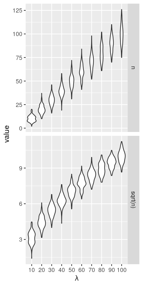
lambda. In the upper panel, the \(y\)-axis is proportional to the data; in the lower panel, it is on a square-root scale. Note how the distribution widths change in the first case, but less so in the second.The data that we see in the upper panel of Figure 4.24 are an example of what is called heteroscedasticity: the standard deviations (or, equivalently, the variance) of our data is different in different regions of our data space. In particular, it increases along the \(x\)-axis, with the mean. For the Poisson distribution, we indeed know that the standard deviation is the square root of the mean; for other types of data, there may be other dependencies. This can be a problem if we want to apply subsequent analysis techniques (for instance, regression, or a statistical test) that are based on assuming that the variances are the same. In Figure 4.24, the numbers of replicates for each value of lambda are quite large. In practice, this is not always the case. Moreover, the data are usually not explicitly stratified by a known mean as in our simulation, so the heteroskedasticity may be harder to see, even though it is there. However, as we see in the lower panel of Figure 4.24, if we simply apply the square root transformation, then the transformed variables will have approximately the same variance. This works even if we do not know the underlying mean for each observation, the square root transformation does not need this information. We can verify this more quantitatively, as in the following code, which shows the standard deviations of the sampled values n and sqrt(n) for the difference choices of lambda.
The standard deviation of the square root transformed values is consistently around 0.5, so we would use the transformation
2*sqrt(n) to achieve unit variance.summarise(group_by(simdat, name, lambda), sd(value)) |> tidyr::pivot_wider(values_from = `sd(value)`)# A tibble: 10 × 3
lambda n `sqrt(n)`
<dbl> <dbl> <dbl>
1 10 3.34 0.523
2 20 4.62 0.513
3 30 5.49 0.505
4 40 6.23 0.498
5 50 7.14 0.506
6 60 7.77 0.503
7 70 8.30 0.492
8 80 9.25 0.518
9 90 8.22 0.436
10 100 10.4 0.522Another example, now using the gamma-Poisson distribution, is shown in Figure 4.25. We generate gamma-Poisson variables u5 and plot the 95% confidence intervals around the mean.
5 To catch a greater range of values for the mean value mu, without creating too dense a sequence, we use a geometric series: \(\mu_{i+1} = 2\mu_i\).
muvalues = 2^seq(0, 10, by = 1)
simgp = lapply(muvalues, function(mu) {
  u = rnbinom(n = 1e4, mu = mu, size = 4)
  tibble(mean = mean(u), sd = sd(u),
         lower = quantile(u, 0.025),
         upper = quantile(u, 0.975),
         mu = mu)
  } ) |> bind_rows()
head(as.data.frame(simgp), 2)
mean sd lower upper mu
1 0.9937 1.131189 0 4 1
2 1.9950 1.720834 0 6 2ggplot(simgp, aes(x = mu, y = mean, ymin = lower, ymax = upper)) +
geom_point() + geom_errorbar()
simgp = mutate(simgp,
  slopes = 1 / sd,
  trsf   = cumsum(slopes * mean))
ggplot(simgp, aes(x = mean, y = trsf)) +
  geom_point() + geom_line() + xlab("")
We see in Figure 4.26 that this function has some resemblance to a square root function in particular at its lower end. At the upper end, it seems to look more like a logarithm. The more mathematically inclined will see that an elegant extension of these numerical calculations can be done through a little calculus known as the delta method, as follows.
Call our transformation function \(g\), and assume it’s differentiable (that’s not a very strong assumption: pretty much any function that we might consider reasonable here is differentiable). Also call our random variables \(X_i\), with means \(\mu_i\) and variances \(v_i\), and we assume that \(v_i\) and \(\mu_i\) are related by a functional relationship \(v_i = v(\mu_i)\). Then, for values of \(X_i\) in the neighborhood of its mean \(\mu_i\),
\[ g(X_i) = g(\mu_i) + g'(\mu_i) (X_i-\mu_i) + ... \tag{4.17}\]
where the dots stand for higher order terms that we can neglect. The variances of the transformed values are then
\[ \begin{align} \text{Var}(g(X_i)) &\simeq g'(\mu_i)^2\\ \text{Var}(X_i) &= g'(\mu_i)^2 \, v(\mu_i), \end{align} \tag{4.18}\]
where we have used the rules \(\text{Var}(X-c)=\text{Var}(X)\) and \(\text{Var}(cX)=c^2\,\text{Var}(X)\) that hold whenever \(c\) is a constant number. Requiring that this be constant leads to the differential equation
\[ g'(x) = \frac{1}{\sqrt{v(x)}}. \tag{4.19}\]
For a given mean-variance relationship \(v(\mu)\), we can solve this for the function \(g\). Let’s check this for some simple cases:
if \(v(\mu)=\mu\) (Poisson), we recover \(g(x)=\sqrt{x}\), the square root transformation.
If \(v(\mu)=\alpha\,\mu^2\), solving the differential equation 4.19 gives \(g(x)=\log(x)\). This explains why the logarithm transformation is so popular in many data analysis applications: it acts as a variance stabilizing transformation whenever the data have a constant coefficient of variation, that is, when the standard deviation is proportional to the mean.
To solve the differential equation 4.19 with this function \(v(\cdot)\), we need to compute the integral
\[\label{eq:} \int \frac{dx}{\sqrt{x + \alpha x^2}}. \tag{4.20}\]
A closed form expression can be looked up in a reference table such as (Bronštein and Semendjajew 1979). These authors provide the general solution
\[ \int \frac{dx}{\sqrt{ax^2+bx+c}} = \frac{1}{\sqrt{a}} \ln\left(2\sqrt{a(ax^2+bx+c)}+2ax+b\right) + \text{const.}, \tag{4.21}\]
into which we can plug in our special case \(a=\alpha\), \(b=1\), \(c=0\), to obtain the variance-stabilizing transformation
\[ \begin{align} g_\alpha(x) &= \frac{1}{2\sqrt{\alpha}} \ln\left(2\sqrt{\alpha x (\alpha x+1)} + 2\alpha x + 1\right) \\ &= \frac{1}{2\sqrt{\alpha}} {\displaystyle \operatorname {arcosh}} (2\alpha x+1).\\ \end{align} \tag{4.22}\]
For the second line in Equation 4.22, we used the identity \({\displaystyle \operatorname {arcosh}}(z) = \ln\left(z+\sqrt{z^2-1}\right)\). In the limit of \(\alpha\to0\), we can use the linear approximation \(\ln(1+\varepsilon)=\varepsilon+O(\varepsilon^2)\) to see that \(g_0(x)=\sqrt{x}\). Note that if \(g_\alpha\) is a variance-stabilizing transformation, then so is \(ug_\alpha+v\) for any pair of numbers \(u\) and \(v\), and we have used this freedom to insert an extra factor \(\frac{1}{2}\) for reasons that become apparent in the following. You can verify that the function \(g_\alpha\) from Equation 4.22 fulfills condition 4.19 by computing its derivative, which is an elementary calculation. We can plot it:
f = function(x, a)
  ifelse (a==0,
    sqrt(x),
    log(2*sqrt(a) * sqrt(x*(a*x+1)) + 2*a*x+1) / (2*sqrt(a)))
x  = seq(0, 24, by = 0.1)
df = lapply(c(0, 0.05*2^(0:5)), function(a)
  tibble(x = x, a = a, y = f(x, a))) %>% bind_rows()
ggplot(df, aes(x = x, y = y, col = factor(a))) +
  geom_line() + labs(col = expression(alpha))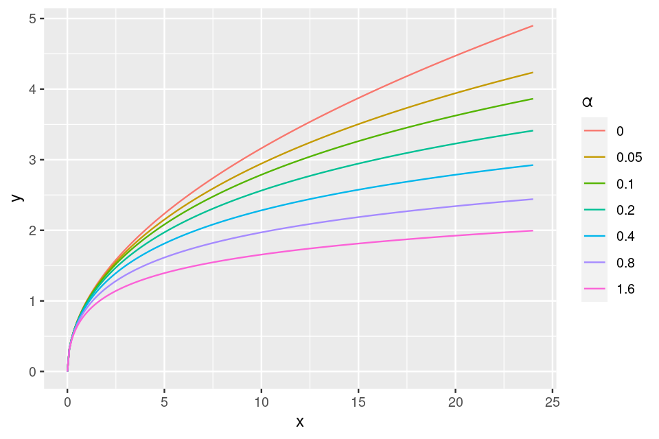
and empirically verify the equivalence of two terms in Equation 4.22:
f2 = function(x, a) ifelse (a==0, sqrt(x), acosh(2*a*x + 1) / (2*sqrt(a)))
with(df, max(abs(f2(x,a) - y)))
[1] 8.881784e-16As we see in Figure 4.27, for small values of \(x\), \(g_\alpha(x)\approx \sqrt{x}\) (independently of \(\alpha\)), whereas for large values (\(x\to\infty\)) and \(\alpha>0\), it behaves like a logarithm:
\[ \begin{align} &\frac{1}{2\sqrt{\alpha}}\ln\left(2\sqrt{\alpha\left(\alpha x^2+x\right)}+2\alpha x+1\right)\\ \approx&\frac{1}{2\sqrt{\alpha}} \ln\left(2\sqrt{\alpha^2x^2}+2\alpha x\right)\\ =&\frac{1}{2\sqrt{\alpha}}\ln\left(4\alpha x\right)\\ =&\frac{1}{2\sqrt{\alpha}}\ln x+\text{const.} \end{align} \]
We can verify this empirically by, say,
  a = c(0.2, 0.5, 1)
  f(1e6, a)
[1] 15.196731 10.259171 7.600903 1/(2*sqrt(a)) * (log(1e6) + log(4*a))[1] 15.196728 10.259170 7.6009024.5 Summary of this chapter
We have given motivating examples and ways of using mixtures to model biological data. We saw how the EM algorithm is an interesting example of fitting a difficult-to-estimate probabilistic model to data by iterating between partial, simpler problems.
Finite mixture models
We have seen how to model mixtures of two or more normal distributions with different means and variances. We have seen how to decompose a given sample of data from such a mixture, even without knowing the latent variable, using the EM algorithm. The EM approach requires that we know the parametric form of the distributions and the number of components. In Chapter 5, we will see how we can find groupings in data even without relying on such information – this is then called clustering. We can keep in mind that there is a strong conceptual relationship between clustering and mixture modeling.
Common infinite mixture models
Infinite mixture models are good for constructing new distributions (such as the gamma-Poisson or the Laplace) out of more basic ones (such as binomial, normal, Poisson). Common examples are
mixtures of normals (often with a hierarchical model on the means and the variances);
beta-binomial mixtures – where the probability \(p\) in the binomial is generated according to a \(\text{beta}(a, b)\) distribution;
gamma-Poisson for read counts (see Chapter 8);
gamma-exponential for PCR.
Applications
Mixture models are useful whenever there are several layers of experimental variability. For instance, at the lowest layer, our measurement precision may be limited by basic physical detection limits, and these may be modeled by a Poisson distribution in the case of a counting-based assay, or a normal distribution in the case of the continuous measurement. On top of there may be one (or more) layers of instrument-to-instrument variation, variation in the reagents, operator variaton etc.
Mixture models reflect that there is often heterogeneous amounts of variability (variances) in the data. In such cases, suitable data transformations, i.e., variance stabilizing transformations, are necessary before subsequent visualization or analysis. We’ll study in depth an example for RNA-Seq in Chapter 8, and this also proves useful in the normalization of next generation reads in microbial ecology (McMurdie and Holmes 2014).
Another important application of mixture modeling is the two-component model in multiple testing – we will come back to this in Chapter 6.
The ECDF and bootstrapping
We saw that by using the observed sample as a mixture we could generate many simulated samples that inform us about the sampling distribution of an estimate. This method is called the bootstrap and we will return to it several times, as it provides a way of evaluating estimates even when a closed form expression is not available (we say it is non-parametric).
4.6 Further reading
A useful book-long treatment of finite mixture models is by McLachlan and Peel (2004); for the EM algorithm, see also the book by McLachlan and Krishnan (2007). A recent book that presents all EM type algorithms within the Majorize-Minimization (MM) framework is by Lange (2016).
There are in fact mathematical reasons why many natural phenomena can be seen as mixtures: this occurs when the observed events are exchangeable (the order in which they occur doesn’t matter). The theory underlying this is quite mathematical, a good way to start is to look at the Wikipedia entry and the paper by Diaconis and Freedman (1980).
In particular, we use mixtures for high-throughput data. You will see examples in Chapters 8 and 11.
The bootstrap can be used in many situations and is a very useful tool to know about, a friendly treatment is given in (B. Efron and Tibshirani 1993).
A historically interesting paper is the original article on variance stabilization by Anscombe (1948), who proposed ways of making variance stabilizing transformations for Poisson and gamma-Poisson random variables. Variance stabilization is explained using the delta method in many standard texts in theoretical statistics, e.g., those by Rice (2006, chap. 6) and Kéry and Royle (2015, 35).
Kéry and Royle (2015) provide a nice exploration of using R to build hierarchical models for abundance estimation in niche and spatial ecology.
4.7 Exercises
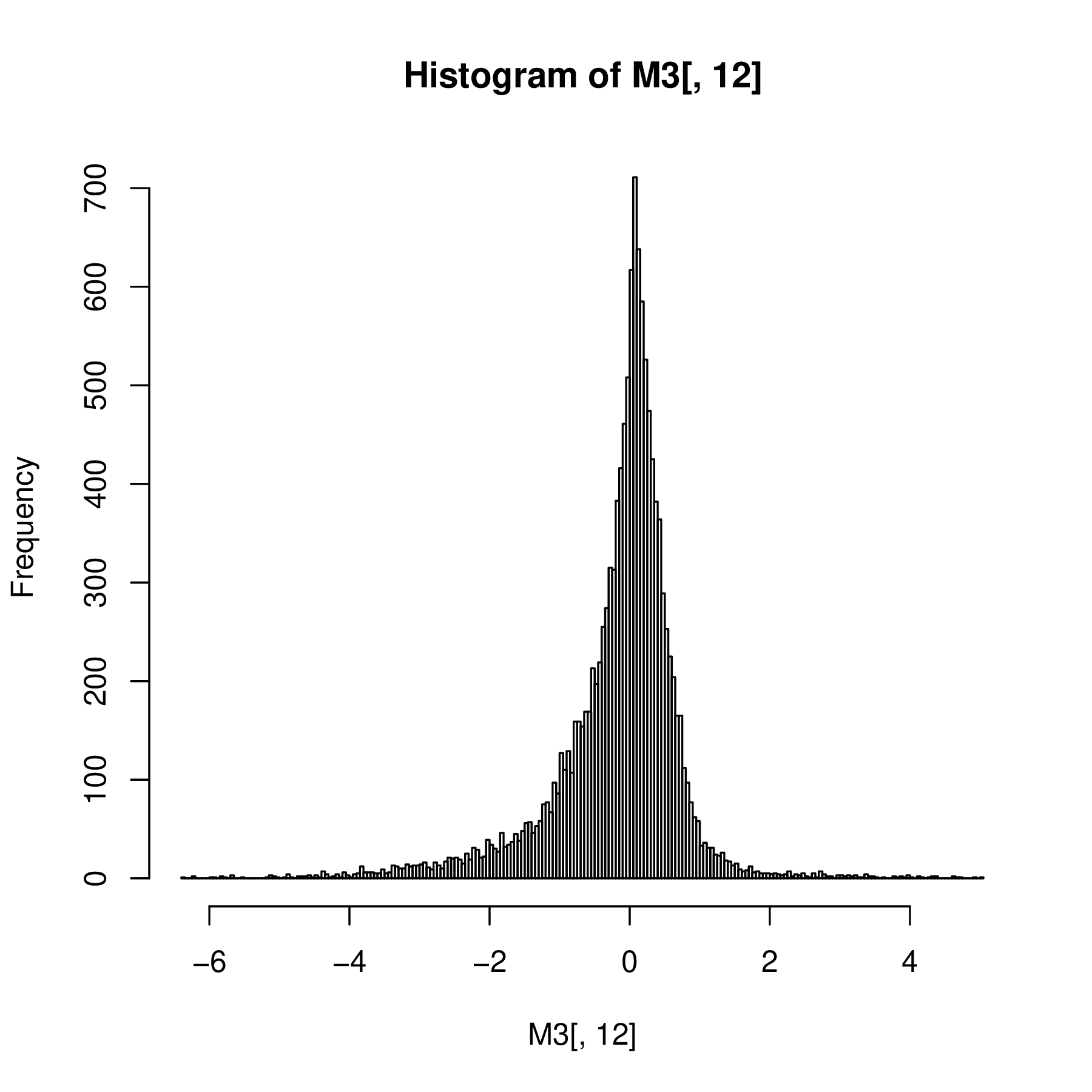
The EM algorithm step by step. As an example dataset, we use the values in the file Myst.rds. As always, it is a good idea to first visualize the data. The histogram is shown in Figure 4.28. We are going to model these data as a mixture of two normal distributions with unknown means and standard deviations, and unknown mixture fraction. We’ll call the two components A and B.
mx = readRDS("../data/Myst.rds")$yvar
str(mx)
num [1:1800] 0.3038 0.0596 -0.0204 0.1849 0.2842 ...ggplot(tibble(mx), aes(x = mx)) + geom_histogram(binwidth = 0.025)
mx, our example data for the EM algorithm.We start by randomly assigning the membership weights for each of the values in mx for each of the components
wA = runif(length(mx))
wB = 1 - wA
We also need to set up some housekeeping variables: iter counts over the iterations of the EM algorithm; loglik stores the current log-likelihood; delta stores the change in the log-likelihood from the previous iteration to the current one. We also define the parameters tolerance, miniter and maxiter of the algorithm.
iter      = 0
loglik    = -Inf
delta     = +Inf
tolerance = 1e-12
miniter   = 50
maxiter   = 1000
Study the code below and answer the following questions:
Which lines correspond to the E-step, which to the M-step?
What is the role of
tolerance,miniterandmaxiter?Compare the result of what we are doing here to the output of the
normalmixEMfunction from the mixtools package.
while((delta > tolerance) && (iter <= maxiter) || (iter < miniter)) {
  lambda = mean(wA)
  muA = weighted.mean(mx, wA)
  muB = weighted.mean(mx, wB)
  sdA = sqrt(weighted.mean((mx - muA)^2, wA))
  sdB = sqrt(weighted.mean((mx - muB)^2, wB))

  pA   =    lambda    * dnorm(mx, mean = muA, sd = sdA)
  pB   = (1 - lambda) * dnorm(mx, mean = muB, sd = sdB)
  ptot = pA + pB
  wA   = pA / ptot
  wB   = pB / ptot

  loglikOld = loglik
  loglik = sum(log(pA + pB))
  delta = abs(loglikOld - loglik)
  iter = iter + 1
}
iter
[1] 461c(lambda, muA, muB, sdA, sdB)[1] 0.4756 -0.1694 0.1473 0.0983 0.1498Why do we often consider the logarithm of the likelihood rather than the likelihood? E.g., in the EM code above, why did we work with the probabilities on the logarithmic scale?
Compare the theoretical values of the gamma-Poisson distribution with parameters given by the estimates in ofit$par in Section 4.4.3 to the data used for the estimation using a QQ-plot.
Mixture modeling examples for regression. The flexmix package (Grün, Scharl, and Leisch 2012) enables us to cluster and fit regressions to the data at the same time. The standard M-step FLXMRglm of flexmix is an interface to R’s generalized linear modeling facilities (the glm function). Load the package and an example dataset.
library("flexmix")
data("NPreg")
First, plot the data and try to guess how the points were generated.
Fit a two component mixture model using the commands
m1 = flexmix(yn ~ x + I(x^2), data = NPreg, k = 2)Look at the estimated parameters of the mixture components and make a truth table that cross-classifies true classes versus cluster memberships. What does the summary of the object
m1show us?Plot the data again, this time coloring each point according to its estimated class.
ggplot(NPreg, aes(x = x, y = yn)) + geom_point()
The components are:
modeltools::parameters(m1, component = 1) Comp.1
coef.(Intercept) -0.20897972
coef.x 4.81689215
coef.I(x^2) 0.03624573
sigma 3.47580781modeltools::parameters(m1, component = 2) Comp.2
coef.(Intercept) 14.717483
coef.x 9.846089
coef.I(x^2) -0.968296
sigma 3.480144The parameter estimates of both components are close to the true values. A cross-tabulation of true classes and cluster memberships can be obtained by
table(NPreg$class, modeltools::clusters(m1))
     1  2
  1 95  5
  2  5 95
For our example data, the ratios of both components are approximately 0.7, indicating the overlap of the classes at the cross-section of line and parabola.
summary(m1)The summary shows the estimated prior probabilities \(\hat\pi_k\), the number of observations assigned to the two clusters, the number of observations where \(p_{nk}>\delta\) (with a default of \(\delta=10^{-4}\)), and the ratio of the latter two numbers. For well-separated components, a large proportion of observations with non-vanishing posteriors \(p_{nk}\) should be assigned to their cluster, giving a ratio close to 1.
NPreg = mutate(NPreg, gr = factor(class))
ggplot(NPreg, aes(x = x, y = yn, group = gr)) +
   geom_point(aes(colour = gr, shape = gr)) +
   scale_colour_hue(l = 40, c = 180)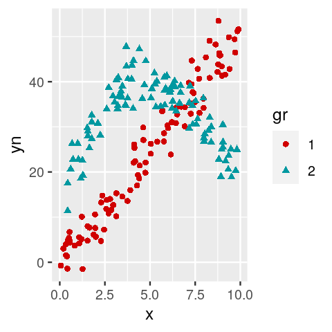
flexmix with the points colored according to their estimated class. You can see that at the intersection we have an `identifiability’ problem: we cannot distinguish points that belong to the straight line from ones that belong to the parabole.Other hierarchical noise models:
Find two papers that explore the use of other infinite mixtures for modeling molecular biology technological variation.
Page built on 2023-08-03 21:37:40.799665 using R version 4.3.0 (2023-04-21)
