Correlation: The
Scatter Diagram
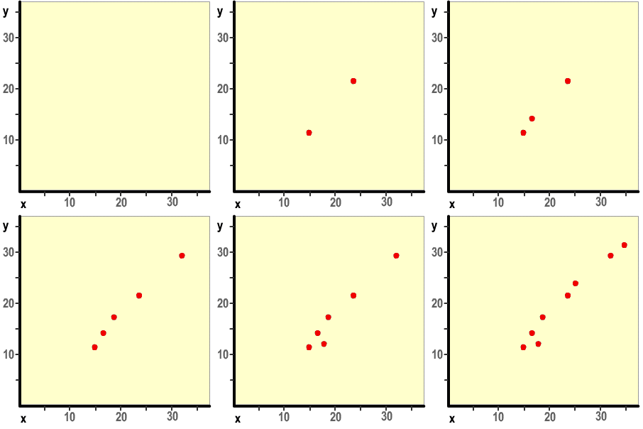
The simplest way to reveal a possible correlation between bivariate data is to express it graphically. Let's use the example from the preceding page:
x |
24 |
15 |
17 |
32 |
19 |
18 |
25 |
34 |
y |
22 |
11 |
14 |
30 |
17 |
12 |
23 |
31 |

Apparently there is a strong linear relationship with the points, one that follows an upward moving pattern. If we were to join the points with a line, it would possess a positive slope, representing a positive relationship. Other examples of scatter diagrams help illustrate relationships between points.
Scatter diagrams are helpful in that they do not require complex calculations. A more precise method of discovering a relationship is to make apply the linear correlation coefficient
![]() Linear Correlation
Coefficient
Linear Correlation
Coefficient
6:2