01 · Sketching
Three concepts from dozens of sketches
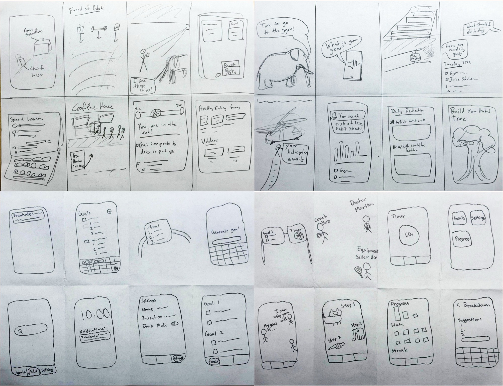
Concept 1
Augmented reality
A camera overlay shows chances to work on your goal: a chair for lunges, the produce aisle for your diet, 5 km left on your run.
Concept 2 · selected
Mobile notifications
Notification prompts keep you on track to reach your goal.
Concept 3
Voice & audio
Talk through your goal with an AI that suggests next steps.
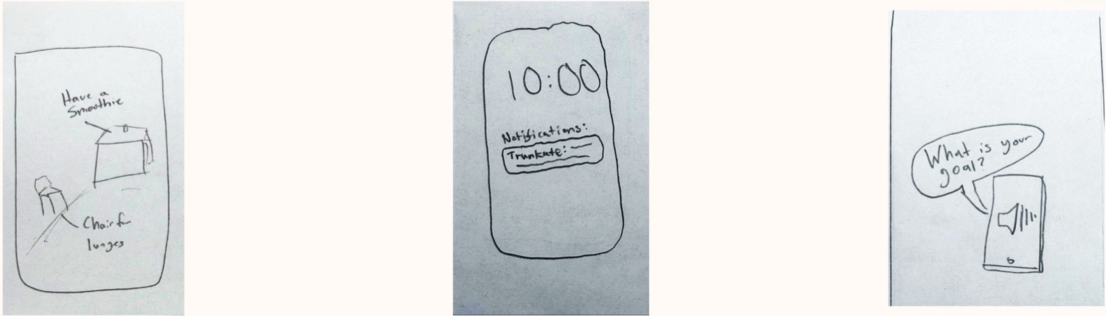
02 · Selected interface
Mobile notifications
Why notifications won
- It prompts action directly.
- It works anywhere. Voice needs a place where you can talk out loud.
- It's cheaper to run.
The trade-off we're watching
Notifications get annoying if overdone. The plan also depends on the AI breaking goals into useful steps.
| Model (via OpenRouter) | Input / M tokens | Output / M tokens |
|---|---|---|
| GPT-5 Mini (text) | $0.25 | $2.00 |
| GPT Audio Mini | $0.60 | $2.40 |
Audio input costs 140% more and audio output 20% more. Source: OpenRouter.
03 · Low-fi prototype
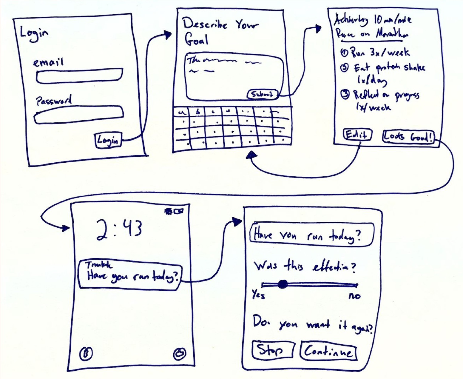
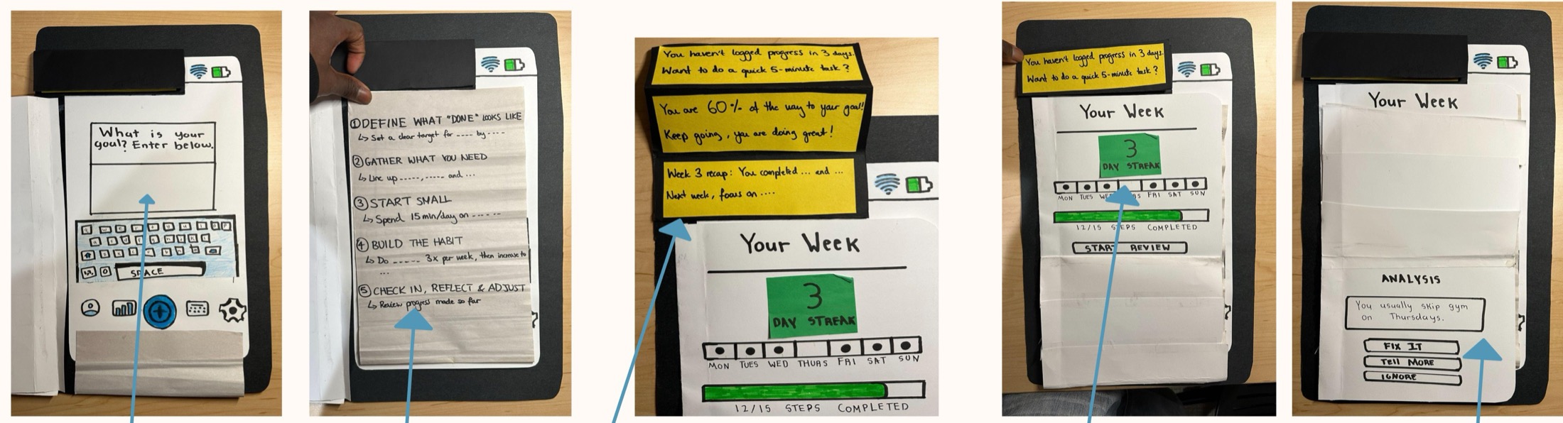
A paper phone with sticky-note notifications

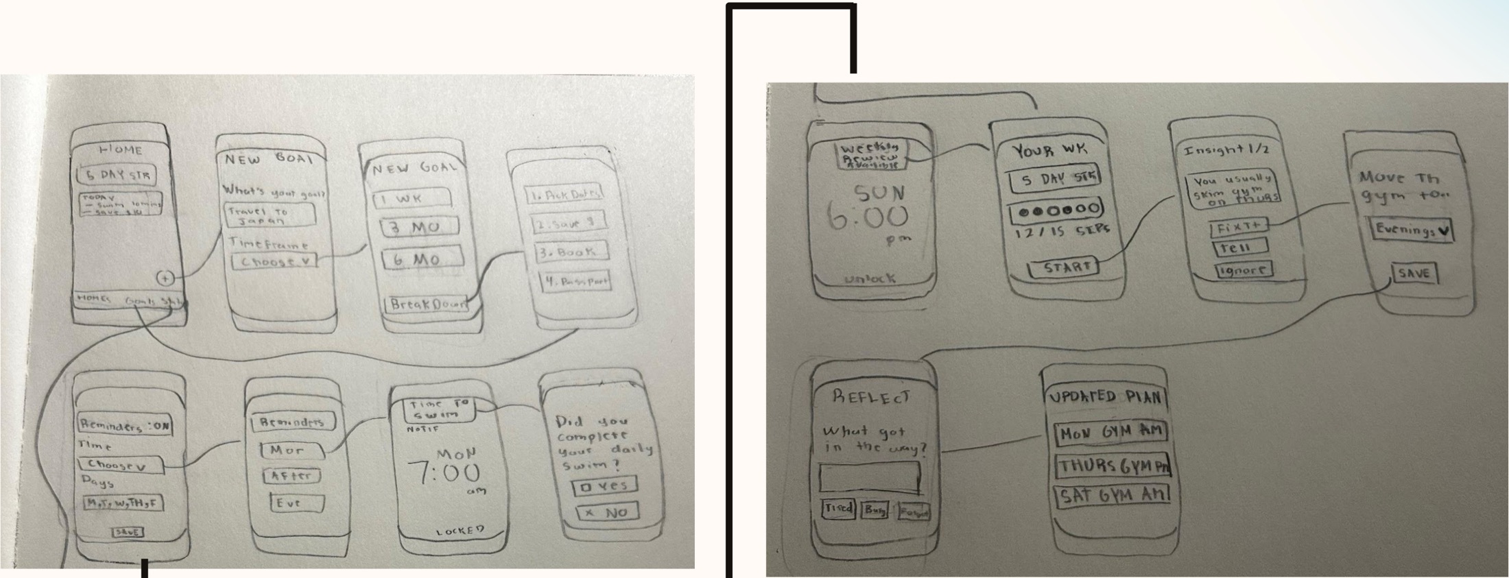
- Screens: goal planning, stats, notifications and progress analysis.
- Interactive: typing a goal, a simulated plan generation, notifications and progress reflection.
- Notifications were yellow sticky notes we slid over the screen.
04 · Testing methodology
Five commuters, three tasks
Participants
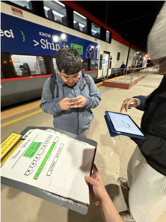
Five people: three in their early 30s and two aged 22 (tested together). An entrepreneur, two software engineers and two hardware interns. Recruited at a train platform at 7 PM, when we expected busy people. No compensation.
Roles
Facilitator: Josh · Computer: Ben · Notetaker: Roland
Process
- Demo the system.
- Set a goal: type it, tap +, understand the breakdown.
- Read the notifications and pick the most effective of three.
- Reflect on progress from the stats page.
- General comments on the interface.
What we measured
Time to complete each task, and the number of critical incidents or errors per task. Our goals were quick completion and few critical incidents.
05 · Results
Planning took longest
Hover a bar for its exact value, or open the table under each chart.
Time to complete each task (minutes)
Show as a table
| Participant | Plan | Notifications | Reflect |
|---|---|---|---|
| P1 | 1.0 | 0.85 | 0.5 |
| P2 | 3.8 | 0.65 | 1.0 |
| P3 | 4.1 | 0.2 | 4.15 |
| P4/5 | 3.25 | 0.87 | 4.3 |
Critical incidents per task
Show as a table
| Task | P1 | P2 | P3 | P4/5 |
|---|---|---|---|---|
| Plan | 1 | 3 | 1 | 0 |
| Notifications | 0 | 0 | 1 | 0 |
| Reflect | 1 | 1 | 1 | 0 |
| General | 0 | 0 | 0 | 1 |
Times are read from our original chart and rounded.
Summary
- Planning took longest, likely from getting used to the interface and reading a long breakdown.
- Without a script, times varied more.
- Three participants weren't sure the AI breakdown was interactive.
- Usability catastrophe: the vague "upcoming" navigation icon.
Other observations
- The streak was engaging (participants 2 and 5).
- Goals varied: train for a marathon, adopt a cat, wake up early, land a full-time job as a forward-deployed engineer.
- Nobody wants annoying notifications (participants 1, 4 and 5).
06 · Critical incidents
Every issue, ranked by severity
| Severity | Participant | Task | Critical incident |
|---|---|---|---|
| 4 | P4/5 | General | Unsure what the upcoming button on the home page shows. |
| 3 | P1 | Reflect | Too many buttons on the analysis screen; stuck on what to press. |
| 3 | P1 | Goal | Not sure if the breakdown is interactive. |
| 3 | P2 | Goal | Wonders how specific the goal has to be. |
| 3 | P2 | Goal | Not sure if the breakdown is interactive. |
| 3 | P3 | Goal | Starts filling in blanks in the breakdown instead of reading it. |
| 2 | P2 | Goal | Wonders if the AI or the user sets the deadline; would prefer to set it herself. |
| 2 | P2 | Reflect | Wonders if reviewing stats is a step toward her goal. |
| 2 | P3 | Reflect | Wonders what the blank in Thursday's streak means. |
| 1 | P3 | Notifications | Wonders if the third notification ("Next week, work on…") asks for a recommendation. |
4 = usability catastrophe · 3 = major · 2 = minor · 1 = cosmetic
07 · Discussion
What we're changing
Changes we're making
- Make the breakdown clearly editable with + and − buttons.
- Redesign the "upcoming" navigation icon.
- Fewer buttons on the analysis page.
- Tell people what a goal needs, like a deadline.
- Make reflection stand out as its own step.
What testing couldn't show
- How well the profile, upcoming and settings pages work.
- How long it takes to update a plan after reflecting.
Open questions
- Streaks may help retention, but what harm can they do?
- We need a better picture of user goals to tune stats and breakdowns.
- Notification frequency: one participant liked one a day, another said fewer is more powerful.
Slides
The full A5 presentation
Use the arrows, the thumbnails or your keyboard's arrow keys.