Value proposition
AI-generated goal breakdowns and notification reminders
People set big goals, then lose track of them. Trunkate breaks each goal into small steps and reminds you at the right time.
"I guess goals… I don't track them at all, which is why I never achieve them."Anne
"A big goal of mine is to travel… trying to budget and save money that way, but I haven't really been thinking about that either."Lily
"It's kind of nice being told what to do when I get to the pool."Bob
01 · Values in design
Wellness first
How the design supports wellness
- Missed days show in amber, never red.
- A "Not today" option, with no guilt.
- Reminders you control, with quiet hours.
- Big goals broken into small steps.
- The trunk encourages and never nags.
Value tension
Streaks keep people on track, but they can also stress people out. We keep the streak, show missed days gently, and let people skip a day without losing face.
02 · Tasks & usability goals
The same three tasks as low-fi
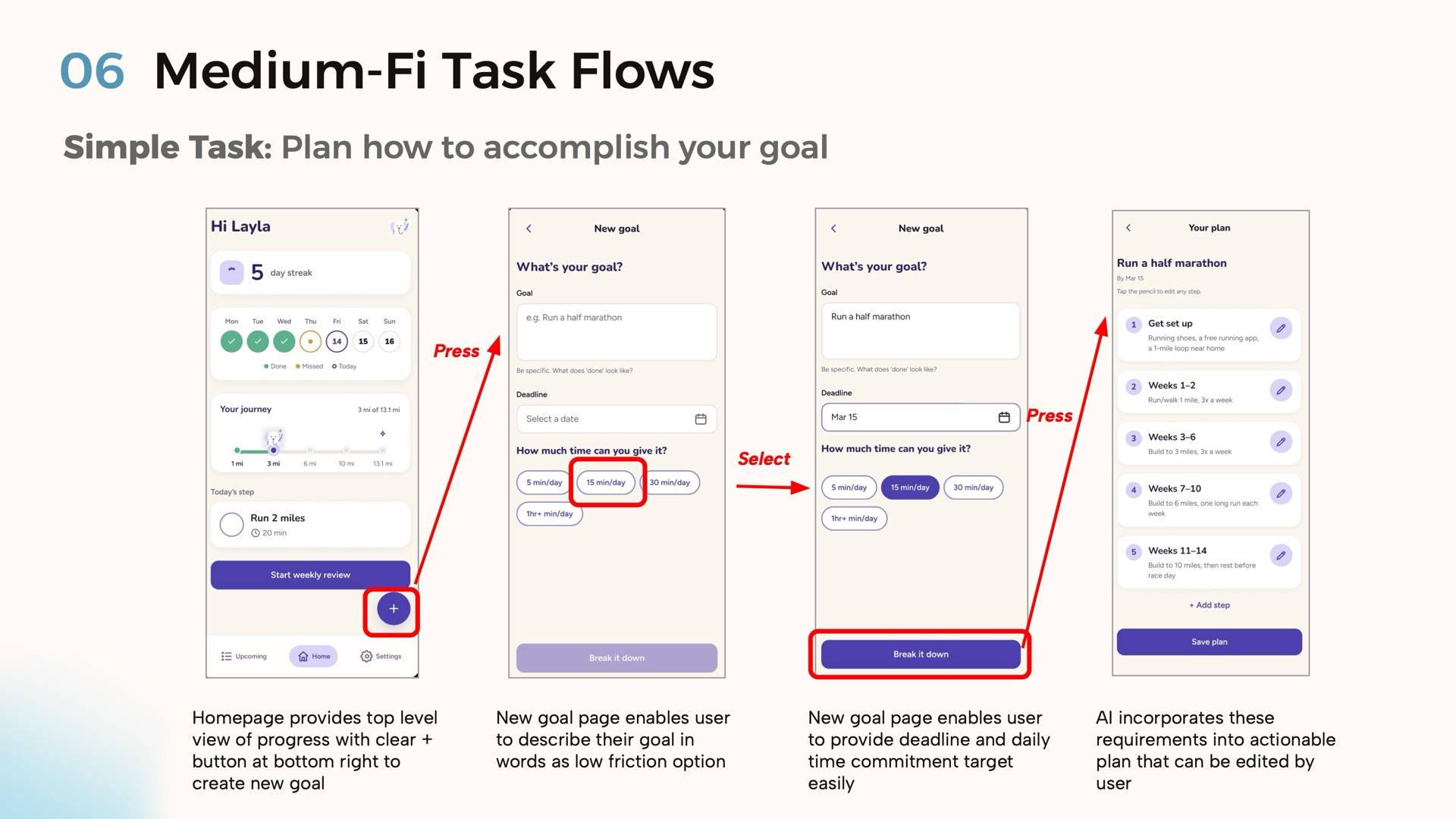
Simple
Plan your goal
Describe a goal and get a step-by-step plan.
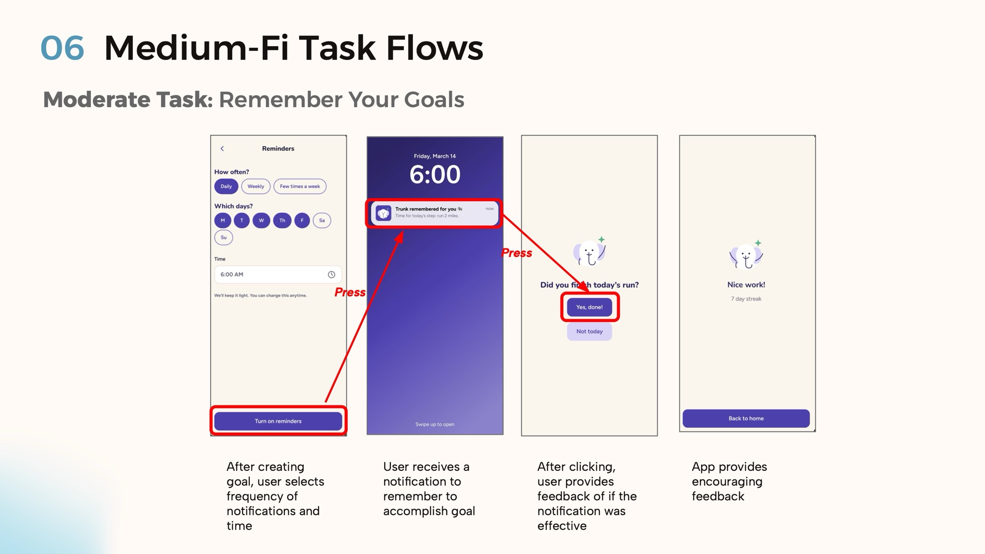
Moderate
Remember your goal
Get reminders at times you choose.
Complex
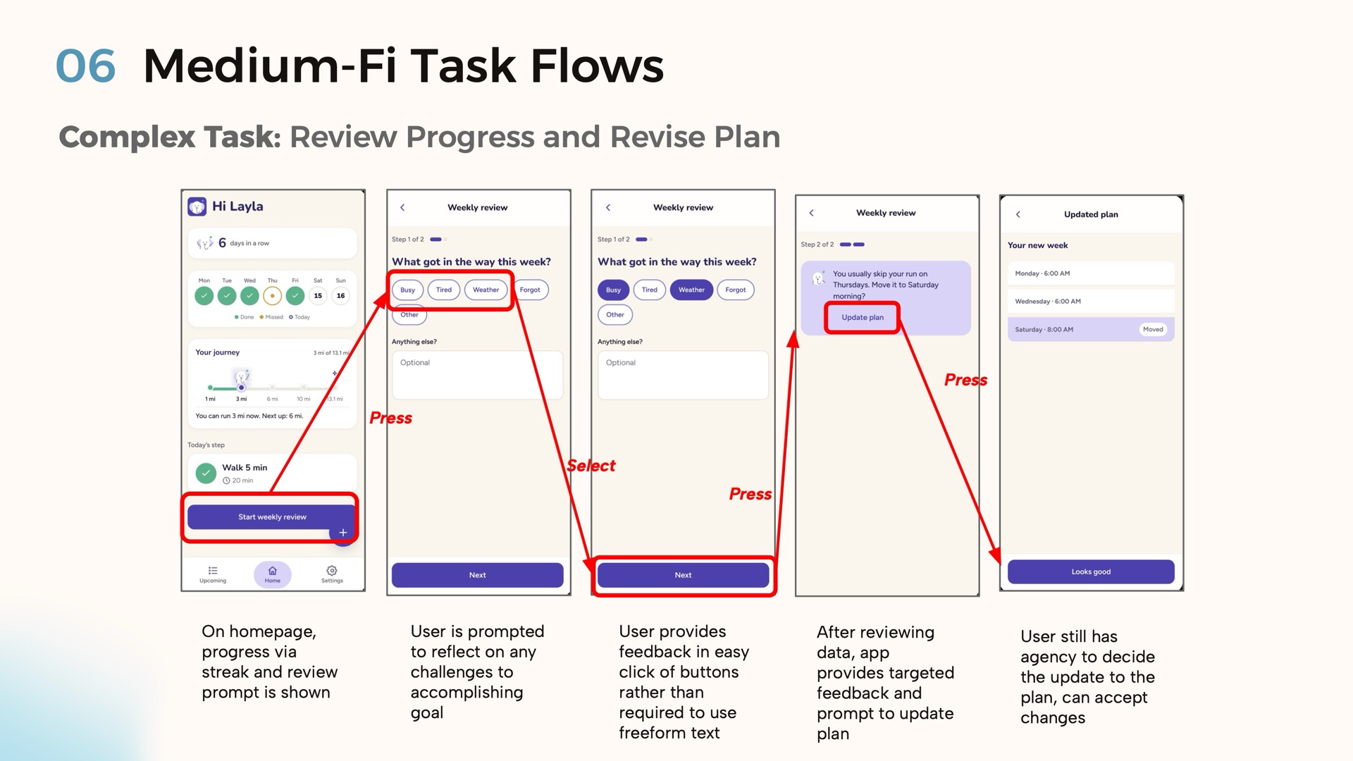
Review progress and edit your plan
Reflect on the week and adjust the plan.
Quick task completion
Measured by time and number of clicks. One click generates an AI plan that you can then edit.
Few critical errors
Measured by incidents per flow. Options don't overlap, and each screen does one thing.
Engaging progress feedback
The streak, weekly tally and miles show progress. We also measure how well notifications work.
03 · Revised sketches
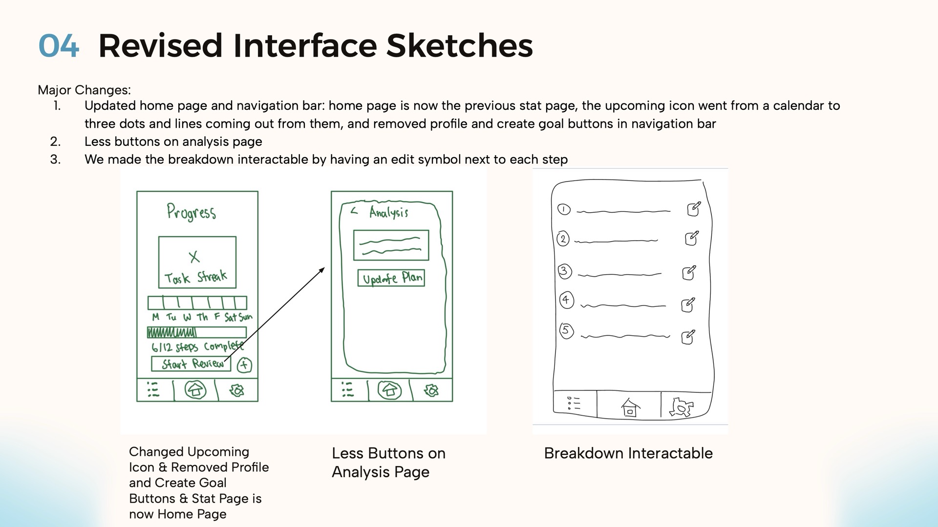
What changed after low-fi testing
Changes
- The home page is now the old stats page.
- The "upcoming" icon is now dots and lines instead of a calendar.
- We removed the profile and create-goal nav buttons. Two testers weren't sure what the icon meant.
- Fewer buttons on the analysis page (one tester got stuck).
- Each step in the breakdown has an edit button. Two testers weren't sure it was editable.
04 · Design system
Calm purple, simple shapes
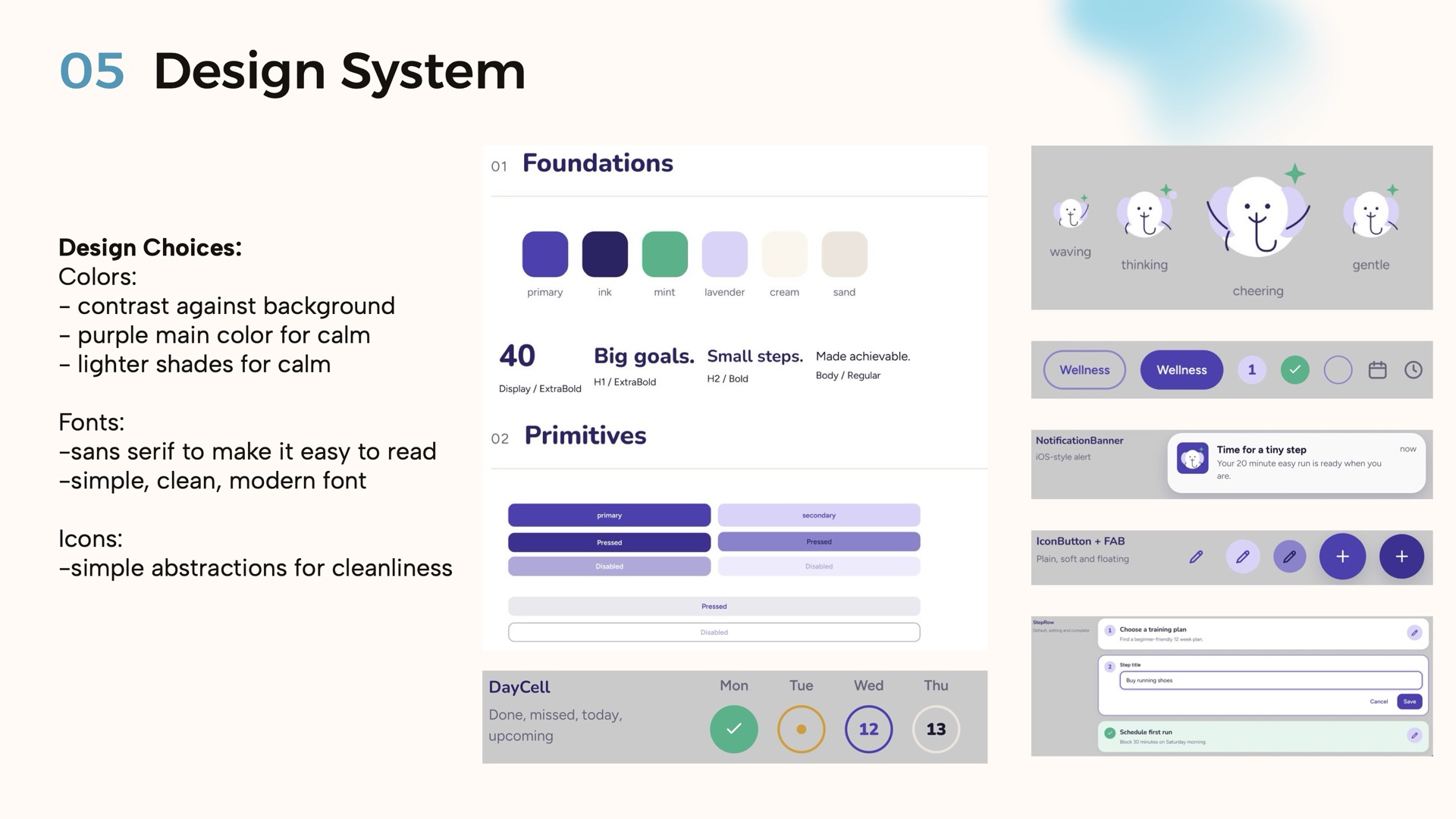
Design choices
- Colors: a purple main color and lighter shades for calm, with enough contrast against the background.
- Fonts: a simple, modern sans-serif that's easy to read.
- Icons: simple shapes to keep screens clean.
- Components: day cells (done, missed, today, upcoming), notification banners, buttons, editable steps, and an elephant mascot in four moods.
05 · Task flows
Three flows in the medium-fi prototype
06 · Implementation
Built in Figma, sketched in Notability
Figma
Pros: reusable components, real-time collaboration, interactive prototypes.
Cons: a learning curve, and wiring up connections is tedious.
Notability
Pros: intuitive, and no paper needed.
Cons: we couldn't edit together.
Limitations
- Only the three task flows are clickable.
- Text fields fill in automatically.
- Only one example edit.
- Only the half marathon goal.
- No memory between sessions.
Wizard of Oz
- The AI breakdown runs on a timer ("Trunkating your goal…").
- The Thursday weekly insight is pre-written.
- The lock-screen notification is a mock.
Hard-coded data
- Goal: Run a half marathon
- Deadline: Mar 15
- Reminder: 6 AM
- Insight: "You usually skip your run on Thursdays. Move it to Saturday morning."
- Streak: 5 days
07 · Try it
How to use the prototype
From our README. It works in any modern browser; a phone feels closest to the real app.
Open it
- Open the clickable prototype.
- Under Pages, pick "Tasks".
- Press Present (the play button).
Not sure what to tap? Tap anywhere and the tappable areas light up in blue. If a button is out of reach, zoom in.
Task 1: Plan a goal
- Tap the purple + in the bottom right.
- Fill in the goal and pick how much time you can give it each day.
- Tap Break it down.
- Tap the pencil next to the first step to edit it.
- Tap Save plan.
Tasks 2 and 3
Remember it: choose how often, which days and what time, then tap Turn on reminders. Tap the reminder on the lock screen and answer "Did you finish today's run?"
Weekly review: on Home, tap Start weekly review, pick what got in the way, read Trunk's insight, tap Update plan, then Looks good.
Slides
The full A6 presentation
Use the arrows, the thumbnails or your keyboard's arrow keys. The appendix covers the Upcoming and Settings screens and in-section revisions.