Worksheet 6: Deceptive visualizations#
Your name:
Your student ID number:
Line charts#
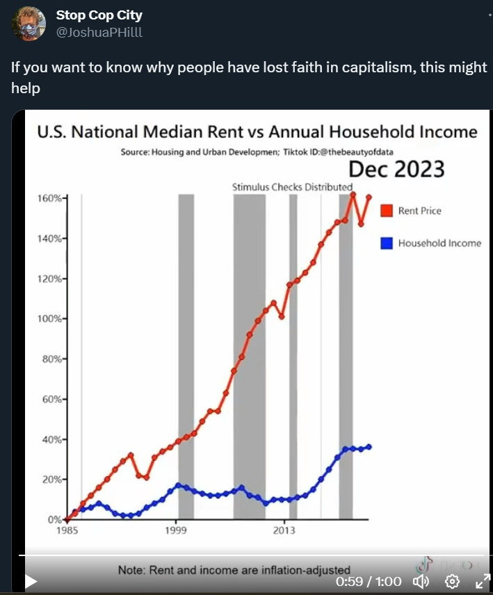
Suppose that a household spent 20% of their income on rent in 1985. Based on the line chart in the lecture slides, what percentage of household income would be spent on housing in 2023?
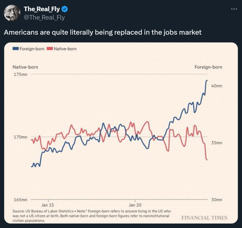
What is misleading about the line chart comparing the number of native and foreign born workers in the US?
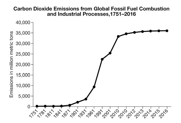
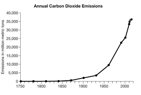
Which of the two line charts displaying global CO2 emissions is more accurate?
Bar charts#
What is wrong with the bar chart showing the world’s most read books?
What would happen to an object if you scaled its height, width and depth each by a factor of 3?
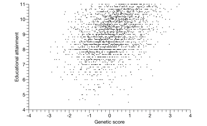
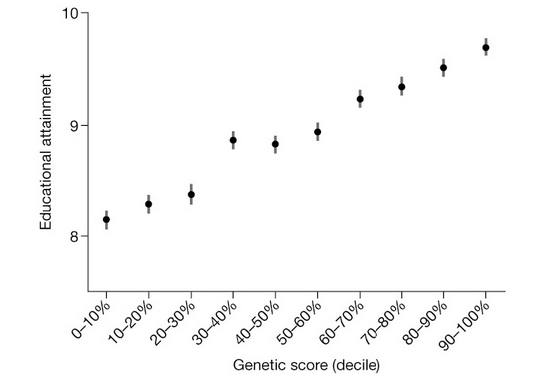
Scatter plots#
How do the two visualization on genetic scores and educational attainment relate to Wednesday’s lecture on summaries of center?