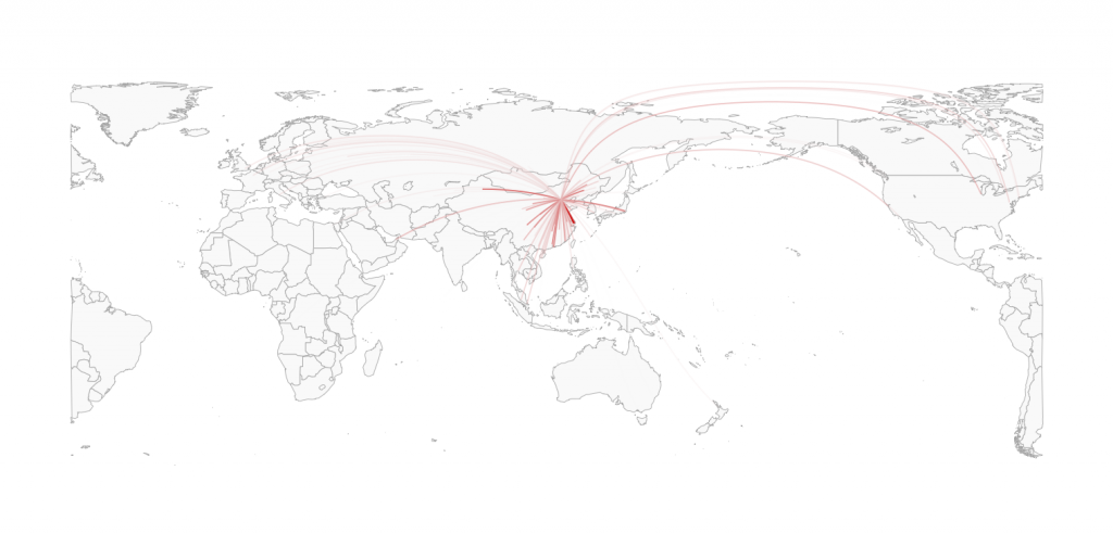
Even though several examples of great circle visualizations exist by now, I had not seen the code of one made with ggplot2. Both solutions offered, here using plot and here using lattice, basically loop through the great circle lines ordered from low to high number of flights and overplot the lines with fewer counts, which are plotted in a light color with those with higher counts, which are plotted in a dark color.
In ggplot we can simply use the alpha parameter for transparency in combination with scale_colour_gradient to obtain a similar effect.
I am also addressing another issue here, namely the ability to flexibly recenter the world map to any longitude (not just 0 and 180) and to avoid the problem of split polygons.
Example data are all flights out of Beijing, China, downloaded from openflights.org.

Continue reading Great circles on a recentered worldmap, in ggplot