Lecture 4: Exploratory Data Analysis#
STATS60, Stanford University Spring 2026
Announcements:
Office hours are now posted:
Tselil: 10-11 W, CoDa E 254
Michael: 11-12 F, CoDa B 40
This week’s practice quizzes are available here.
Please complete this Google Form so that we can gather and analyze some data together.
Data in context#
Data is another way to put claims in context.
Data visualization and data summaries help you understand your data.
This unit:
Exploratory data analysis.
Using visualization and data summaries to understand data.
Today:
Terminology for describing data.
Data visualizations.
Terminology for data#
Example: Old Faithful eruptions#
Old Faithful is a geyser in Yellowstone National Park.
The name ‘Old Faithful’ comes from the fact that the eruptions are roughly an hour apart.
How ‘faithful’ is Old Faithful?

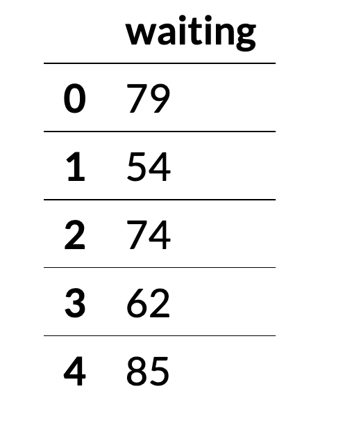
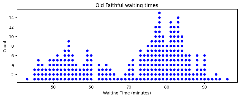
Old Faithful data#
Here are some measurements of the number of minutes between eruptions at Old Faithful. The data is from the 1970s.
Visualization of waiting times#
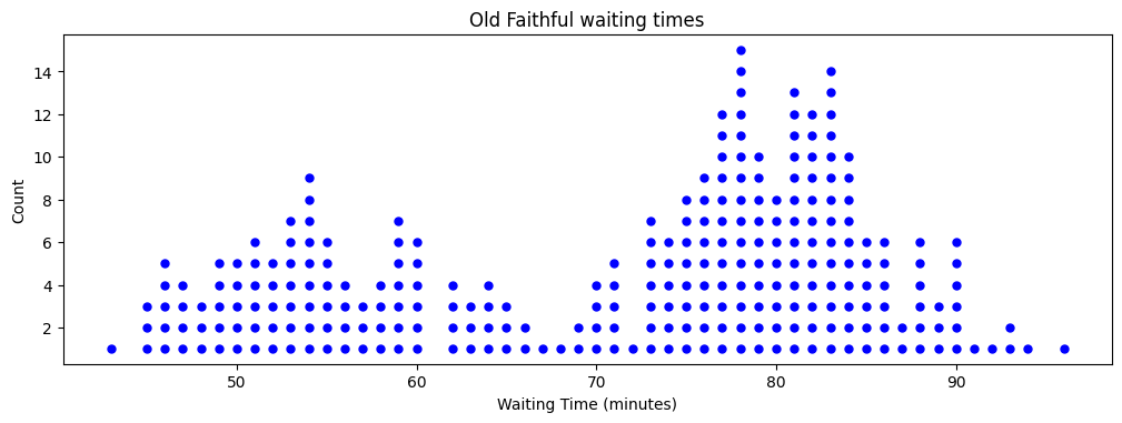
6 of the waiting times are exactly one hour.
90% of the waiting times are between 50 and 90 minutes.
There appear to be two clusters of waiting times. One cluster is around 55 minutes and another is around 80 minutes.
Variation in waiting times#
Question: what could be causing the variation in waiting times?
Possible answers:
Time of day.
Time of year.
Size of previous eruption.
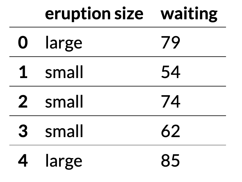
Eruption size#
The dataset contains information about the size of the previous eruption.
Eruptions are either small (less than 3.5 minutes) or large (3.5 minutes or longer).
Visualizing small and large waiting times#
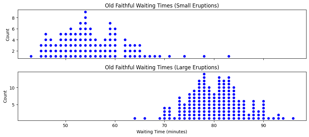
After a small eruption, 90% of the waiting times are between 45 and 65 minutes.
After a large eruption, 90% of the waiting times are between 70 and 90 minutes.
Knowing the size of the eruption gives a lot of information about the waiting time.
Data definitions#
Data: values measured or characteristics recorded on individual entities of interest.
Observational units: The individual entities on which data is recorded.
Variables: the measured values or recorded characteristics of the observational units.
Some variables are quantitative and take numerical values. For example, height and number of siblings are quantitative variables.
Other variables are categorical. For example, eye color, relationship status, and state of residence are categorical variables.
The distribution of a variable describes the pattern of the variable across the different observational units.
What is the most common value for the variable?
How spread out are the values?
Old faithful data#
In the Old Faithful dataset:
The observational units are individual eruptions of the Old Faithful geyser.
The waiting time and eruption size are the variables.
The waiting time is a quantitative variable. It is a numerical value.
The eruption size is a categorical variable. It is either large or small.
The dot plot is a visualization of the distribution of the waiting time.
Organ donations#
In the US, thousands of people die each year waiting for organ transplants.
Surveys find that although 90% of US adults support organ donation, only 60% are registered organ donors.
Most people sign up to be organ donors when they apply for a driver’s license or register to vote in a new state.

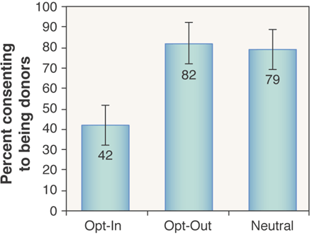
Organ donations and defaults#
A 2003 study titled Do defaults save lives? investigated whether the phrasing of the sign-up question affects the number of people who signed up.
161 study participants filled out an online fake application for a driver’s license.
Participants were asked to sign up to be organ donors in different ways:
Opt-in: the participants were told that the default was not being a donor, but they could opt-in.
Opt-out: the participants were told that the default was being a donor, but they could opt-out.
Neutral: the participants were not told about default and asked to choose to either become a donor or not.
Organ donations and defaults#
What are the observational units in the organ donation study?
The observational units are the individual study participants.
What are the variables? Are they quantitative or categorical?
The type of question asked (neutral, opt-in, opt-out) is a categorical variable.
The decision to sign up (yes or no) is a categorical variable.
Organ donation results#
Sign up rates were much lower in the opt-in group.
Dorm mate compatibility#
Suppose you want to study what makes pairs of college dorm mates compatible.
a. What are the observational units? b. What are some relevant variables?
Answer:
a. Pairs of college dorm mates. b. Age of the dorm mates, their majors, their extracurricular activities, and many more.
Vegetarian meals at dining halls#
Suppose you want to study the availability of vegetarian meals at Stanford dining halls.
a. What are the observational units? b. What are some relevant variables?
One possible answer:
a. Meals at dining halls. b. Whether the meal is vegetarian, the name of the dining hall serving the meal, what cuisine is the meal, and many more.
Another possible answer:
a. Dining halls. b. The number of meals on the menu, the number of vegetarian meals on the menu, the name of the dining hall, and many more.
Observational units and variables#
To determine the observational units, it is helpful to think about what variables are being measured:
Whether the meal is vegetarian is a variable → individual meals are the observational units.
Number of vegetarian meals is a variable → dining halls are the observational units.
Distributions and visualization#
The distribution of a variable describes the pattern of the variable across the different observational units.
The best way to represent this pattern is often with a visualization.
Summary#
Data: values measured or characteristics recorded on individual entities of interest.
The individual entities on which data is recorded are the observational units.
The recorded characteristics of the observational units are variables. Variables are either quantitative or categorical.
Data Visualization#
The Goal of Data Visualization#
The purpose of data visualization is to communicate data to others. It is as much psychology and art, as it is math.
The following data set consists of flights departing from NYC airports in 2013.
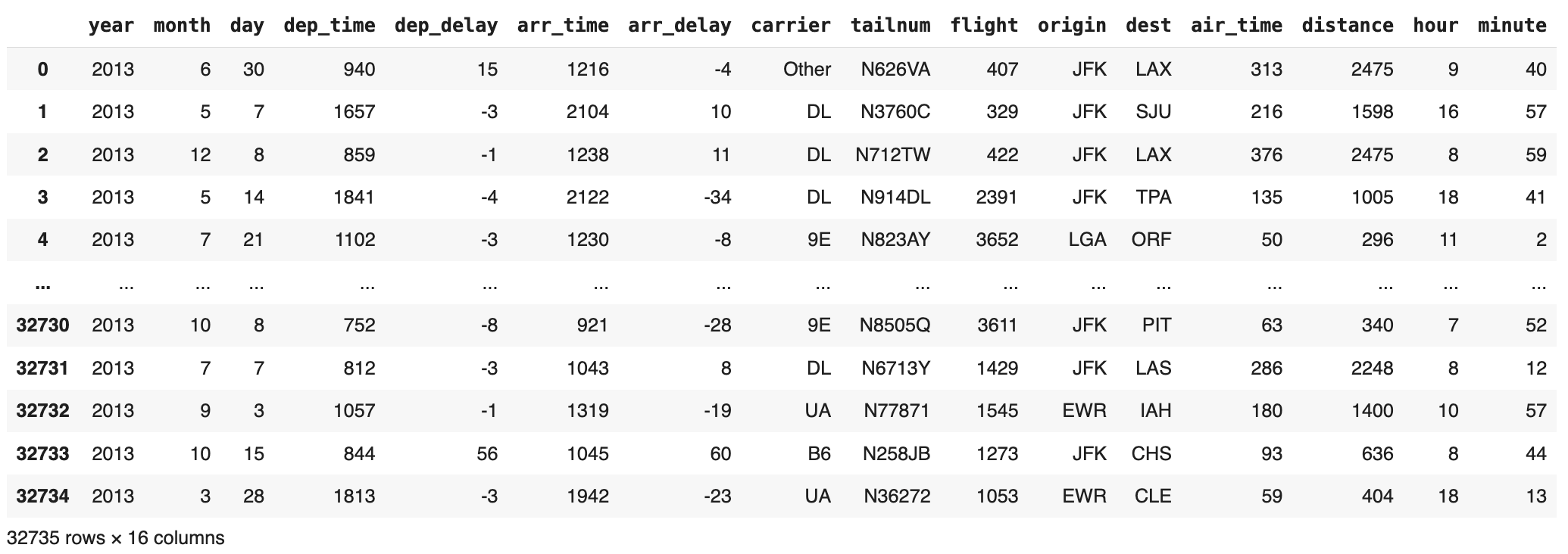
There is too much information in a data set. We have to decide what to show and how to show it.
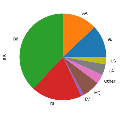
Categorical Variables#
Pie Charts#
One way to visualize a categorical variable, such as carrier, is to make a
pie chart, which depicts the percentage of the whole that each category
makes up.
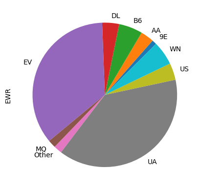
Here is a pie-chart showing the distribution of carrier for the flights that left from JFK airport
Multiple pie charts#
The following pie charts depict the categorical variable carrier at each of the
three origin airports.
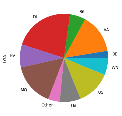
What interesting insights can you draw from these pie charts?
Lying with Pie Charts#
What’s wrong with the following “stylish” version of the above pie chart?
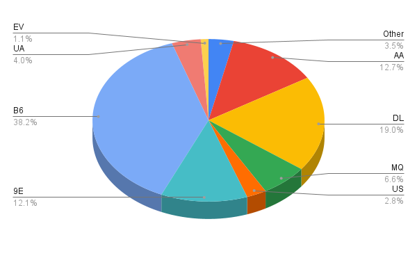
3D plots distort the numbers.
The proportional ink principle: “When a shaded region is used to represent a numerical value, the area of that shaded region should be directly proportional to the corresponding value.”
The Problem with Pie Charts#
Humans are bad at judging angles and areas, so even “good” pie charts can mislead.
Here is a pie chart of the origin airports from the flights data.
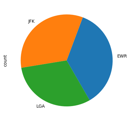
Which airport had the most flights? Which had the fewest?
Bar Charts#
On the other hand, humans are very good at judging lengths, so consider making a bar chart instead, where each value is represented by the length of a bar.
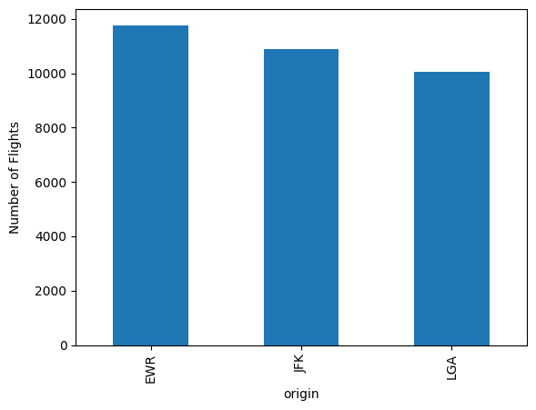
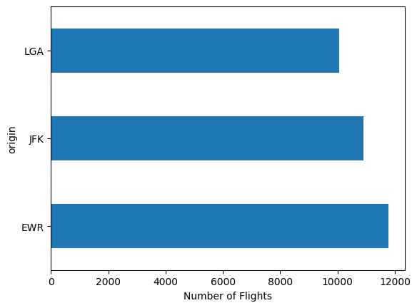
With a bar chart, it is dead obvious which airport had the most flights and which had the fewest.
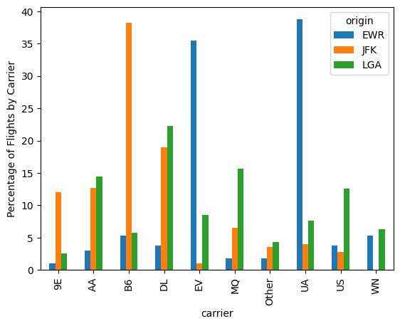
Grouped Bar Charts#
Unlike pies, bars can be easily plotted side-by-side for easy comparison.
Other Bar Charts#
Another advantage of bar charts is that you can plot values other counts.
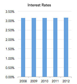
Lying with Bar Charts#
How many problems can you spot in the following bar chart?
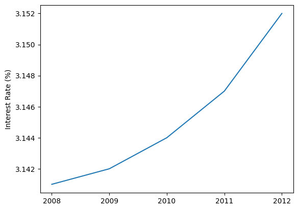
Lying with Bar Charts#
Here is a more truthful visualization.
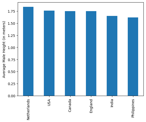
Tips for Reading Bar Charts
Check the axes. The bars should always start at 0 to satisfy the “proportional ink principle”.
Check for extraneous variation, such as both height and width varying.
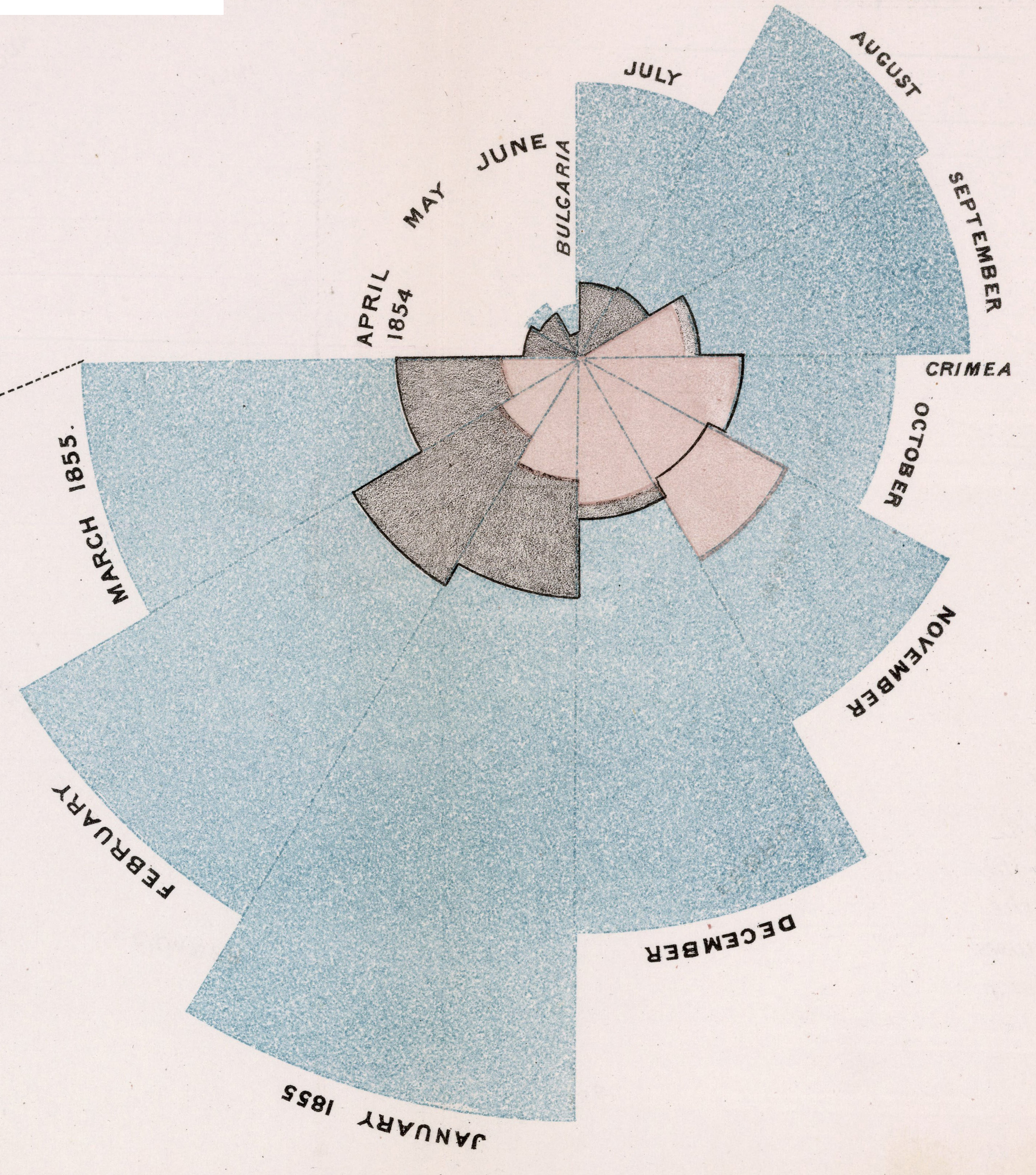
Data Visualization in History#
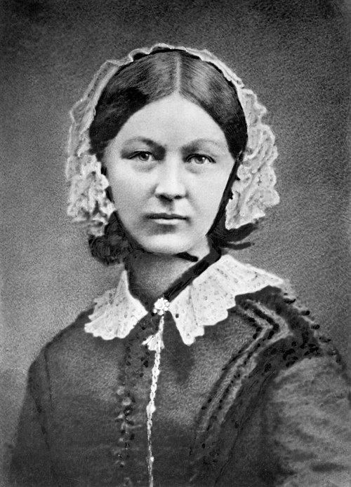
Nightingale is best known as the founder of modern nursing.
But she was also a statistician, the first female member of the Royal Statistical Society in 1879.
She drew public attention to the importance of nursing by making visualizations, such as the one on the next slide, which depicts deaths during the Crimean War.
Rose diagram#
Diagram of the causes of mortality in the army in the East
Time Series Data#
Time Series#
Data collected over time is called a time series.
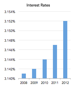
The change is completely obscured by the “correct” bar chart on the right!
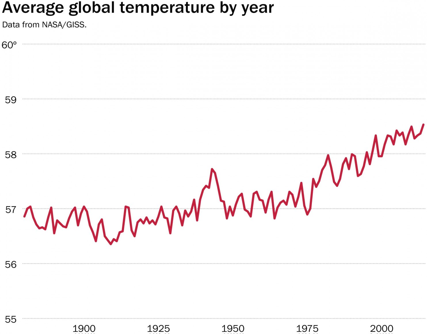
Line Charts#
Line charts can be a good compromise. They do not need to be anchored at 0. (Why not? Doesn’t the proportional ink principle apply to them?)
Lying with Line Charts#
In fact, anchoring line charts at zero can be misleading, as shown in this graphic tweeted by the National Review.

Lying with Line Charts#
A line chart of the same data drawn by the Washington Post is more alarming.
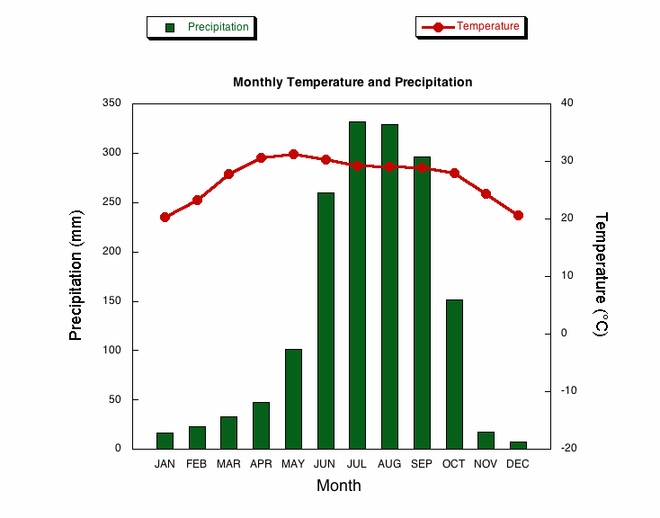
Combining Bar Charts and Line Charts#
Sometimes line charts and bar charts are combined in a single visualization, as in the following climograph (of Kolkata, India), a visualization of a location’s basic climate.
Next lecture#
Data visualizations for quantitative data (histograms and scatter plots).
Data visualization that use maps (dot maps and cloropleths).
Summaries of center (mean, median and mode).