Practice Quizzes#
Week 1 - Ballpark estimates#
There are three practice quizzes below, each with three questions. The prompt is the same for all three of them:
Ballpark estimates: For each of the quantities below, decide whether the statement is reasonable by coming up with a ballpark estimate. You do not need to compute the final number, instead set up the calculation and be sure to explain your reasoning, and estimate the order of magnitude for comparison. You will be graded on how you broke up the problem and whether your reasoning made sense, rather than the accuracy of your estimate.
Practice Quiz #1#
One million cups of coffee are consumed on Stanford Campus on an average Monday.
Solution
I know there are roughly 8,000 undergraduate students, so say there are 10,000 people in total (nearest factor of 10).
Say on average each person consumes about 2 cups of coffee per day.
(10,000 people) x (2 cups / person day)
Rounding to the nearest factors of 10,
(10,000 people ) x (1 cup / person / day) ≈ 10,000 cups.
This is not a reasonable statement.
More than a billion hours of human labor are spent on styling hair in the US each year.
Solution
There are roughly 330 million people in the U.S., the nearest factor of 10 is 10^8 people.
Say about 40% are women old enough to style their hair, and say 40% are men old enough to style their hair. Suppose women spend 20 minutes per day on average and men spend 1 minute per day on average.
Then up to a nearest factor 10, the average person spends 10 minutes per day styling their hair.
There are 365 ~ 100 = 10^2 days per year, and 1/60 ~ .01 = 10^{-2} hours per minute
(10^8 people)×(10 min/day) x (1 hr/60 min)×(365 day/yr)
~ (10^8 people)×(10^1 min/person/day) x (10^{-2} hr/min )×(10^2 day/yr)
~ 10^9 = 1 billion hours/year
This statement is not unreasonable.
You could fit billions of dice into the stats 60 classroom.
Solution
Say the classroom is about 40m by 40m by 7m, volume = (40x40x7 m^3).
That’s about 10^3 m^3.
A standard die is about 2cm per side, volume = (2 cm x 2cm x 2cm) * (.01 m/cm)^3.
That’s about 10^{-6} m^3.
(10^3 m^3) / ( 10^{-6} m^3 )
≈ 10^9 dice
The statement is not unreasonable.
Practice Quiz #2#
You could park at least 10,000 Honda Civics on the quad.
Solution
Say the quad is about 500ft by 500ft, and we’ll round up to ~ (10^3)^2 ft^2
A Honda Civic is roughly 15ft by 6ft, ~ 10^2 ft^2
(10^6 ft^2 in the quad )/(10^2 ft^2 per Civic) ~ 10^4 Honda Civics
The number looks a little high.
A billion hours of human labor each year are spend on correcting typos.
Solution
There are roughly 9 billion people in the world. Say about 5 billion type regularly. That is still about 10^9 people typing.
Say each corrects about 10 typos per day, and each typo takes about 10 seconds to notice and fix.
There are 365 ~ 100 days/year and (1/60)^2 ~ 10^{-4} seconds/hour
( 10^9 people)×(10 typos/day)x(10^2 days/ year)×(10 sec/typo)×(10^{-4} hours/sec)
≈ 10^9 hr/yr
The statement looks reasonable.
No more than 1 million people in the U.S. have the letter “z” in their first name.
Solution
There are about 330 million ~ 10^8 people in the U.S. The letter z is one of 26 letters, it’s reasonable to assume there are about 5 ~ 10^1 letters per name. The letter z is not that common, but say it appears at least 1/100 of the time.
(10^8 names) x (10 letters/name) (10^{-2} z’s per letter) ≈ 10^{7) people
The statement doesn’t seem reasonable, the number looks a bit low.
Practice Quiz 3#
More than 10 million gallons of milk are consumed in the bay area each year.
Solution
Say there are about 10 million = 10^7 people in the Bay Area. Each probably consumes about 1 cups of milk per week.
There are closer to 100 than 10 weeks per year, and about 10 cups/gallon.
(10^7 people) x (1 cups / week) x (10^2 weeks / year) x (10^{-1} gallons/cup) ≈ 10^8 gallons/year
The statement looks reasonable.
I could empty the fountain in white plaza in one day using only a teaspoon.
Solution
The fountain is about 4m x 4m x .5 m, so (4 x 4 x .5 m^3) ~ 10 m^3 of water.
A teaspoon is about 5 mL = 5/(10^2)^3 meters^3 ~ 10^{-6} m^3 of water.
Say I can scoop and dump 1 teaspoon every second, there are 60 x 60 x 24 ~ 10^{5} seconds/day.
(10 m^3 of water) / ((10^{-6} m^3/ teaspoon) x (1 teaspoon / second) x (10^{5} seconds/day)) = 10^2 days.
The statement doesn’t seem plausible, the number of days looks kind of low.
Stanford students collectively buy many thousands of textbooks each year.
Solution
There are roughly 8,000 undergraduate students, so say there are ~10^4 undergrads + grad students in total.Say each student takes about 10 courses per year on average, and about 1 in 2 courses requires a textbook, but only 1/10 textbooks cannot be found for free online.
(10^4 students )×(10 courses/student/yr)×(1 books/course) x (10^{-2} books purchased/required) ≈ 10^3 books / year.
The statement seems a bit unreasonable, our estimate makes it seem like there would only be a couple thousand.
Week 2 - Exploratory data analysis#
Practice quiz #1#
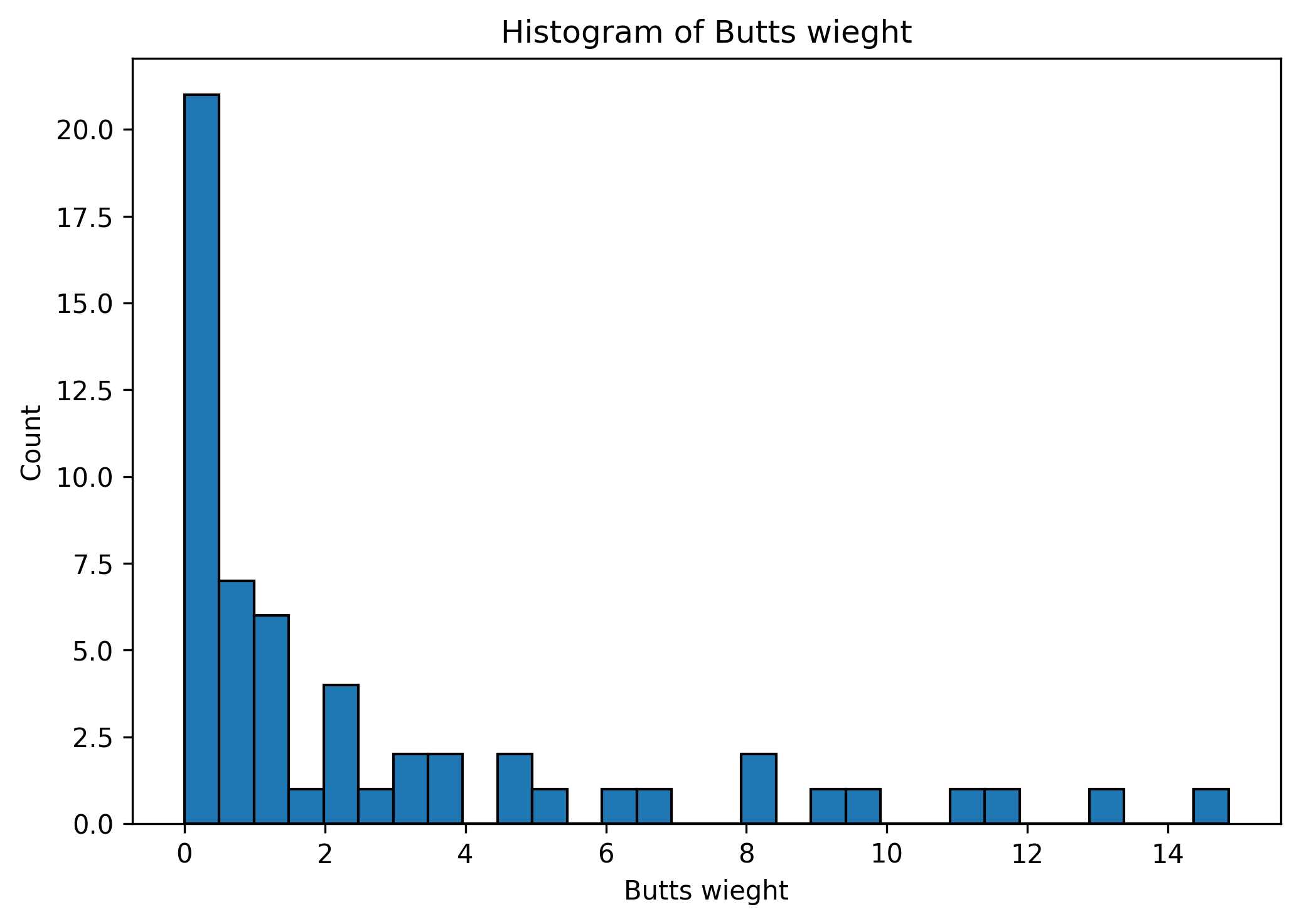
Practice quiz #1 is about a 2013 study that found that bird nests that contained cigarette butts typically contained fewer parasites. This was done by measuring the number of parasites and the weight of cigarette butts in different bird nests.
What are the observational units for this study? What are some relevant variables?
Solution
The observational units are individual bird nests.
The weight of cigarette butts and number of parasites are relevant variables.
What type of visualization would be best to see the relationship between the weight of cigarette butts and the number of nest parasites?
Solution
A scatter plot would be best. This is because the weight of cigarette butts and the number of pests are both quantitative variables, and we want to see the relationship between these two variables.
Below is a histogram of the weight of cigarettes found in different birds nests. Based on the histogram, is the mean or median weight larger? Explain why.
Solution
Based on the histogram, the mean weight will be larger than the median weight. This is because the mean is more sensitive to outliers and so the small number of nests with a large weight will increase the mean more than the median.
Practice quiz #2#
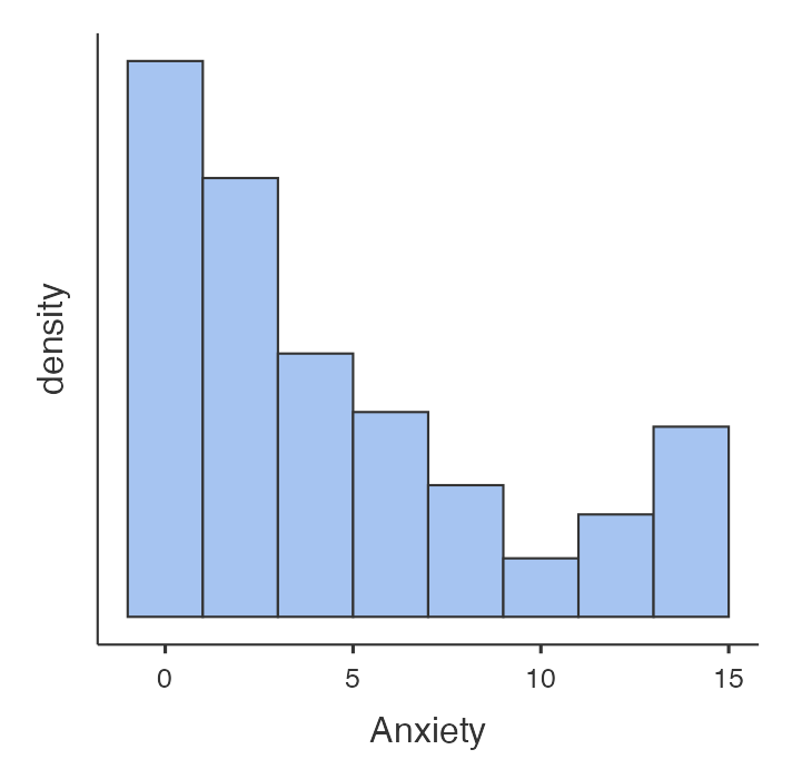
Practice quiz #2 is about a 2021 study that found switch a smartphone to grayscale can reduce self-reported problematic screen use. Half the study participants had their phones put on grayscale for a week. The researchers measured the phone use of participants, and recorded the participants’ responses to questions about their phone use and mental health.
What are the observational units for this study? What are some relevant variables?
Solution
The observational units are the people who participated in the study.
Some relevant variables would be whether the phone was in grayscale, the time spent on their phone during the week and their level of anxiety.
What type of visualization could be used to see the relationship between the participant’s use of grayscale and the time they spent on their phones.
Solution
There are two correct answers:
A pair of histograms with one for the group who put their phones in grayscale and one for the group who did not.
A bar chart showing the mean amount of time for each group (or the median amount of time for each group).
Below is a histogram of the participants’ anxiety scores at the start of the experiment. The mean anxiety score value is 4.47. Does the mean represent the typical value?>
Solution
No, the mean does not represent the typical anxiety score. The most common anxiety scores are around 0 and 1. Relatively few had scores that were around 4 and 5.
Practice quiz #3#
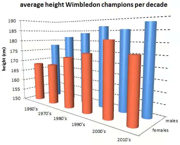
Practice quiz #3 is about a blog post about the heights of the winners of Wimbledon tennis matches over time. They want to know if the heights of the winners has increased over time.
What are the observational units for this study? What are some relevant variables?
Solution
The observational units are the different Wimbledon tennis tournaments.
Some relevant variables are the height of the tournament champion and the year of the tournament.
What type of visualization could you use to see the trend over time of the height of the Wimbledon champions?
Solution
A line chart would be best. This is because we are plotting a quantitative variable (height) over time.
What are some issues with the following visualization showing the average height of the Wimbledon champions per decade?
Solution
The visualization has the following issues:
The 3D perspective distorts the numbers.
The y-axis does not start at zero.
A line chart would be better than a bar graph for seeing the trend over time.
Week 3 - Variability#
Practice Quiz #1#
I hand you a dataset which shows the weekly section attendance numbers for each of the 5 discussion sections of STATS 60 last quarter. What would you do in an exploratory analysis of this data? What kind of visualizations would you make, which summary statistics would you compute, and why?
There is no one correct answer, you will be graded on whether your approach is reasonable given this sort of data, and whether your approach is likely to reveal interesting trends.
In the dataset represented by the top histogram below, is the mean a. About the same as the median, b. Larger than the median, or c. Smaller than the median?
Explain why you think your answer is correct. (Even if your answer is technically incorrect, you’ll get full credit if your reasoning is sound—we don’t expect you to compute the mean and median).
 {width=600}
Which of the two distributions exhibits greater variability? Justify your answer with an appropriate quantitative measure of variability.
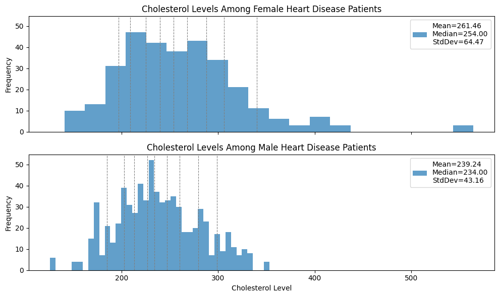 {width=600}
Practice Quiz 1 Solutions
Make a line plot with the week on the x-axis and attendance on the y-axis with one line for each section to see how different section attendances change over time. Make a histogram for each section to see the distribution of how many students attended each section. For summary statistics, compute the mean and median attendance for each section. Also compute the min, max, and mean of all sections combined to detect anomalous weeks.
It looks like the mean is smaller than the median; the distribution looks heavy-tailed on the left, with the highest frequencies on high numbers, and then many entries spread out over low numbers, which usually decreases the mean relative to the median.
The Cholesterol level among female patients exhibits higher variability. The means are pretty close and the standard deviation is a factor 2/3 larger, and also the distance between the 90th and 10th percentiles is larger.
Practice Quiz # 2#
I hand you a dataset which contains the number of points scored by each player in the Golden State Warriors (the local NBA basketball team) in each game of the 2025 season. What would you do in an exploratory analysis of this data? What kind of visualizations would you make, which summary statistics would you compute, and why?
There is no one correct answer, you will be graded on whether your approach is reasonable given this sort of data, and whether your approach is likely to reveal interesting trends.
In the dataset represented by the histogram below, is the mean a. About the same as the median, b. Larger than the median, or c. Smaller than the median?
Explain why you think your answer is correct. (Even if your answer is technically incorrect, you’ll get full credit if your reasoning is sound—we don’t expect you to compute the mean and median).
Which of the two distributions exhibits greater variability? Justify your answer with an appropriate quantitative measure of variability.
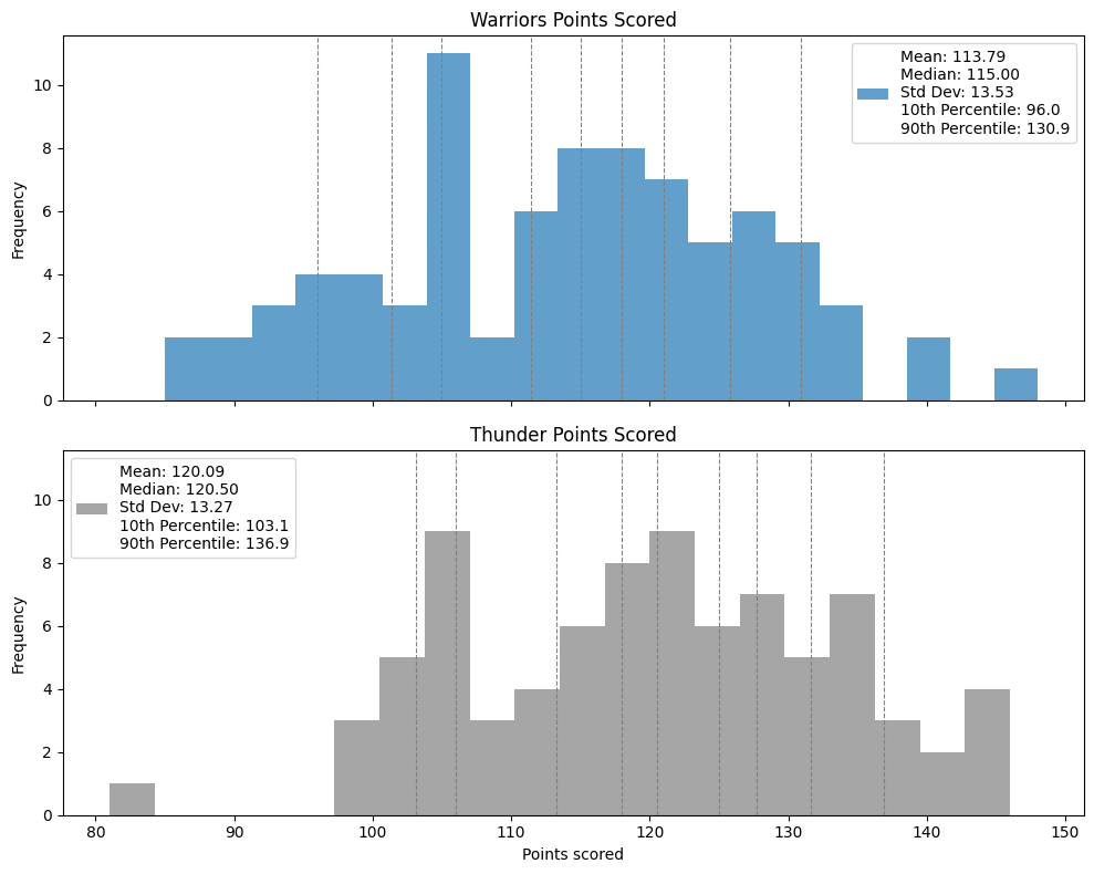
Practice Quiz 2 Solutions
Make a histogram of points per game for each player to compare the scoring distributions and variability across players. Make a line plot to see points per game for key players to spot trends over the course of the season such as injuries. Make a pie chart to see what fraction of all points were scored by each player. For summary statistics, compute the mean and variance of points scored per player.
It looks like the mean is larger than the median; the distribution looks heavy-tailed on the right, with the highest frequencies on low numbers, and then many entries spread out over high numbers, which usually pulls up the mean relative to the median.
The Warriors points distribution exhibits greater variability; the distance between the median and 10th percentile is almost 30 points, whereas the thunders’ is less than 20. Also, there are more outliers, the distance between the 10th and 90th percentile is slightly larger, and the standard deviation is also slightly larger.
Practice Quiz #3#
I hand you a dataset which shows the maximum and minimum temperature each day in San Francisco over the past year. What would you do in an exploratory analysis of this data? What kind of visualizations would you make, which summary statistics would you compute, and why?
There is no one correct answer, you will be graded on whether your approach is reasonable given this sort of data, and whether your approach is likely to reveal interesting trends.
In the dataset represented by the histogram below, is the mean a. About the same as the median, b. Larger than the median, or c. Smaller than the median?
Explain why you think your answer is correct. (Even if your answer is technically incorrect, you’ll get full credit if your reasoning is sound—we don’t expect you to compute the mean and median).
Which of the two distributions exhibits greater variability? Justify your answer with an appropriate quantitative measure of variability.
Practice Quiz 3 Solutions
Make a line plot of the temperature vs day with one line for the daily maximum and one line for the daily minimum to look for seasonal patterns. Make a histogram of the daily maximum temperatures to get a sense of the variability. For summary statistics, compute the max, min, mean, and median high and low temperatures for each month as well as the year. Then make a line plot with the mean temps for each month with one line for high temps and one line for low temps to see a smoothed plot of seasonal trends.
The mean and median look about the same; the histogram looks like it is roughly balanced around the center.
The variability of the 2020 data is higher. The standard deviation is almost twice as large. The gap between the mean and median is also almost twice as large, which reflects the presence of more outliers.
Week 4 - Probability#
For this week’s quiz you do not need to simplify your answers, but you must explain your reasoning.
Practice Quiz #1#
There is a class with 30 students. Suppose a professor randomly selects one student and then randomly selects a second, different student.
What is the size of the sample space? In other words, what is the number of possible outcomes?
Give an example of an event for this sample space.
Suppose that I flip 5 coins. Which of the follow sequences of heads (H) and tails (T) is more likely? Why?
a. HHHHH
b. HTTHT
Suppose I have a bag with 10 balls labeled 1,2,3,…,10. I draw three balls from the bag without replacement. What is the probability that the labels on the balls are increasing by one (for example the first ball could be 1, the second ball 2, and the third ball 3)? Justify your answer.
Practice Quiz 1 Solutions
The number of possible outcomes is \(30 \times 29\). An example of an event is that both the students are first year students.
The two sequences have the same probability. By the multiplication rule, the total number of possible outcomes is \(2^{5}\).
This means that any particular outcome has probability \(\frac{1}{2^5}\). In particular, these two outcomes are equally likely.
The probability is \(\frac{8}{10 \times 9 \times 8}\).
This is because there are 8 outcomes in the event that the labels on the balls are increasing by one. These outcomes correspond to the starting number which could be any number between 1 and 8.
By the multiplication rule, the total number of possible outcomes is \(10 \times 9 \times 8\). This means that the probability of the event is
$$\mathrm{Pr}[\text{labels increasing by one}] = \frac{8}{10 \times 9 \times 8}$$
Practice Quiz #2#
Suppose that you roll two six sided dice.
What is the size of the sample space? In other words, what is the number of possible outcomes?
Give an example of an event for this sample space.
Suppose I flip 5 coins. What is the probability that I get at least one heads? Justify your answer.
Suppose you create a new pin by selecting a random number between 0000 and 9999. What is the probability that all the digits are distinct? Justify your answer.
Practice Quiz 2 Solutions
By the multiplication rule, the number of possible outcomes is \(6 \times 6 = 36\). An example of an event is that both die land on 6.
The total number of outcomes is \(2^5\) (by the multiplication rule). The compliment of the event “getting at least one head” is “getting no heads”. The event no heads corresponds to exactly one event. This means that
\[\mathrm{Pr}[\text{no heads}] = \frac{1}{2^5}\]And by the rule of compliments
\[\mathrm{Pr}[\text{at least one head}] = 1-\frac{1}{2^5}\]The total number of possible outcomes is \(10,000 = 10^4\). By the multiplication rule, the number of pins with distinct digits is
\[ 10 \times 9 \times 8 \times 7\]The probability that the pin has all distinct digits is therefore
\[\mathrm{Pr}[\text{all digits distinct}] = \frac{10 \times 9 \times 8 \times 7}{10^4} \]
Practice Quiz #3#
Suppose that you flip three coins.
What is the size of the sample space? In other words, what is the number of possible outcomes?
Give an example of an event for this sample space.
In a class with 100 people, 60 people think that a hot dog is a type of sandwich. If you randomly picked two people from the class without replacement, what is the probability that neither of them think that a hot dog is a type of sandwich? Justify your answer.
Suppose that I roll a red die and a blue die. What is the probability that the two die show the same number? What is the probability that the red die shows a bigger number than the blue die? Justify your answer.
Practice Quiz 3 Solutions
By the multiplication rule, the number of possible outcomes is \(2 \times 2 \times 2 = 8\). An example of an event is that all the coins land on tails.
By the multiplication rule, the number of possible outcomes is \(100 \times 99\). The number of outcomes where both people think that a hot dog is not a type of sandwich is \(40 \times 39\). The probability that neither of them think that a hot dog is a type of sandwich is
\[\mathrm{Pr}[\text{neither think a hot dog is a type of sandwich}] = \frac{40 \times 39}{100 \times 99}\]By the multiplication rule, the total number of possible outcomes is \(6 \times 6 = 36\). There are \(6\) outcomes where the two dice show the same number. Therefore
\[\mathrm{Pr}[\text{both die show the same number}] =\frac{6}{6 \times 6}=\frac{1}{6}\]There are \(5+4+3+2+1=15\) outcomes where the red die shows a bigger number. So
\[\mathrm{Pr}[\text{red die shows a bigger number}] =\frac{15}{6 \times 6}=\frac{15}{36}\]
Week 5 - Conditional probability#
Practice Quiz #1#
11% of the U.S. population lives in California.
7% of people incarcerated in the United States are Californian.
Let \(C\) be the event that an individual is Californian, and let \(I\) be the event that an individual is incarcerated in the U.S.
Phrase the above statistic in the language of conditional probabilities.
What would you expect to be higher: \(\Pr[C \mid I]\), or \(\Pr[I \mid C]\)? Why?
Identify the flaw in the following statement, and explain the flaw using the language of conditional probabilities:
“Since 7% of incarcerated individuals are Californians, and there are 50 states, Californians are more likely to be incarcerated than citizens of other states!”
Practice Quiz 1 Solutions
\(\Pr[C \mid I] = 0.07\).
The fraction of Californians incarcerated \(\Pr[I \mid C]\) should be much smaller than the fraction of incarcerated people who are Californian, \(\Pr[C \mid I]\). We’d expect \(\Pr[C \mid I]\) to be on the same order as \(\Pr[C]\), and \(\Pr[I \mid C]\) to be on the same order as \(\Pr[I]\); the fraction of people incarcerated, \(\Pr[I]\), should be much smaller than the fraction of Californians.
Even though California is only 1/50 states, it actually contains 11% of the US population, so this argument ignores the base rate of being Californian.
In fact, though we wouldn’t expect you to reproduce the following math on a quiz,
Which, multiplying both sides by \(\Pr[I]\) and dividing by \(\Pr[C]\), gives
So actually, the probability of being incarcerated is lower, conditioned on being Californian.
Practice Quiz # 2#
17% of NBA players are at least 7 ft.
Phrase the statistic above in the language of conditional probabilities.
What do you think is larger, the number of NBA players or the number of people more than 7ft tall?
Identify the flaw in the following statement, and explain the flaw using the language of conditional probabilities:
“Wow, you’re more than 7ft tall! Are you a professional basketball player?”
Practice Quiz 2 Solutions
Let \(H\) be the event of being at least 7ft tall, the \(B\) be the event of being in the NBA. The statistic above says that \(\Pr[H \mid B] = 0.17\).
The number of people over 7ft tall is small, but it is probably much larger than the number of NBA players (a Fermi estimate indicates that there are probably around 20 x 30 NBA players).
This confuses \(\Pr[H \mid B]\) with \(\Pr[B \mid H]\). Even though \(\Pr[H \mid B]\) is large, \(\Pr[B \mid H]\) is still very small, as there are so few professional basketball players.
Practice Quiz #3#
A classroom of 28 students is evenly split between seniors, juniors, sophomores and first-years. There are four English majors in the class; two are juniors and two are first-years.
Choose a student uniformly at random from the class; let \(E\) be the event that the student is an English major, and let \(F\) be the event that the student is a first year.
Describe \(\Pr[E \mid F]\) in plain English.
Compute \(\Pr[E \mid F]\) and \(\Pr[F \mid E]\). You may leave your answer as an unsimplified fraction. Are these quantities equal?
The class takes an “anonymized” survey. One of the questions on the survey is “what is your major?” and another question is “what is your class year?.” Explain the flaw in the following statement by the course instructor using the language of conditional probability:
“The survey is anonymous because there are 7 of you in each year, so even if I know your class year, I only have a 1/7 chance of guessing who you are.”
Practice Quiz 3 Solutions
This is the chance that if you choose a first-year uniformly at random, they will be an English major.
\(\Pr[E \mid F] = \frac{\Pr[E \cap F]}{\Pr[F]} = \frac{2}{7}\), while \(\Pr[F \mid E] = \frac{\Pr[E \cap F]}{\Pr[E]} = \frac{2}{4}\), so \(\Pr[E \mid F]\) is not the same as \(\Pr[F \mid E]\).
The flaw is that the instructor will also know the class year; there are only two English majors in a year, so conditioned on all available information of both major and class year the instructor might have a 1/2 chance of guessing who the student is.
Week 6 - Hypothesis testing#
Practice Quiz #1#
Suppose that the league average for a soccer player scoring a penalty is 78%. A new player just scored 18 out of their last 20 penalty kicks.
You will investigate whether the number of goals scored by this new player is significantly different from the league average.
What are the null and alternative hypotheses? Describe them both in English and in mathematical symbols.
Describe how you would do a simulation to compute a p-value. If the null was true, what would be the “probability of success”? What would be the “number of trials”? What value would you compare the simulated data to?
The p-value for the observed results (18 out of 20 goals) is 0.15. What do you conclude about the null hypothesis?
Practice Quiz 1 Solutions
The null hypothesis is that the new player is just as good at scoring penalties as the league average. The alternative hypothesis is that the new player is better at scoring penalties.
In symbols, let \(\pi\) be the long run probability of the new player scoring on a penalty. The null hypothesis is \(H_0 : \pi = 0.78\) and the alternative hypothesis is \(H_A : \pi > 0.78\).
You could also do a two-sided alternative hypothesis \(H_A : \pi \neq 0.78\). In words, the new player has a probability of scoring a penalty that is different from the league average.
A “success” would correspond to the goal being scored. If the new player was just as good as the league average then they would score with probability 0.78. Therefore, the “probability of success” is 0.78.
The number of trails is 20 (the number of penalties taken).
The value to compare to is 18 (the number of goals scored in the sample).
Since the p-value is greater than 0.05, we do not have evidence against the null hypothesis that the player is just as good as the league average.
Practice Quiz #2#
In a parking garage, there are three elevators and someone suspects that elevator 3 might be broken and hence less likely to be the elevator that comes down when called. The next 10 times an elevator is called, elevator 3 comes down 0 times.
You will investigate whether the number of times the elevator did not come down is statistically significant.
What are the null and alternative hypotheses? Describe them both in English and in mathematical symbols.
Describe how you would do a simulation to compute a p-value. If the null was true, what would be the “probability of success”? What would be the “number of trials”? What value would you compare the simulated data to?
The p-value for the observed results (elevator 3 comes down 0 out of 10 times) is 0.017. What do you conclude about the null hypothesis?
Practice Quiz 2 Solutions
The null hypothesis is that elevator three is not broken and is as likely to come down as either of the other two elevators. The alternative hypothesis is that elevator three is broken and less likely than the other two elevators to come down.
In symbols, let \(\pi\) be the long run proportion of times elevator three comes down. The null hypothesis is \(H_0 : \pi = 1/3\) and the alternative hypothesis is \(H_A : \pi < 1/3\).
You could also do a two-sided alternative hypothesis \(H_A : \pi \neq 1/3\). In words, elevator three comes down more or less often than due to chance.
A “success” would correspond to elevator 3 coming down. If elevator 3 was not broken then the probability that it would come down is \(1/3\). The “probability of success” is therefore \(1/3\).
The number of trails is 10 (the number times an elevator was called).
The value to compare to is 0 (the number of times elevator 3 came down in the sample).
Since the p-value is less than 0.05, we have evidence against the null hypothesis that elevator three is not broken.
Practice Quiz #3#
A candy company promises that at least 30% of their chocolate eggs contain a figurine of the fictional character Elsa from Frozen; the rest contain other toys. Suppose you buy 40 chocolate eggs, and only 9 of them contain an Elsa figurine.
You will investigate whether the low number of Elsa figurines is statistically significant.
What are the null and alternative hypotheses? Describe them both in English and in mathematical symbols.
Describe how you would do a simulation to compute a p-value. If the null was true, what would be the “probability of success”? What would be the “number of trials”? What value would you compare the simulated data to?
The p-value for the observed results (an Elsa figurine in 9 of the 40 chocolate eggs) is 0.04. What do you conclude about the null hypothesis?
Practice Quiz 3 Solutions
The null hypothesis is that the company is telling the truth and the chocolate eggs have a 30% chance of containing an Elsa figurine. The alternative hypothesis is that the chocolate eggs have a smaller than 30% chance of containing an Elsa figurine.
In symbols, let \(\pi\) be the long run proportion chocolate eggs that contain an Elsa figurine. The null hypothesis is \(H_0 : \pi = 0.3\) and the alternative hypothesis is \(H_A : \pi < 0.3\).
You could also do a two-sided alternative hypothesis \(H_A : \pi \neq 0.3\). In words, the probability of a chocolate egg containing an Elsa figurine is more or less than the 30% advertised by the company.
A “success” would correspond to the chocolate egg containing an Elsa figurine. If the company is telling the truth, then the 30% of the chocolate eggs would contain an Else figurine. The “probability of success” is therefore 0.3
The number of trails is 40 (the number chocolate eggs bought).
The value to compare to is 9 (the number of chocolate eggs that contain an Elsa figurine).
Since the p-value is less than 0.05, we have evidence against the null hypothesis that 30% of chocolate eggs contain an Elsa figurine.
Week 7 - Experimental Design#
Practice Quiz #1#
In each of the following experiments (a) list the strengths and weaknesses of each experimental design, (b) state whether you think the experiment will be effective at answering the experimenters’ question, and if not, suggest an alternative design that would be more effective.
An elementary school wants to decide between two choices of curriculum for teaching reading: A or B. The school has 100 pupils in each grade, each divided into 4 equal classrooms of size 25. The administration decides to run the following experiment: they will randomly assign two kindergarten classes to curriculum A, and the remaining two to curriculum B, and at the end of a 1 year period they will give each student a reading assessment, and use the results to determine if A or B was better.
A marketer wants to determine whether people are more likely to buy product A or product B. They do a survey, choosing 100 random customers and asking each one of them if they are more likely to buy A or B.
A psychiatrist is trying to determine whether there is a causal relationship between sleep and positive social interactions. The psychiatrist surveys 1000 people, asking each (1) how many hours of sleep they get on a typical night, and (2) how positive are their social interactions on a scale from 1-10. The psychiatrist then measures the correlation coefficient of these variables.
Practice Quiz 1 Solutions
Relatively effective.
Strengths: Randomization at the classroom level helps control for confounding variables at that level (e.g., classroom assignment isn’t based on ability). Same assessment is used for all students, ensuring consistent measurement.
Weaknesses: If each classroom has a different teacher, the effect of curriculum is confounded with teacher quality or teaching style. The study is limited to kindergarten so if the school wants to apply this across all grades, results may not extrapolate. With only 2 classrooms per treatment, there could be too much noise from teacher quality to make a conclusion about the choice of curriculum.
Proposed changes to make more effective: randomize more classrooms per treatment, potentially across multiple grades or schools. Rotate teachers across treatments to remove teacher quality confounding.
Not very effective.
Strengths: Random sample of customers.
Weaknesses: Stated preferences can differ from actual behavior. There is no random assignment and no control for confounding variables (eg. demographics, purchase history, etc.)
Proposed changes to make more effective: make this a truly randomized experiment by randomly showing a customer either A or B in a purchase setting, and measuring real purchase rates.
Not very effective.
Strengths: Large sample size
Weaknesses: Survey response bias, people can misreport their hours of sleep, no standardized way of measuring amount of sleep, social interactions are rated on a subjective scale, and no consideration for confounding variables (eg. mental health, job stress, age, etc.) No random assignment.
Proposed changes to make more effective: make this a truly randomized experiment by assigning participants to a sleep intervention group versus a control group, and measuring outcomes over time
Practice Quiz # 2#
In each of the following experiments (a) list the strengths and weaknesses of each experimental design, (b) state whether you think the experiment will be effective at answering the experimenters’ question, and if not, suggest an alternative design that would be more effective.
An election forecaster wants to predict whether it is more likely that candidate A or candidate B will win a county election. The race is expected to be close; the voting population of the county is \(100,000\), and both of the previous elections were decided by about \(500\) votes. The forecaster carefully chooses a uniform sample of 100 voters in the county, and asks them who they plan to vote for.
A behavioral economist wants to determine whether people are more likely to perform tasks voluntarily when they are in a good mood. The economist runs a randomized control trial on students in their ECON 101 class, assigning half of them randomly to a treatment group and half to a control group. Students in the control group are asked if they are willing to help clean a chalkboard. Students in the treatment group are first told that they scored well on an exam, then asked if they are willing to help clean a chalkboard.
A politician wants to determine which stump speech is more effective to give on the campaign trail. In order to decide, he gives version A of the speech at the first stop on the trail, and version B at the second stop, and then goes with the version that received a more enthusiastic response.
Practice Quiz 2 Solutions
Not very effective.
Strengths: Random sample of constituents
Weaknesses: Sample size is too small so the margin of error is too high for this tight race (with high confidence the sample mean error for a proportion is on the order of \(1/\sqrt{n}\), and we need an error less than \(500/100000\), so we require a sample size of \(n\) on the order of \(10,000\)). There is survey response bias and the race is constantly evolving so responses obtained by the survey may change between now and the election.
Proposed changes to make more effective: ideally collect a much larger sample size to mitigate some of the issue raised in the weaknesses section.
Effective.
Strengths: Random treatment assignment, being told of good exam score is a straightforward way to induce a good mood, willingness to help clean whiteboard is easy response to measure.
Weaknesses, proposed changes: none of note.
Not very effective.
Weaknesses: The treatment is not randomly assigned, the demographics of the audience at each stop can be totally different and delivery of the speech may differ from stop to stop. Due to crowded behavior, positive or negative reception of the speech can be amplified.
Proposed changes to make more effective: Make this a randomized experiment by randomly assigning speech versions across many similar audiences and measuring outcomes consistently (e.g., applause duration, follow-up engagement).
Practice Quiz #3#
In each of the following experiments (a) list the strengths and weaknesses of each experimental design, (b) state whether you think the experiment will be effective at answering the experimenters’ question, and if not, suggest an alternative design that would be more effective.
A team of medical researchers is trying to determine which dosage of blood thinner is most effective at preventing strokes in heart disease patients. They run a randomized trial across ten hospitals in ten large US cities. Within each hospital, every patient is assigned randomly in a double-blind manner to either dose A or dose B, and the number of strokes in each group is tracked over a 5 year period.
A city is trying to determine what the best strategy is for decreasing auto break-ins. The city council decides to increase police patrols in the problematic areas and see if the number of break-ins decreases.
A health advocate is trying to determine whether caffeine consumption causes negative mental health outcomes. The advocate conducts a survey of \(10,000\) randomly chosen U.S. adults, and asks each of them about (1) their caffeine consumption habits and (2) their mental health.
Practice Quiz 3 Solutions
Effective
Strengths: Randomization within hospitals, double blind design prevents biases, study performed across 10 large hospitals increases robustness, long followup period of 5 years.
Weaknesses: Does not account for confounding variables in the respective patient populations, patients can drop out of study in 5 years
Proposed changes to make more effective: within-hospital randomization done separately per hospital to control for potential systematic differences in patient demographics.
Not very effective.
Weaknesses: No randomized treatment, there is no clear measurement, no way to address confounding variables.
Proposed changes to make more effective: Create a randomized treatment by assigning (randomly) some high crime areas to increased patrol and others to the status quo.
Not very effective.
Weaknesses: Adults are randomly selected to answer survey but this has nothing to do with randomly assigning a treatment. There is no mention of confounding variables (eg. stress, work habits, lifestyle, etc.) There is self-reporting bias in survey results. Cannot establish causal relationship from observational study.
Proposed changes to make more effective: Randomize treatment by assigning people to reduce caffeine intake (and others to have a specified non-reduced amount of caffeine).
Week 8 - Estimation#
Practice Quiz #1#
Decide whether the following statement is True or False, and justify your answer:
“The Normal Approximation of the sample mean applies, no matter how the samples are collected”
In the following scenario, explain
a. What is the population
b. What is the variable \(x\) being measured
c. What is the sample \(x_1,\ldots,x_n\)
An economist wants to estimate what percent of the average San Francisco restaurant servers’ earned income comes from tips. The economist looks at the municipal tax records, picks 100 random people who list their occupation as “restaurant server”, and calls them to ask them what percent of their earned income last year was from tips.
You are trying to estimate the proportion of left-handed people on Stanford campus (about 10% of people in the population overall are left-handed). You collect a sample of size \(n=50\) and record whether they are left-handed. Will the normal approximation apply to \(\hat{\pi}_n\) (the sample proportion of people who are left-handed)?
Practice Quiz 1 Solutions
False. It is important that the data points are collected independently and uniformly.
In this scenario, the population is the San Francisco restaurant servers, and the variable \(x\) is the percent of the server’s income that came from tips last year. The sample is, for each contacted server, the percent \(x_i\) that this specific server made from tips in the last year.
No. The normal approximation does not apply since we expect to have \(\hat{\pi}_n \approx \frac{1}{10}\) and so \(n\hat{\pi}_n \approx 50 \times \frac{1}{10} = 5 < 10\). This means that \(n\) is too small for the normal approximation to be used.
Practice Quiz #2#
Decide whether the following statement is True or False, and justify your answer:
“When estimating a mean, a larger sample size will make the confidence interval smaller.”
In the following scenario, explain
a. What is the population
b. What is the variable \(x\) being measured
c. What is the sample \(x_1,\ldots,x_n\)
A penguin ecologist is trying to determine the average number of offspring a female Antarctic penguin will hatch over her lifetime. The ecologist tags \(n\) Antarctic female penguins at random, then records the number of eggs that each penguin hatches in her lifetime.
Suppose you conduct a poll on an issue on which the population is roughly divided (you expect about half the people will answer yes). You survey \(n=50\) people and 20 said yes.
a. Compute \(\hat{\pi}_n\) the sample proportion of people who said yes.
b. Suppose that the standard deviation of \(\hat{\pi}_n\) is \(0.07\). Construct a 95% confidence interval for \(\pi\) the proportion of people in the population who would say yes.
Practice Quiz 2 Solutions
True.
A 95% confidence inteval for the mean is of the form \([\hat\mu_n - 2\sigma/\sqrt{n}, \hat\mu_n + 2\sigma/\sqrt{n}]\) where \(\hat\mu_n\) is the sample mean, \(\sigma\) is the standard deviation of a single observation and \(n\) is the sample size. The width of this interval is \(4\sigma/\sqrt{n}\). Therefore, increasing the sample size \(n\) will make the confidence interval smaller.
In this scenario, the population is the Antarctic female penguins, and the variable \(x\) is the number of eggs that a female hatches over the course of her lifetime. The sample is, for each tagged female penguin, the number of eggs \(x_i\) that the female hatched over her lifetime.
The sample proportion is \(\hat{\pi}_n = \frac{20}{50} = 0.4\). We are told that the standard deviation of \(\hat{\pi}_n\) is \(0.07\). Therefor, a 95% confidence interval for \(\pi\) would be
\[\left[\hat{\pi}_n - 2 \times 0.07, \hat{\pi}_n + 2 \times 0.07 \right] =\left[0.4- 2 \times 0.07, 0.4 + 2 \times 0.07 \right] = \left[0.26, 0.54\right]\]
Practice Quiz #3#
Decide whether the following statement is True or False, and justify your answer:
“The normal approximation of the sample mean always applies when samples are drawn independently and uniformly, no matter how small the sample size is.”
In the following scenario, explain
a. What is the population
b. What is the variable \(x\) being measured
c. What is the sample \(x_1,\ldots,x_n\)
An engineer has designed a new machine for injecting medication for heart attack victims. It is important that the injection is deployed as quickly as possible. In order to determine the mean deployment time, the engineer tests out the machine on artificial tissue in the lab \(n\) times.
You are interested in the mean height of male Stanford undergraduates. You take a sample of \(n=100\) male undergraduates and record their heights in inches to create a sample \(x_1,\ldots,x_n\). The sample mean is \(\hat{\mu}_n = 70\) inches and the sample standard deviation of \(x_1,\ldots,x_n\) is \(\hat{\sigma}_x = 3\) inches.
a. What is the standard deviation of \(\hat{\mu}_n\)?
b. Use the standard deviation of \(\hat{\mu}_n\) to compute a 95% confidence interval for \(\mu\) the mean height of Stanford males.
Practice Quiz 3 Solutions
False. If \(n\) is too small, say \(n=1\), then the distribution of \(\hat \mu_n\) is not approximately normally distributed. For instance, the distribution of \(\hat \mu_n\) could be the distribution of the outcome of a coinflip.
In this scenario, the “population” is the uses of the machine. The variable \(x\) is the amount of time it takes to deploy the injection. The sample is \(n\) different trials of the machine, and each \(x_i\) is the amount of time it took to deploy the medication on the \(i\)th trial.
The standard deviation of \(\hat{\mu}_n\) is
\[\frac{\hat{\sigma}_x}{\sqrt{n}}=\frac{3}{10}=0.3\]A 95% confidence interval for the mean has the form
\[\left[\hat{\mu}_n - 2 \frac{\hat{\sigma}_x}{\sqrt{n}}, \hat{\mu}_n + 2\frac{\hat{\sigma}_x}{\sqrt{n}}\right]\]Using the results above, a 95% confidence for the mean height is
\[[70 - 2 \times 0.3, 70 + 2 \times 0.3] = [69.4, 70.6]\]
Week 9 - Intro to Machine Learning#
Practice Quiz #1#
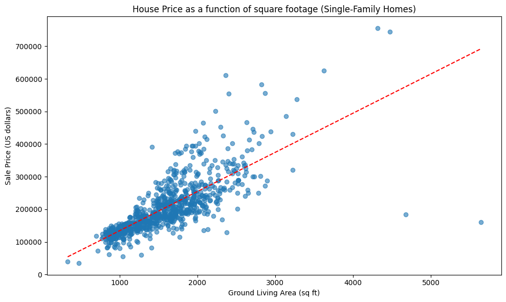
Below is a linear model that, given a single family home’s square footage, predicts its price. Based on the model, how much would you predict that a 1,000 square foot home would cost?
This model was trained on standalone single family homes. Would you use the same model to predict the price of a condo/apartment? Explain why or why not.
Suppose you want to calculate the average sale price \(\mu\) of a 1,000 square foot home. You design a survey that samples 1,000 square foot homes at random and determines their sale price; you’ll take your estimate \(\hat{\mu}\) to be the average of the survey value. How many homes \(n\) would you have to survey to be 95% confident that your estimate is within $10,000 of the truth? The standard deviation for the price of a home is $20,000.
Practice Quiz 1 Solutions
About $ 130,000
The model will probably not make accurate predictions for condos/apartments. The reason is sampling bias. Condos and apartments are probably systematically lower-cost than standalone single family homes, since people value privacy and/or having a yard. Therefore this model will probably lead to an over-estimate of the home cost.
Using the 68-95-99 rule we need that two standard deviations of the sample mean is less than $ 10,000. So we solve for the smallest \(n\) such that \(10,000 > 2 \cdot \frac{20,000}{\sqrt{n}}\), and get \(n \ge 16\).
Practice Quiz #2#
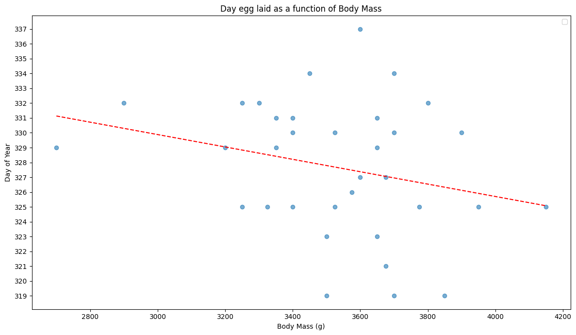
Below is a linear model that, given a mother Chinstrap penguin’s body mass, tries to predict how early in the season she will lay her egg. Based on this model, on which day of the year would you predict that a 3000 g penguin will lay her egg?
The model was trained on Chinstrap penguins. Gentoo penguins are a distinct species from Chinstrap penguins. Would you use the same model to make predictions for Gentoo penguins? Explain why or why not.
Suppose you want to determine the average day of the year \(\mu\) in which a 3000g-3500g Chinstrap penguin will lay her egg. You sample penguins in this weight range at random and see when they lay their eggs. You’ll take your estimate \(\hat{\mu}\) to be the average of the days. How many penguins \(n\) would you have to observe to be 99% confident that your estimate is within one day of the truth? The standard deviation for the date of egg laying is 6 days.
Practice Quiz 2 Solutions
Around day 330
The model might not make good predictions for Gentoo penguins. In general, different species might have radically different body mass and breeding seasons, so the training data being Chinstrap might mean the conclusions are not relevant for Gentoo.
Using the 69-95-99 rule, we need that 1 day is more than 3 standard deviations of the sample mean. We solve for \(n\): \(1 \ge 3\cdot \frac{6}{\sqrt{n}}\) and get that we need \(n \ge (18)^2\).
Practice Quiz #3#
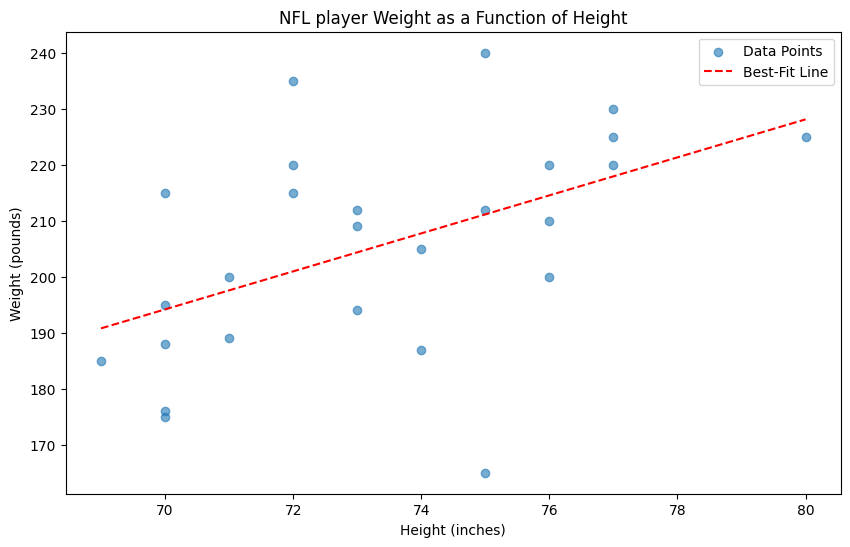
Below is a linear model that, given an NFL player’s height, tries to predict his weight. Based on this model, how much would you predict that a 72 in tall NFL player weighs?
The model was trained on data from the LA Rams. Would you use the same model to predict the weight of a player from a different NFL team, such as the San Francisco 49ers?
Suppose you want to determine the average weight \(\mu\) of a 74 inch tall NFL player. You sample 74 inch tall NFL players at random and compute as your estimate the sample average weight, \(\hat \mu\). How many players \(n\) would you have to observe to be 68% confident that your estimate is within 1 lbs of the truth? The standard deviation for the weight of the NFL players is 7 lbs.
Practice Quiz 3 Solutions
About 200 lbs
The model would probably work as well on the 49ers as on the Rams, as football teams probably have similar compositions; each has more or less the same number of players of each position. For this reason the training data for the Rams is probably reasonably representative for the 49ers.
Using the 68-95-99 rule, we need that 1 lb is more than one standard deviation of the sample mean. Solving for \(n\): \(1 \ge 1 \cdot \frac{7}{\sqrt{n}}\) and we need \(n \ge 49\).