Lecture 6: Deceptive visualizations#
STATS 60 / STATS 160 / PSYCH 10
Recap#
Wednesday#
Data visualization (histograms, scatter plots, dot maps and choropleths).
Summaries of center (mean, median, mode).
Today#
Examples of bad and misleading data visualizations.
Quiz 2.
Line charts#
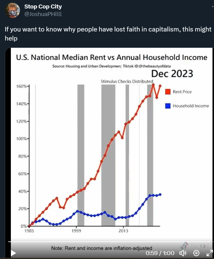
Household income and rent#
The following graph when viral on Twitter/TikTok, but it is misleading.
Let’s do a Fermi calculation based on the graph:
Suppose a household spent 20% of their income on rent in 1985.
Based on the graph, what percentage of their income would they be spending on housing in 2023?
Household income and rent#
In the previous graph, only income is adjusted for inflation.
Here is what the trend looks like when both are adjusted for inflation.
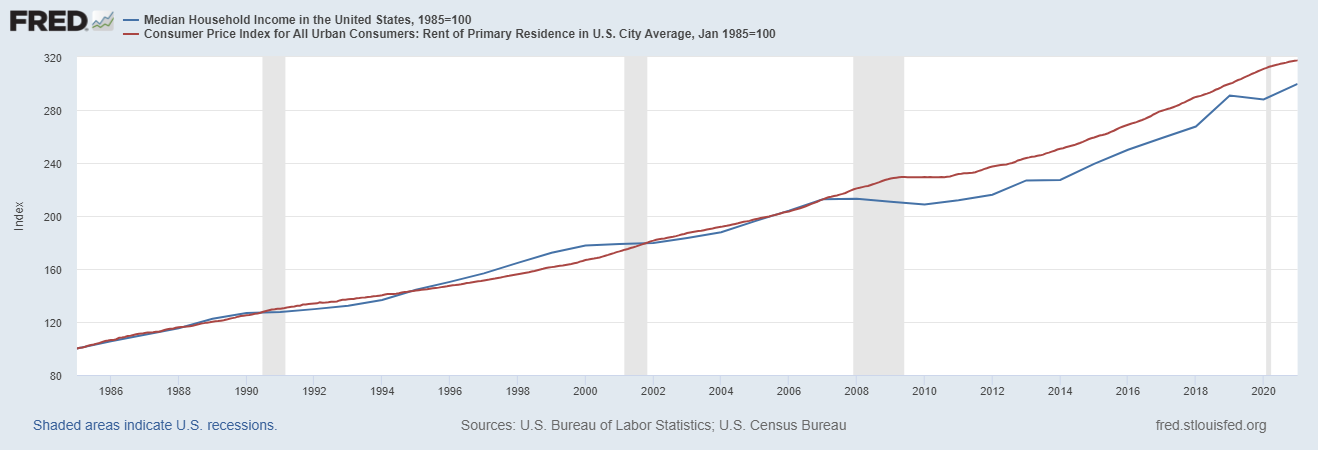
In general, alarming data visualizations are some of the ones to look out for.
Fortunately, the issue with the previous graph was noticed in the community notes.
Native and foreign born workers#
What is misleading about this line chart, original posted in the Financial Times?
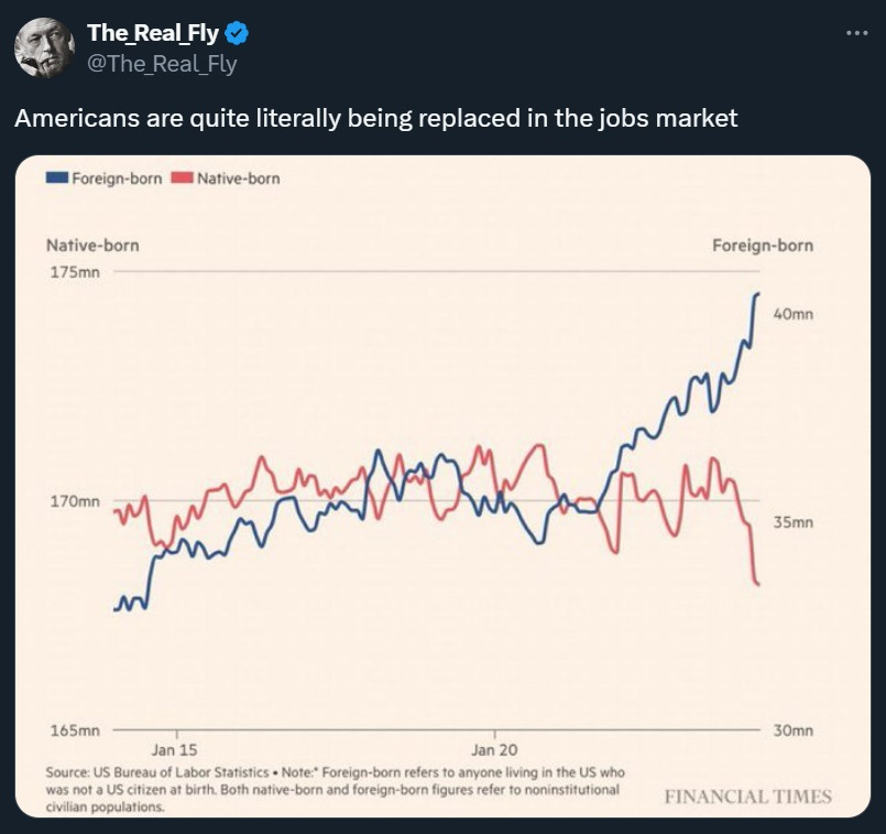
Be careful of double axes!
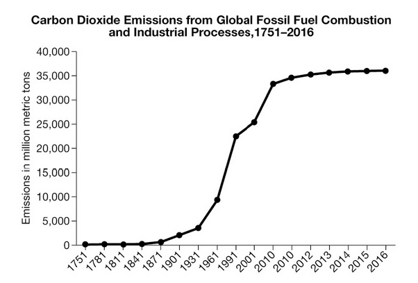
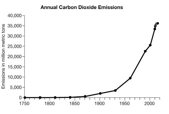
Global CO2 emissions#
Which of these two graphics more accurately represents the data?
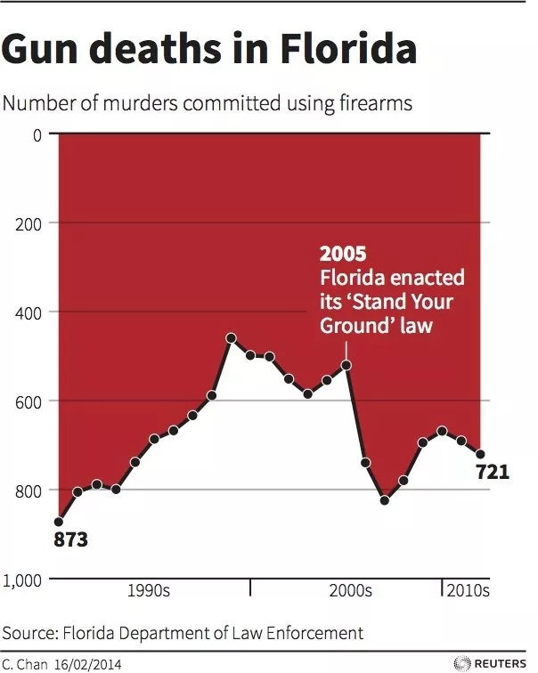
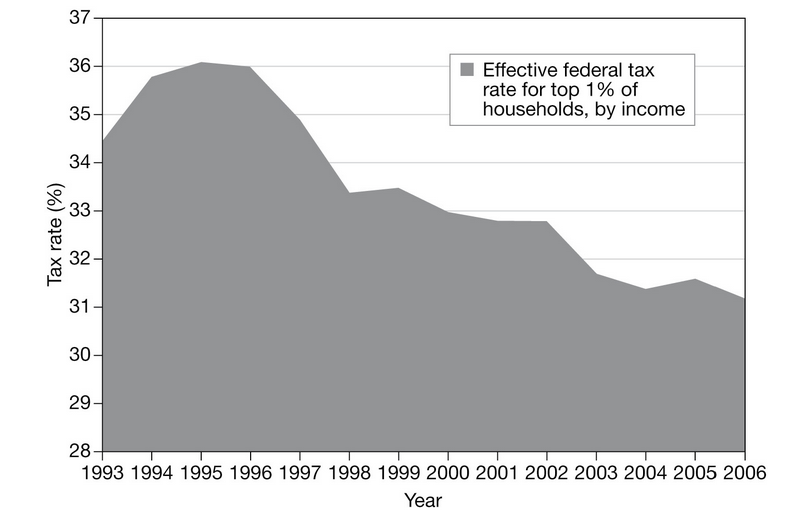
Gun deaths in Florida#
The line chart on the right shows an increase in gun deaths after Florida enacted its ‘Stand your ground’ law.
But the inverted y-axis makes it look like a decrease!
Bar charts#
The most read books#
What is wrong with the following bar chart from Business Insider?
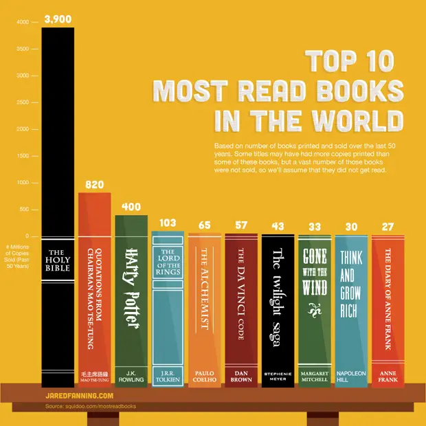
It violates the principle of proportional ink!
Ironically, Business Insider has an article on bad charts!
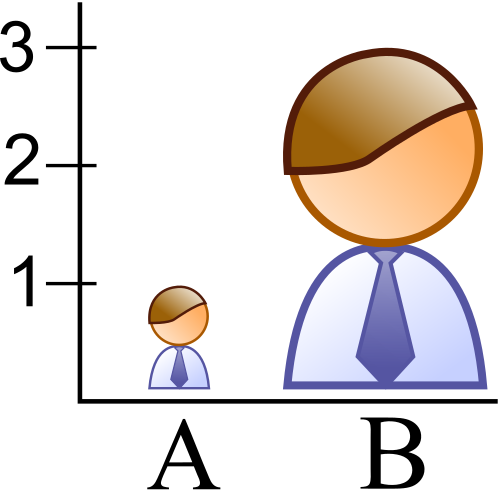
Proportional ink#
There are many ways the principle of proportional ink can be violated:
Using 3D perspective.
Changing the x or y axes.
Using a ‘stylish’ shape.
Examples#
Two examples from Calling Bullshit.
Proportional ink#
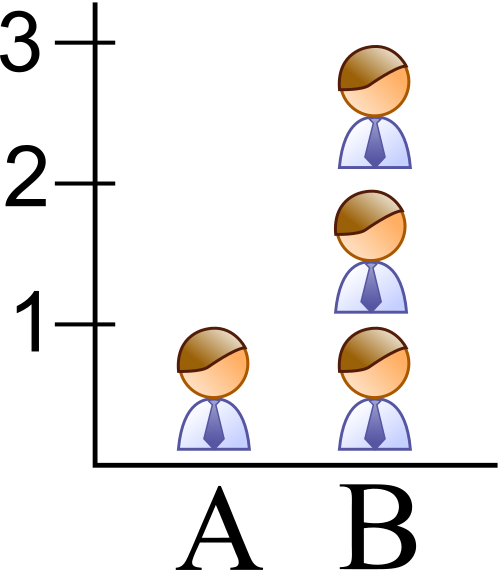
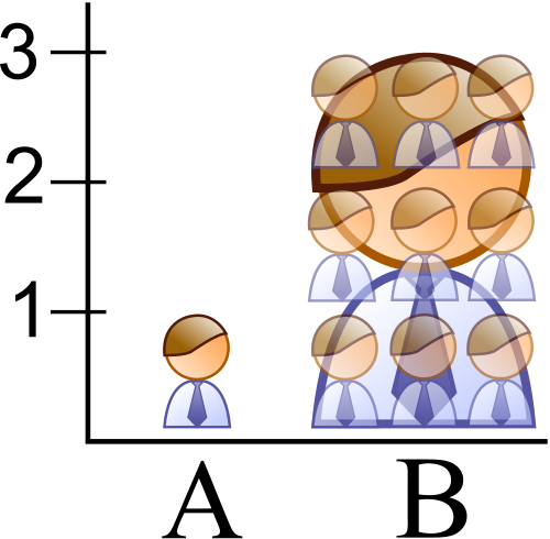
The principle of proportional ink also applies to other types of visualizations.
Scaling height and width#
Scaling both height and width also violates the principle of proportional ink as shown in this example from Wikipedia.
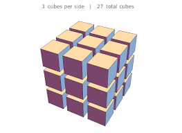
Scaling 3D objects#
The problem gets even worse with 3D objects!
What would happen to an object if you scaled its height, width and depth each by a factor of 3?
The object will increase in size by a factor of \(3 \times 3 \times 3 = 27\)!
Scatter plots#
Genetic scores and education attainment#
One great thing about scatter plots is that they show both trend and variation.
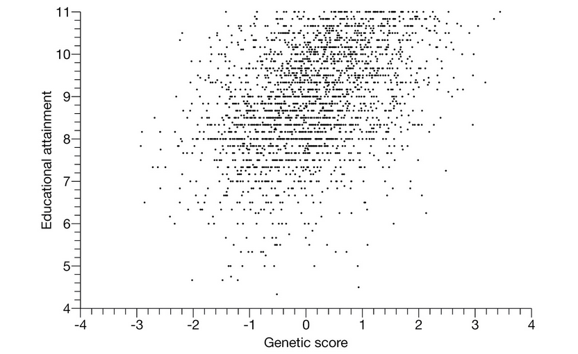
Genetic scores and education attainment#
Sometimes it is tempting to hide the variation.
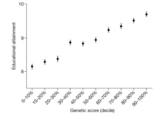
Variation in scatter plots#
How does the difference between these two visualizations relate to our class on Wednesday about summaries of center?
The visualization on the right hides the variation. The center does not tell the whole story.
Ducks#
The big duck#
A data visualization that puts style over substance is called a “duck.”

Ducks from USA today#
A duck in a scientific paper#
Good visualizations#
Data visualizations#
Despite all these examples, data visualizations remain the one of the best ways to explore, understand and communicate data.
There are many websites dedicated to producing and sharing high quality data visualizations:
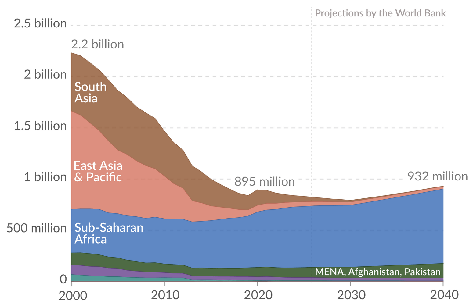
People living in an extreme poverty#
The following graphic is from the article on progress towards ending extreme poverty from Our World in Data.
Interactive data visualizations#
There are also many high quality interactive data visualizations: