Lecture 5: Summaries of Center#
STATS 60 / STATS 160 / PSYCH 10
Announcements
Section 05: 4:30 - 5:20pm Hewlett 101 (new location).
The slides for discussion 2 are online.
Recap#
Lecture 4
Data definitions (observational unit, variables, distribution).
Different types of visualizations (pie charts, bar charts, and line charts).
Today
Data visualizations for quantitative data (histograms and scatter plots).
Data visualization that use maps (dot maps and cloropleths).
Summaries of center (mean, median and mode).
Quantitative Variables#
Quantitative Data#
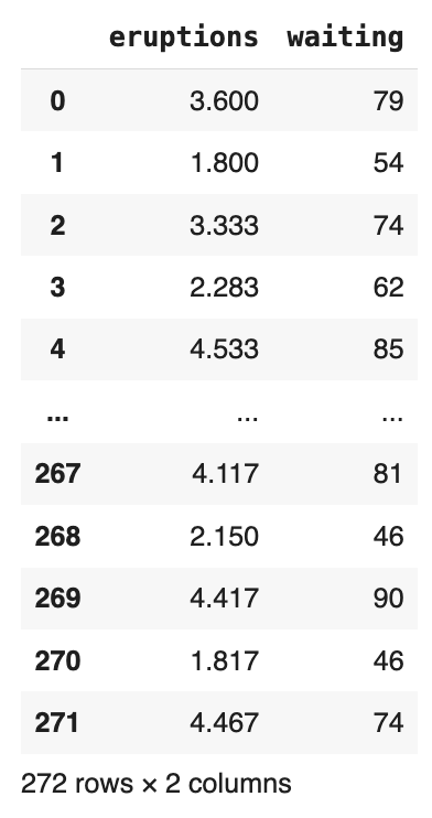
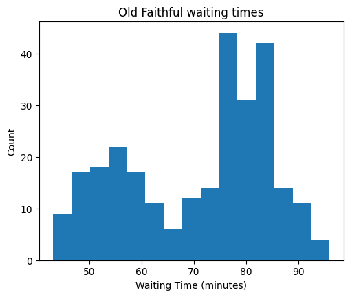
Let’s take another look at the old faithful dataset.
Dot plots for quantitative data#
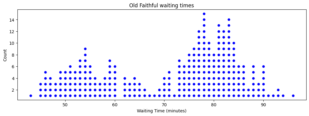
How could we improve this visualization?
Histograms#
A histogram is a more appropriate visualization for a quantitative variable. First, values are sorted into bins, and the number of values in each bin is plotted as a bar.
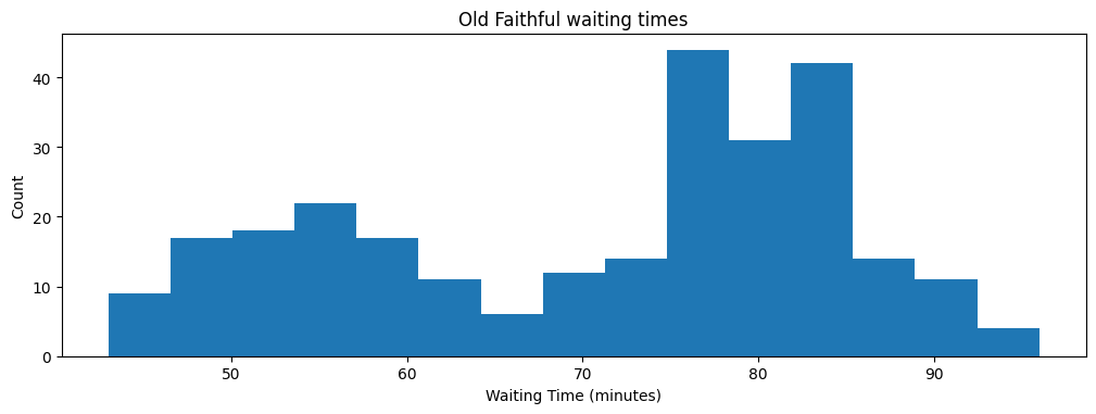
A Histogram is Not a Bar Chart!#
How is a histogram different from a bar chart?
Histograms vs bar charts#
Histograms are for quantitative variables and bar chart are for categorical variables.
The y-axis of a bar chart can be something other than a count.
For a histogram the y-axis is always a count or a frequency.
Relationships between Variables#
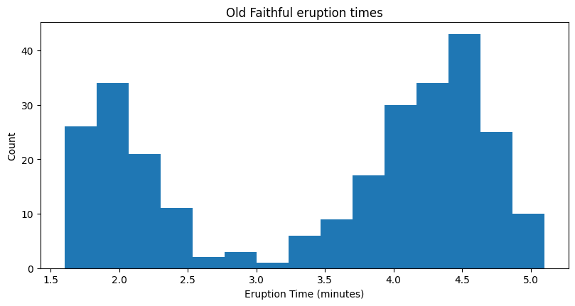
We can also make a histogram of the eruption time of each eruption.
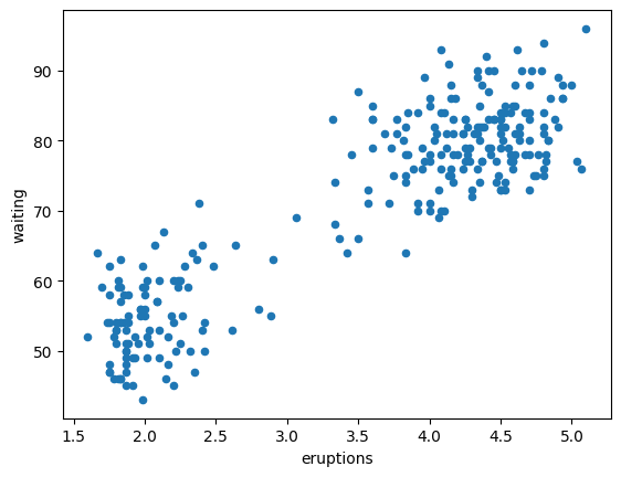
But how do we understand the relationship between two quantitative variables?
Scatter plots#
In a scatter plot, each observation is represented by a point \((x, y)\). The \(x\)-coordinate represents the value of one variable, while the \(y\)-coordinate represents the value of the other.
Maps#
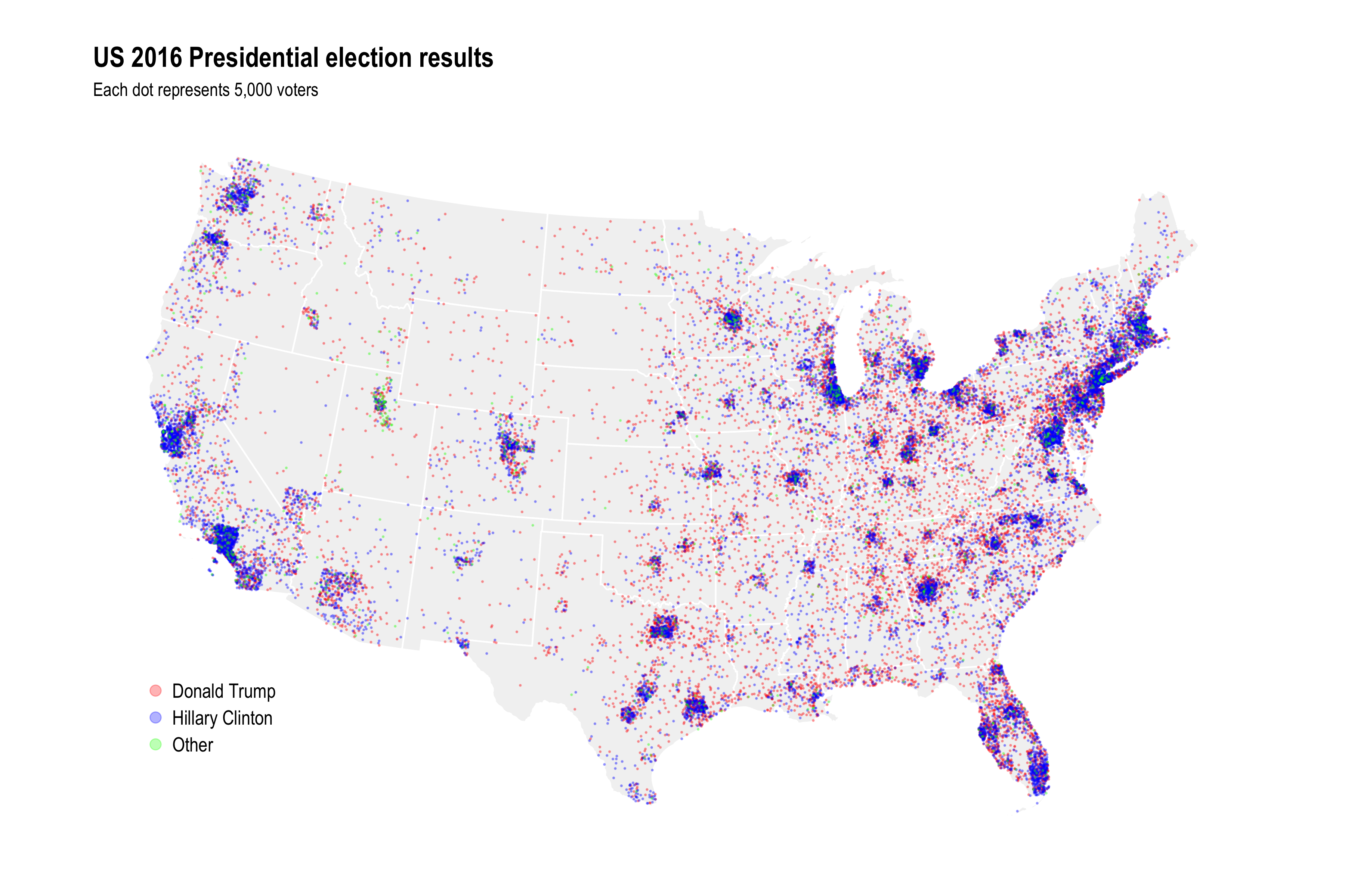
Dot maps#
](../figures/coffee-dotmap.png)
John Snow’s Cholera map#
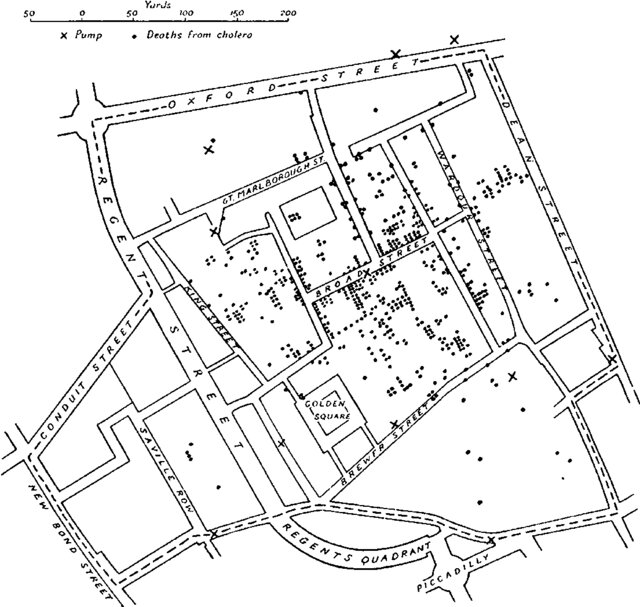
A problem with dot maps#
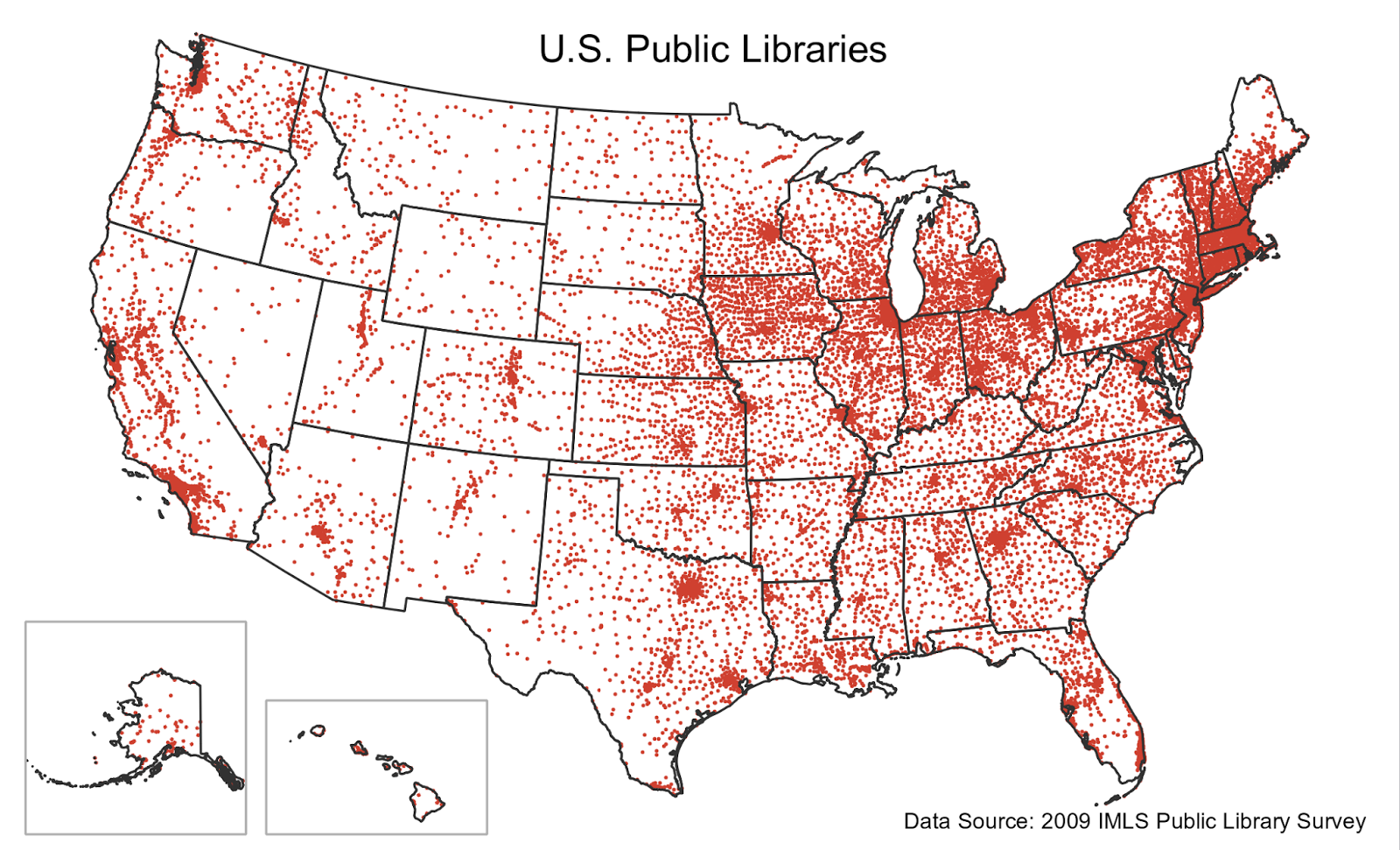
Be careful of dot maps that are really just population maps!
Cloropleths#
A cloropleth is a map where regions are colored according to the values of a variable.
“cloro” + “pleth” means “region” + “many”.
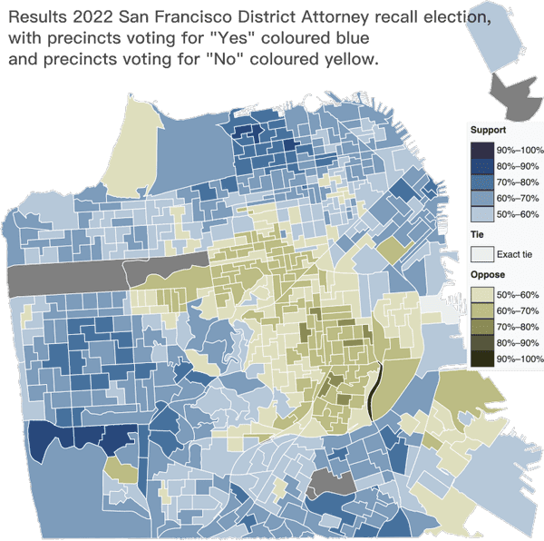
Cloropleths#
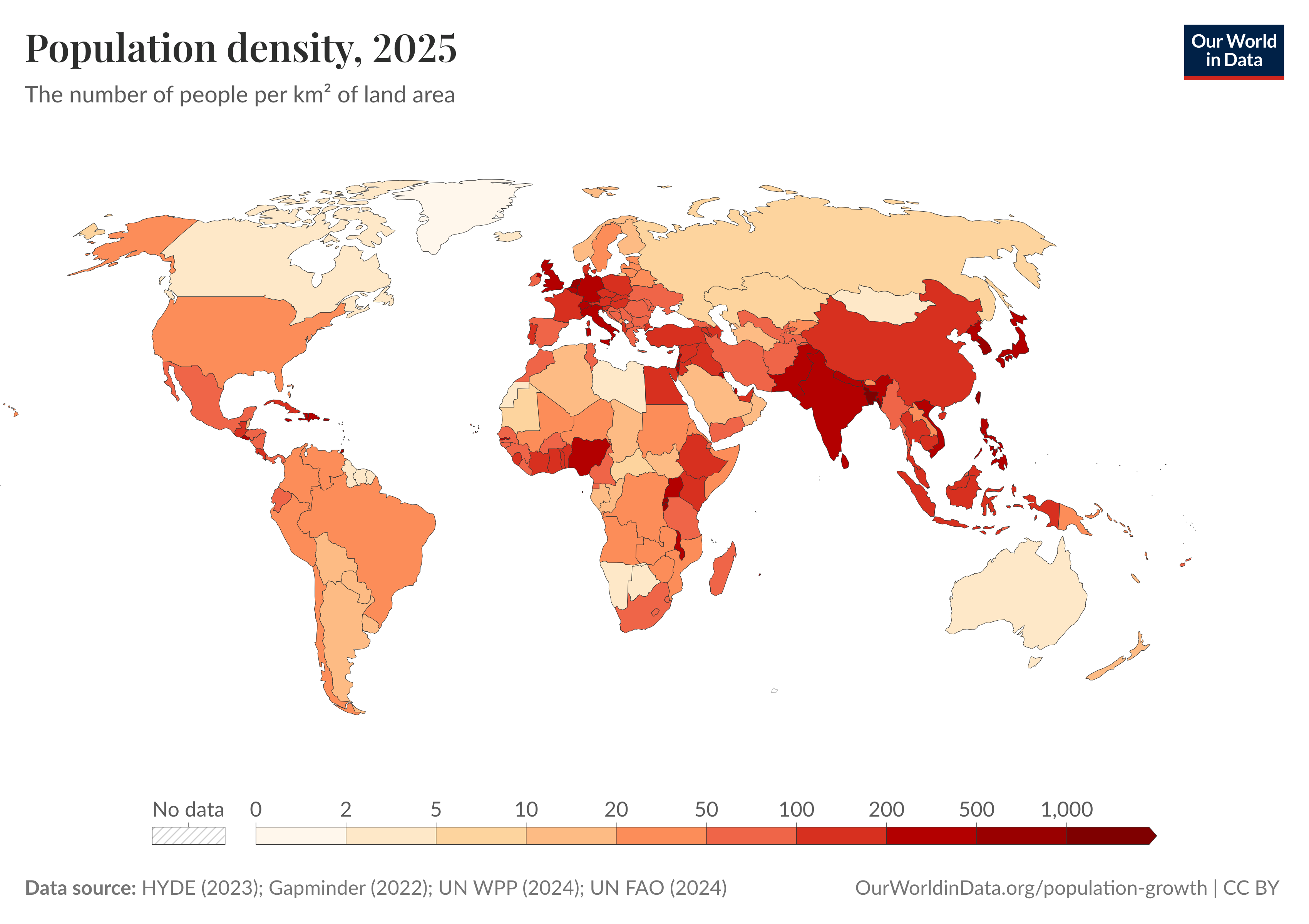
Problems with cloropleths#
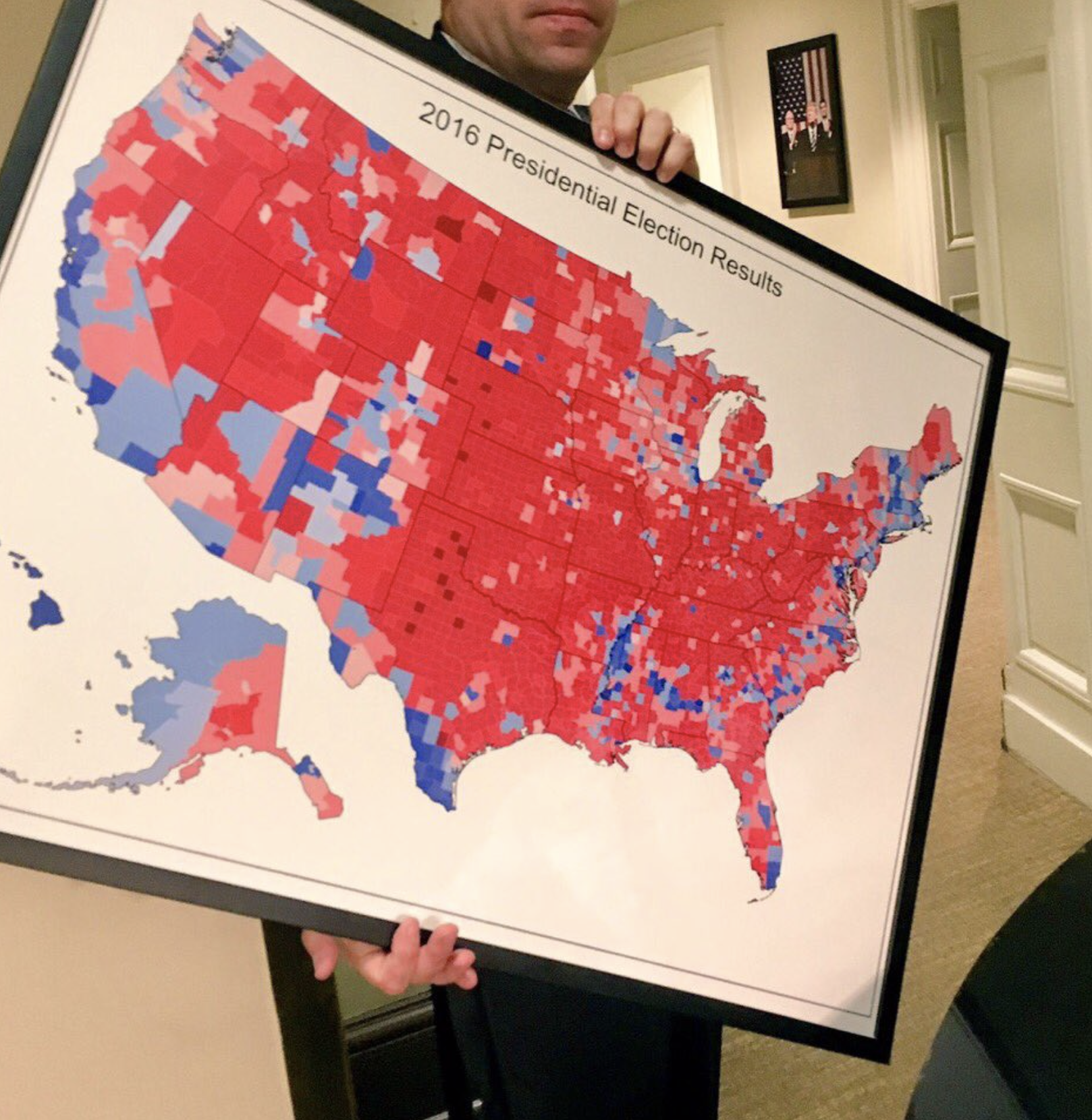
“Oh I love those beautiful red areas, that middle of the map. There’s just a little blue here, and a little blue, everything else is bright red.” —Donald Trump
What is misleading about this chloropleth showing the 2016 election results?
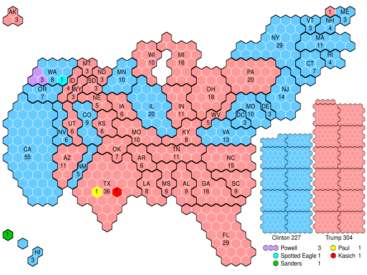
Alternatives#
Visualization summary#
When making a visualization, think about the number of variables and the type of variable (quantitative or categorical).
For a single variable:
Categorical: bar chart or pie chart.
Quantitative: histogram.
For multiple variables:
Two categorical: stacked bar chart.
Two quantitative: scatter plot.
One quantitative, one categorical: side-by-side histograms.
For a variable that changes over time: line chart.
For a variable that changes over locations: dot map or chloropelth (maps).
Summaries of center#
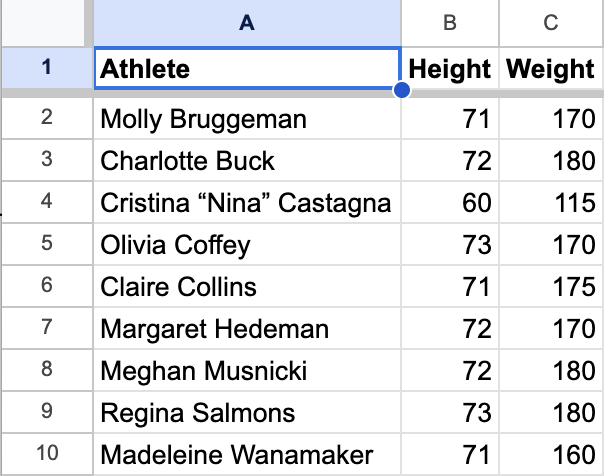
USA Women’s Eight Rowing#
Shown below are stats for the members of the USA Women’s Eight rowing team that competed at the 2024 Paris Olympics.

USA Women’s Eight Rowing#
In the dataset of rower weights:
a. What are the observational units? b. Is weight a quantitative or categorical variable? What visualization could we use to represent the variable weight?
The rowers are the observational units.
Weight is a quantitative variable. We could use a histogram.
Histogram of weights#
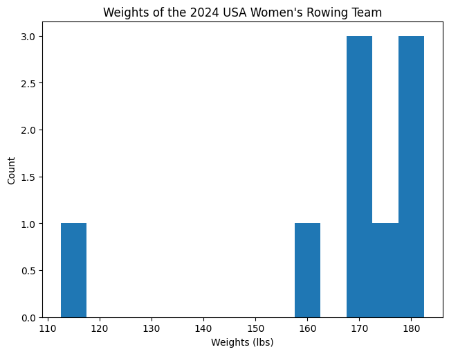
But what if we wanted to summarize the data by a single number?
Mean#
One common summary of a quantitative variable is the mean (or average, although this is less precise).
To calculate the mean, add up the numbers and divide by how many there are: $\( \bar x = \text{mean} = \frac{x_1 + x_2 + \dots + x_n}{n}. \)$
\(n\) is the number of observational units.
\(x_1,x_2,\ldots,x_n\) are the different values of a variable.
\(\bar x\) is a common shorthand for the mean of the values \(x_1,\ldots,x_n\).
Mean of the rowers#
Calculate the mean weight of the rowers.
Surprisingly the mean was not used to summarize data until about 1720! See this article for more history.
Interpreting the Mean#
The mean \(\bar x \approx 166.7\) measures the “center” of the distribution.
It is where the histogram would “balance” if we put it on a scale.
Median#
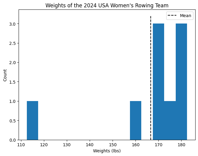
The mean is not the only way to summarize the center of a distribution. Another summary is the median, the middle value when the data is sorted in order.
Calculate the median weight of the rowers.
The median#
When \(n\) is even, there are two middle numbers. The median is the mean of the two middle numbers.
Calculate the median weight of the \(n=8\) rowers, excluding the coxswain.
Interpreting the Median#
The median \(170\) is another summary of the “center” of the distribution.

It is the value where half the data is below and half the data is above.
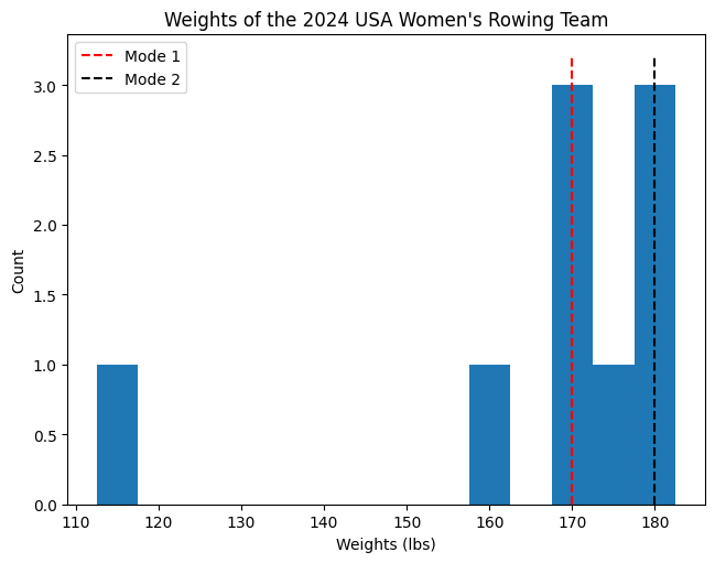
Mode#
The mode is another way of measuring the center of a distribution. The mode is value that appears most often.
The weights of the rowers have two modes:
This is an example of a bimodal distribution.
The mode#
Modes are peaks in the histogram.
Mean vs. Median vs. Mode#
We have now seen three different summaries of center:
\(\displaystyle \text{mean} = \frac{170 + 180 + 115 + 170 + 175 + 170 + 180 + 180 + 160}{9}\approx 166.7\)
\(\displaystyle 115, 160, 170, 170, \underbrace{170}_{\text{median}}, 175, 180, 180, 180\)
\(\displaystyle 115, 160, \underbrace{170, 170, 170}_{\text{mode 1}}, 175, \underbrace{180, 180, 180}_{\text{mode 2}}\)
What would happen to the mean, median and mode, if the coxswain weighed only 90 pounds? What if the coxswain weighed 140 pounds?
Answer: The mean would change, but the median and mode would not.
Moral: The mean is sensitive to outliers (in either direction), but the median and mode are not. Statisticians say that the median is more “robust” than the mean.
Sensitivity of the mean#
Recall the general formula for the mean:
Changing a single data point will change the mean by a proportional amount.
On the other hand, there is a limit to how much any single data point can change the median or the mode.
Exercise#
Shown below is a histogram of the arrival delays from the flights data.
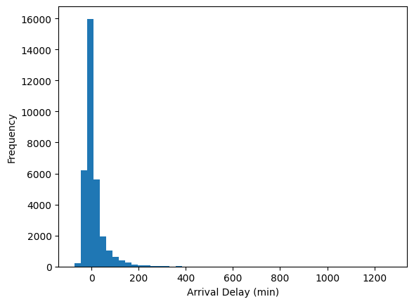
How do you think the mean and median of the arrival delays compare?
The mean will be bigger than the median.
The mean is around 7 minutes and the median is -5 minutes.
The Center Doesn’t Tell the Whole Story#
Many people think that the mean/median represent the “typical” value, but this is not always the case.
Consider the Old Faithful eruption times.
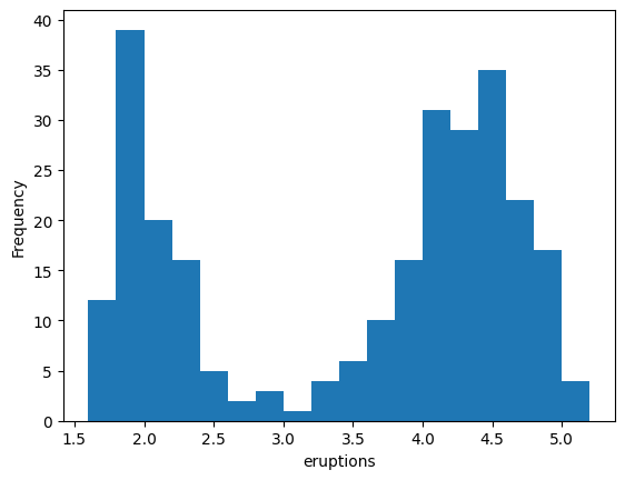
The mean eruption time is about \(3.5\) minutes.
If we only reported this number, we would miss the fact that most eruptions are either much shorter or much longer!
This is another bimodal distribution.
Variability#
Shown below are histograms of daily average temperatures in two cities.
Chicago
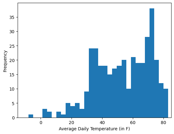
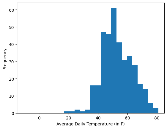
The means of the two cities are about the same (\(53.25^\circ\text{F}\) for Chicago vs. \(53.07^\circ\text{F}\) for Seattle), but the distributions are very different.
Recap#
The mean, the median and the mode are three summaries of center.
The mean is sensitive to outliers.
However, summaries of center don’t paint the full picture.
Looking ahead#
Tomorrow
Review and solution to practice quiz 1.
Vibe coding to make visualizations.
Friday
Misleading data visualizations.
Quiz on data visualizations and summaries of center.