Homework 8: BiasBars
Due: 11:55pm (Pacific Time) on Wednesday, December 7th
Based on problems by Colin Kincaid, Monica Anuforo, Jennie Yang, Nick Bowman, Juliette Woodrow, Chris Piech, Mehran Sahami, and Kathleen Creel.
To get started, download the zip file for HW8 here.
In this assignment, we have done all of the file reading and data processing for you. We have organized the data files and stored them into a dictionary (the structure of which is described below). In this assignment, you will write code to plot the data in an interesting way. Plotting and visualizing across professor gender and review quality reveals interesting trends about human language usage. We hope that you will be able to use this exercise in data visualization to also think critically about the underlying biases that exist in online datasets! The end product of this assignment is a complete application that will help you dig deep into our provided dataset while answering important social and ethical questions along the way.
Main Program: Analyzing Data Bias
Introduction
In this assignment, you will use your nested data structure and new matplotlib skills to build your very own data visualization application. You will analyze a historical dataset consisting of nearly 20 years of reviews of college and university professors posted on RateMyProfessors.com, a popular review aggregation website. Teacher ratings are a common and impactful facet of life in university – here at Stanford, we fill out course reviews at the end of every quarter. Students use the results of these reviews to help them choose their classes and plan their academic futures. However, teaching evaluations are not an objective source of truth about the quality of a professor's teaching. Recent research has shown that teaching evaluations often demonstrate harmful biases, including gender bias. The bias in teaching evaluations is a problem because the scores are often used in decisions about who to hire, fire, tenure, and promote. Your goal is to build a piece of software that helps you investigate and reason about how humans use language in gendered (and potentially biased) ways. Here are two screen shots of the program you will build:
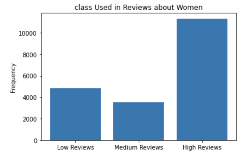
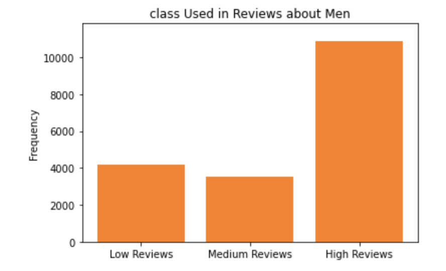
First when exploring the word "class":
The x values are [0, 1, 2] which we have turned into labels "Low Reviews", "Medium Reviews", "High Reviews".
The y values for women are [4856.251650382888, 3515.315553208344, 11329.87853181938]
The y values for men are [4161.032213925694, 3543.692174480071, 10871.598616730716]
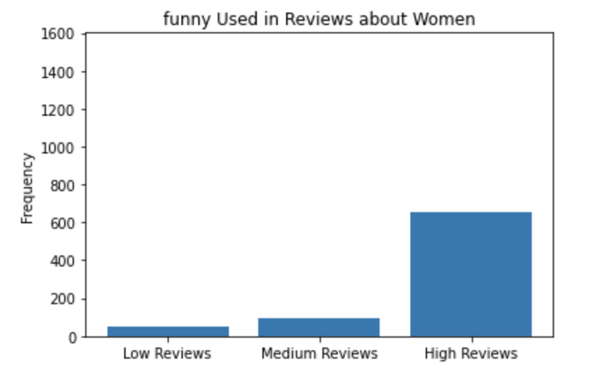
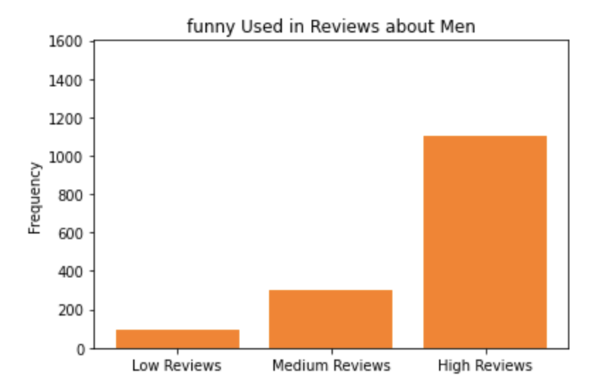
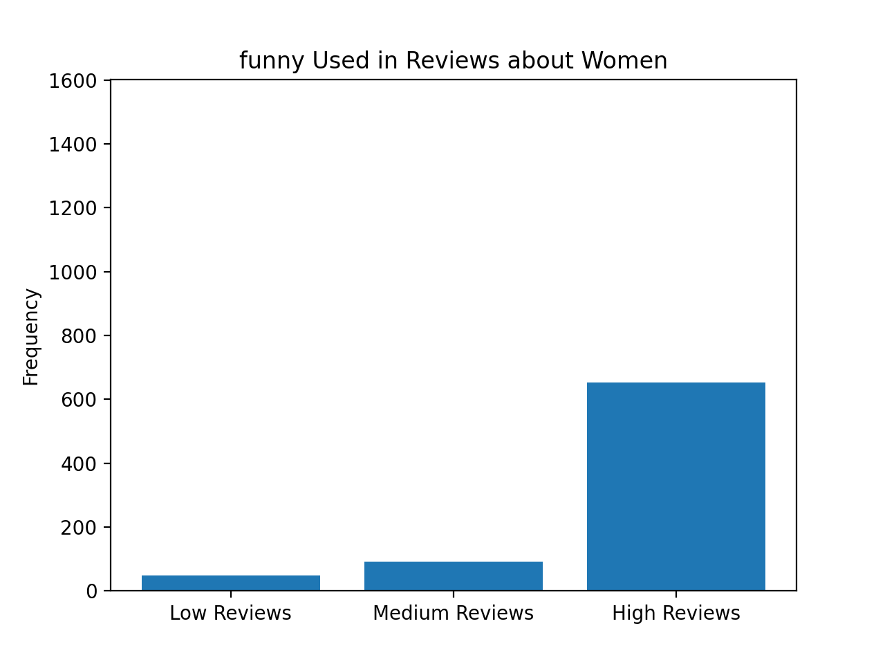
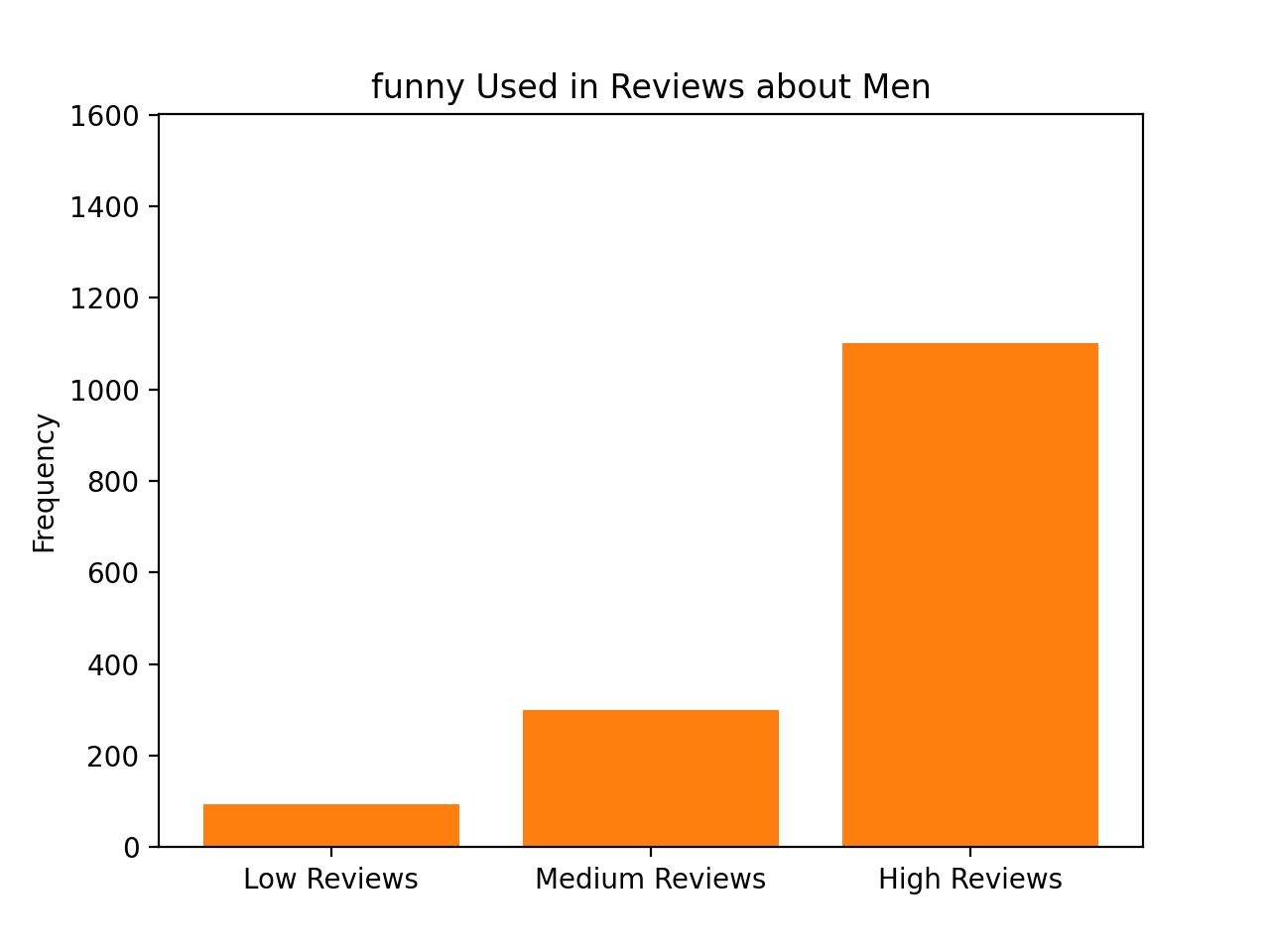
The x values are [0, 1, 2] which we have turned into labels "Low Reviews", "Medium Reviews", "High Reviews".
The y values for women are [49.51148666490626, 90.77105888566146, 651.9012410879324]
The y values for men are [93.53636961297322, 299.3163827615143, 1101.0566937298563]
Before we get started coding, we first want to provide you with some background about why being able to investigate and identify biases in datasets is such an important problem to solve. Much of today’s work in artificial intelligence involves natural language processing, a field which studies the way language is used today and has been used in the past. The datasets we use to train artificially intelligent systems are usually collections of text that humans have written at some point in the past. If there are imbalances in how different groups of people tend to be described or represented in these datasets, then our machines will pick up on and potentially amplify those imbalances. Extreme manifestations of these biases like Tay, Microsoft’s 2016 chatbot infamous for tweeting racist and anti-Semitic statements after just a day of learning from anonymous posts on the Internet, magnify the importance of understanding the ways we use language. More recent examples include Amazon's AI tool for expediting hiring and recruiting, which was shut down after demonstrating extreme negative bias towards hiring candidates based on their gender.
Even when people do not mean to be malicious, their language can still exhibit biases that influence how our machines learn. For example, when history of science professor Londa Schiebinger attempted to Google Translate a Spanish article written about her, all of the pronouns became “he” and “him” rather than “she” and “her” simply because masculine pronouns were more common than feminine pronouns in the available data. In a later study, Schiebinger found more insidious translation errors that assumed genders for people of certain professions based on the frequency of word usage in gendered languages such as German. The software engineers who made Google Translate probably did not mean for this to occur; they probably did not even account for that possibility as they were designing their translation algorithm. The moral of the story? To prevent these kinds of slip-ups, computer scientists need to consider the social impacts of their work at the beginning of their design process.
Identifying issues of bias and representation in datasets is a natural extension of many of the interesting ethical topics that we have talked about in CS106A so far this quarter. As we've mentioned before, our hope is that by introducing these sorts of topics early in computer science education, we can help the next generation of software developers and computer science researchers—which could include you!—be more mindful of the potential social implications of their work.
Assignment Overview
The rest of this handout will be broken into several sections. Each section defines a distinct, manageable milestone that will allow you to use the power of decomposition to build a complex final program out of many small, testable components.
- Understand the dataset and word_data dictionary: We have written all the code for this section. Peruse our file reading code and learn more about the dataset that you will be exploring and the nested data structure.
- Get matplotlib installed: Make sure that matplotlib has been installed so that you can use the functions in this module.
- Create the plots: Write some code to create bar charts for an inputted word.
- Investigate bias in the dataset: Using your functional BiasBars application, explore the dataset to identify possible instances of biased/gendered use of language.
IMPLEMENTATION TIP:
We highly recommend reading over all of the parts of this assignment first to get a sense of what you’re
being asked to do before you start coding. It’s much harder to write the program if you just implement
each separate milestone without understanding how it fits into the larger picture.
Milestone 1: Understand the dictionary structure
In this milestone, you are going to understand the structure of the dictionary created by the provided file reading code.
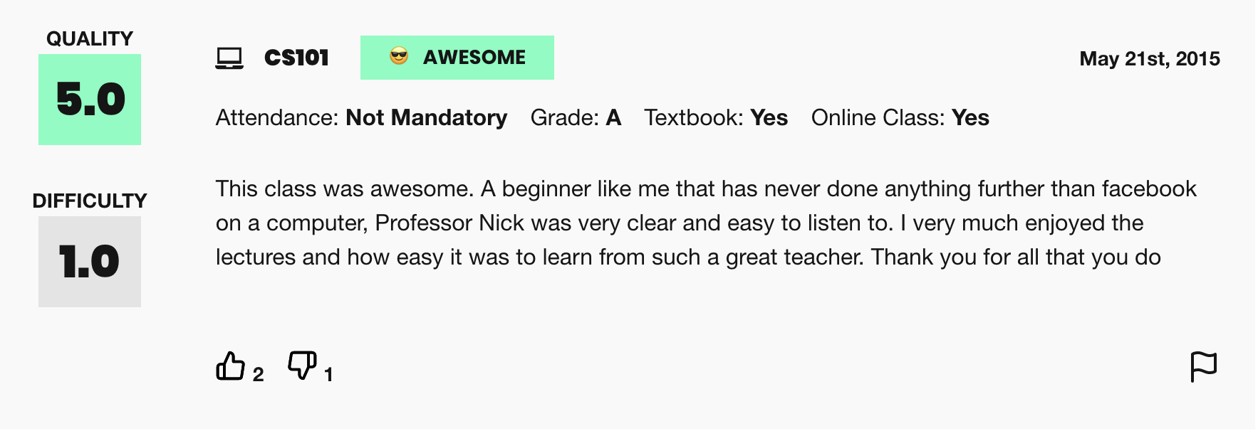
This assignment uses real world data from RateMyProfessors.com, an online platform that enables students to leave anonymous, public reviews about their college/university professors. A typical review on RateMyProfessors.com consists of an overall numerical rating of quality (from 1-5), a number of qualitative tags (like "amazing lectures" or "difficult exams"), and a free-response comment section where students can write a short paragraph describing their experience with the professor. An example review for our very own Nick Parlante is shown below:
The power of the Internet makes this platform for reviews accessible to the global community of students, empowering students to make decisions about classes they might want to take or universities they might want to attend based on the quality of instruction. The indirectness and anonymity of being behind a computer or phone screen also gives people a sense of security to say whatever they want, which can range from the supportive or constructive to the downright offensive or harmful. In analyzing this dataset you will be working to answer the following question: does a professor's gender influence the language people use to describe them?
To examine this question, we have collected and compiled a dataset of 20,000 reviews from RateMyProfessors.com posted over a 17-year span from 2001 to 2018. We have cleaned and organized the data into one large text file that will act as the source of information for the program you will write. There are 3 important components of every review that we have used to build the dataset: the gender of the professor being reviewed, text content of the free-response comment, and overall quality (a numerical score from 1-5).
A note on gender vs sex: In this dataset, gender is the only piece of information we have about these people’s social identities; the dataset does not include other salient identities such as race and ability. Furthermore, gender is only classified into the categories of woman and man, which means non-binary people are unfortunately not represented. We choose to describe the two genders included in this dataset as “woman” and “man” rather than “female” and “male,” as the former terms refer to gender and social role whereas the latter typically refer to sex assigned at birth. Professors do not have the opportunity to describe their own gender identity; this data represents the guesses of students. We will reflect further on this point in the ethics questions at the end of the assignment.
Provided code
We have written a few functions, namely convert_rating_to_index(rating),
add_data_for_word(word_data, word, gender, rating), and read_file(filename) in
biasbarsgraph.py. These functions are complete and you do not need to add code here. Feel free to peruse them.
The data structure we have built for you
To begin with, we need to consider the issue of being able to organize the data by the numerical rating associated with the review, since we want to be able to identify trends in how a given word is used in positive reviews vs. negative reviews. Since numerical rating is a float (real value) that can take on many different values between 1.0 and 5.0, we are going to make our data processing task simpler by representing review quality using only three "buckets":
- Reviews with a numerical rating of less than 2.5 will be considered "low reviews"
- Reviews with a numerical rating between 2.5 and 3.5 (inclusive on both ends of range) will be considered "medium reviews"
- Reviews with a numerical rating above 3.5 will be considered "high reviews"
With this knowledge, here is a data structure that we built for you to organize word frequencies (counts) across
both gender and review quality. The data structure for this program (which we will refer to as
word_data) is a dictionary that has a key for every word that we come across in the
dataset. The value associated with each word is a nested dictionary, which maps gender to a list of
counts, broken down by rating bucket (the ordering is counts for low reviews, then medium reviews, then high
reviews). A partial example of this data structure would look something like this:
        {
            'great': {
                'W': [30, 100, 800],
                'M': [100, 200, 1500]
            },
            'teacher': {
                'W': [330, 170, 852],
                'M': [402, 250, 1194]
            }
        }
Let's break down the organization of this data structure a little bit with an example. Let's say we wanted to access the current count of occurrences of the word "great" in high reviews for women (which we can see to be 800 from the above diagram). What steps could we take in our code to traverse the nested data structure to access that value?
- We can then access the overall
word_datadictionary to get the data associated with the word "great" using the expressionword_data['great']. This gives us an inner dictionary that looks like this:{ 'W': [30, 100, 800], 'M': [100, 200, 1500] } - Now, we must access the list of word counts associated with our gender of interest. To do that, we can use
another level of dictionary access, now specifying the dictionary key for women, with the expression
word_data['great']['W']. This expression gives us the following list[30, 100, 800] - Finally, we're one step away from our end goal. The last step is to index into the innermost list to get the
word count associated with the specific review bucket we want to analyze. We know that high reviews fall in
the last bucket of our list (index 2), so we access our overall desired count with the expression
word_data['great']['W'][2]which finally gives us the desired count of800.
Now that we have covered the structure as well as how to access different values within the nested structure, we can move on to the coding that you will have to do for the assignment: building a cool visualization for this data! We have already completed all of the file reading for you in the starter project.
Milestone 2: Getting matplotlib installed
In this milestone you are going to make sure you have everything installed properly in order to complete the assignment.
Unzip and open the assignment folder in PyCharm as usual. Make sure you have thematplotlib package
installed,
which allows you to quickly and easily draw graphs. If you haven't done this already, open the terminal in PyCharm
and run the following command:
python3 -m pip install matplotlib
If you have a Windows computer, substitute py for python3.
Milestone 3: Creating the plots
In this section, you will write code in plot_women_words(word_data, word, max_frequency) and
plot_man_words(word_data, word, max_frequency) using your new matplotlib skills to create bar
charts for each word. Each bar chart should have a separate bar for the low, medium, and high reviews measuring
the frequency of the given word in that review category for that gender. Recall from Wednesday's lecture that in
order to make a plot you need a list of x values and a list of y values. Below is example code to create a bar
chart:
x_vals = # some list of x values
y_vals = # some list of y values
plt.bar(x_vals, y_vals, color="orange")
plt.title("Awesome Title Here")
For the bar chart for women's data, you will want to access the reviews in the dictionary with the key 'W' in
order to build your list of y values. For the bar chart for men's data, you will want to access the reviews in the
dictionary with the key 'M' in order to build your list of y values. The x values for each bar chart have been
provided for you.
To test this, we have provided you with a main function that takes the word that you want to plot as a command line argument. To save you time, we wrote the main function, but feel free to check it out to understand how it works. When you are ready to test, you can run the following in the terminal:
python3 biasbarsgraph.py funny
If you have a Windows computer, substitute py for python3. You can replace 'funny' with any word that you want
to see plotted.
Note that the graphs may show up on top of each other so you can drag the top one over to the side in order to see the bottom graph.
Below are example screenshots for the plots of the word 'funny'. Once you've implemented the plot functions, you should see these pop up if you run the line from above.
Milestone 4: Investigating bias in the dataset
In this milestone, you are going to think critically about the RateMyProfessors.com dataset and reflect on the
relevant ethical issues that computer scientists should consider when working on data science problems. You
will be answering the following questions in ethics.txt.
Diana Navas gave an awesome lecture on ethics in the data. Many critical issues can arise when working with datasets that have real data describing real people. In the last part of the assignment, we are going to ask you a few questions. Remember our moral from the earlier tale of Microsoft's chatbot or Google's translation software? Computer scientists need to consider the social impacts of their work at the beginning of their design process. We hope that these questions will provide a foundation for you to think critically about the social impacts of your work should you continue on into the wonderful field of computer science! As usual, please take the time to seriously think about each of the questions presented below and answer each in at least 2-3 well thought-out sentences.
- Plot a few “neutral” words such as "class", "the", and "teach". What do you see? Now plot a few more
"loaded”
words (think normative terms) to investigate potential biases in the dataset. Possible examples: "funny",
"mean",
"fair", "unfair", "genius", or "brilliant". What do you see? Include at least
three of the “loaded”
words you explored and their corresponding frequencies for men and women for the low, medium, and high buckets
in your
ethics.txtfile. - Based on the definitions of fairness presented in class, under what conditions (that could be observed from a dataset like this) would it be unfair for a university to use either the ratings or the prevalence of particular words (such as brilliant or genius) as a factor in decisions to hire, tenure, or fire professors? Assume the universities are using end-of-term student evaluations written by their own students, which might have different distributions.
- What kind of information do the subjects represented in a dataset (in this case, professors) deserve to know about the trends in the data? How could you as the programmer provide this information?
- In this assignment, we asked you, “does a professor's gender influence the language people use to describe them?” That is an important question, and we haven’t given you the right kind of data to fully answer it: the dataset presents a binary classification of gender based on students’ beliefs as to the gender of the professor. There are some people in the dataset whose gender is misdescribed, and others, such as non-binary people, who do not have a category that fits them at all. If you could design the ratings website, how might you address this problem?
- In 106A, we create clearly-defined assignments for you to work on; we tell you what to do at each step and what counts as success at the end. In other words, we are formulating problems for you to solve. As we discussed in class, problem formulation is one of the ways in which you embed values in your work as a computer scientist. Formulate a different problem related to the topic of professor evaluation or visualization of patterns in language use, ideally one you could solve with your current skills. Explain what values are being embedded in this problem formulation, and who this problem is being solved for.
Once you've finished thinking through and answering all these questions, make sure to stop and really admire the magnitude of what you've accomplished! You've wrangled a complex real-world dataset and used it to flex your ethical and critical thinking skills. Congrats on making it to the end!
Submitting your work
Once you've gotten all the parts of this assignment working, you're ready to submit!
Make sure to submit only the python files you modified for this assignment on Paperless. You should make sure to submit the files:
- biasbarsgraph.py
- ethics.txt