Drawing Statistical Conclusions#
Download#
Case Study A: Motivation for creative writers#
Creative writing students randomly assigned to intrinsic vs. extrinsic priming questionnaires.
require(ggplot2)
creativity = read.csv('https://raw.githubusercontent.com/StanfordStatistics/stats191-data/main/Sleuth3/creativity.csv', header=TRUE)
salaries = read.csv('https://raw.githubusercontent.com/StanfordStatistics/stats191-data/main/Sleuth3/salaries.csv', header=TRUE)
set.seed(0)
Loading required package: ggplot2
head(creativity)
| Score | Treatment | |
|---|---|---|
| <dbl> | <chr> | |
| 1 | 5.0 | Extrinsic |
| 2 | 5.4 | Extrinsic |
| 3 | 6.1 | Extrinsic |
| 4 | 10.9 | Extrinsic |
| 5 | 11.8 | Extrinsic |
| 6 | 12.0 | Extrinsic |
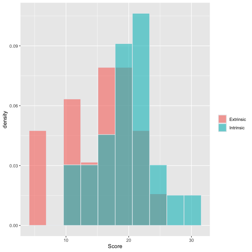
Summarizing the groups#
Extrinsic Group#
extrinsic = creativity$Score[creativity$Treatment == 'Extrinsic']
summary(extrinsic)
   Min. 1st Qu.  Median    Mean 3rd Qu.    Max.
   5.00   12.15   17.20   15.74   18.95   24.00
Intrinsic Group#
intrinsic = creativity$Score[creativity$Treatment == 'Intrinsic']
summary(intrinsic)
   Min. 1st Qu.  Median    Mean 3rd Qu.    Max.
  12.00   17.43   20.40   19.88   22.30   29.70
Histogram of Score stratified by Sex#
# this plot is for visualization only
# students not expected to reproduce
fig <- (ggplot(creativity, aes(x=Score, fill=Treatment)) +
        geom_histogram(aes(y=after_stat(density)),
	color="#e9ecef",
	alpha=0.6,
	position='identity',
	bins=10) +
        labs(fill=""))
fig
Case Study B: Difference in salaries between male and female employees#
Salaries from Harris Trust and Bank over years 1969-1977
head(salaries)
| Salary | Sex | |
|---|---|---|
| <int> | <chr> | |
| 1 | 3900 | Female |
| 2 | 4020 | Female |
| 3 | 4290 | Female |
| 4 | 4380 | Female |
| 5 | 4380 | Female |
| 6 | 4380 | Female |
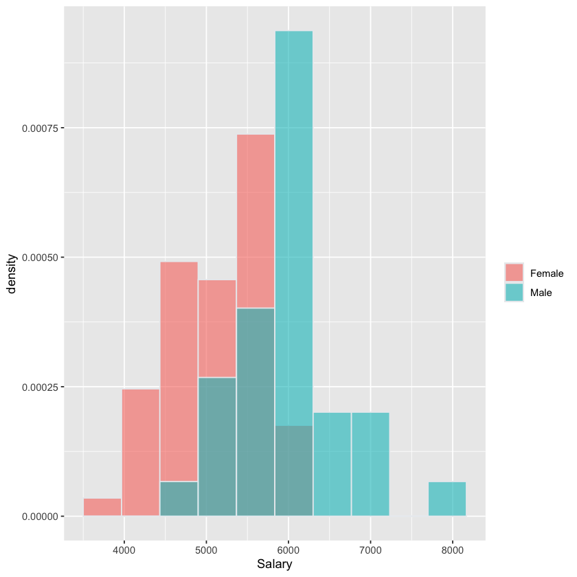
Females#
female = salaries$Salary[salaries$Sex == 'Female']
summary(female)
   Min. 1st Qu.  Median    Mean 3rd Qu.    Max.
   3900    4800    5220    5139    5400    6300
Males#
male = salaries$Salary[salaries$Sex == 'Male']
summary(male)
   Min. 1st Qu.  Median    Mean 3rd Qu.    Max.
   4620    5400    6000    5957    6075    8100
Histogram of Salary stratified by Sex#
# this plot is for visualization only
# students not expected to reproduce

fig <- (ggplot(salaries, aes(x=Salary, fill=Sex)) +
        geom_histogram(aes(y=after_stat(density)),
                       color="#e9ecef",
                       alpha=0.6,
                       position='identity',
                       bins=10) +
        labs(fill=""))
fig
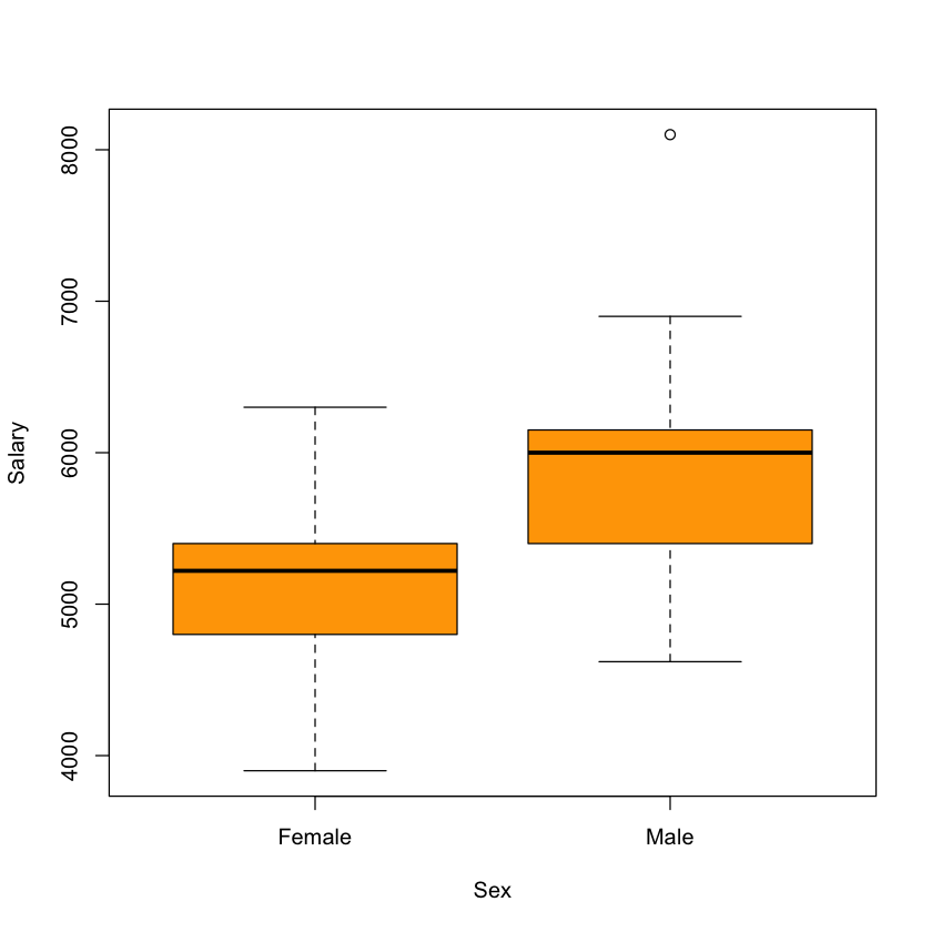
Boxplot of Salary stratified by Sex#
boxplot(Salary ~ Sex, data=salaries, col='orange')
Key differences between the studies#
Creative writing study was a randomized experiment.
Salary dataset was an observational study.
Implications#
Differences in strength of conclusions: randomized experiments like
creativitycan admit causal conclusionsGeneralizability: what population are the data from?
If we consider Harris a typical bank, then
salariesrepresents a sample of starting salaries.
Making statistical inferences#
 {width=600 fig-align=”center”}
What sort of conclusions are we entitled to make?
Modelling uncertainty in creativity#
The observed difference (i.e.
treatment_effect) is not 0. Is there a real difference?We need a (statistical) model to draw statistical inferences!
Mental model: the world before randomization#
 {width=600 fig-align=”center”}
Potential outcomes before randomization
Mental model: the null hypothesis#
{width=400 fig-align=”center”}
\(H_0\): green outcome identical to red
Mental model: the world after randomization#
 {width=800 fig-align=”center”}
Observed outcomes after randomization
Computing difference via t.test#
estimates = t.test(Score ~ Treatment, data=creativity)$estimate
estimates
- mean in group Extrinsic
- 15.7391304347826
- mean in group Intrinsic
- 19.8833333333333
Effect#
treatment_effect = treatment_effect=estimates[2] - estimates[1]
treatment_effect
Null hypothesis: no difference in Score between the groups#
null_treatment = sample(creativity$Treatment, 47, replace=FALSE)
null_data = data.frame(Score=creativity$Score,
                       Treatment=null_treatment)
null_estimates = t.test(Score ~ Treatment, data=null_data)$estimate
null_estimates
- mean in group Extrinsic
- 17.3782608695652
- mean in group Intrinsic
- 18.3125
null_treatment_effect = null_estimates[2] - null_estimates[1]
null_treatment_effect
Repeated 10000 times#
# this code/plot is for visualization only
# students not expected to reproduce

estimates = t.test(Score ~ Treatment, data=creativity)$estimate
treatment_effect = treatment_effect=estimates[2] - estimates[1]

null_treatment_effect = rep(NA, 10000)
for (i in 1:10000) {
    null_treatment = sample(creativity$Treatment, 47, replace=FALSE)
    null_data = data.frame(Score=creativity$Score,
                           Treatment=null_treatment)
    null_estimates = t.test(Score ~ Treatment, data=null_data)$estimate
    null_treatment_effect[i] = null_estimates[2] - null_estimates[1]
}

treatment_effect = data.frame(treatment_effect=treatment_effect)
fig <- (ggplot(data.frame(null_treatment_effect),
               aes(x=null_treatment_effect)) +
    geom_histogram(aes(y=after_stat(density)),
                   color="#e9ecef",
                   alpha=0.6, bins=30) +
    geom_vline(aes(xintercept=treatment_effect), treatment_effect,
               color='red', linewidth=2) +
    geom_vline(aes(xintercept=-treatment_effect), treatment_effect,
               color='red', alpha=0.5, linewidth=1) +
    geom_density() +
    labs(fill=""))
fig
treatment_effect = treatment_effect[1,]
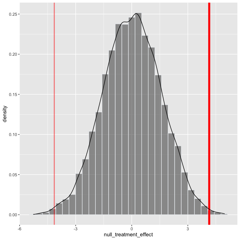
length(null_treatment_effect)
p_value = mean(abs(null_treatment_effect) > treatment_effect)
p_value
Modelling uncertainty in salaries#
The difference is not 0. Is the difference real?
We need a model to draw statistical inferences!
Mental model: Male and Female salaries#
 {width=600 fig-align=”center”}
There are two populations of salaries
Mental model: Male and Female salaries#
{width=600 fig-align=”center”}
\(H_0\): distribution of orange box identical to purple
Computing difference via t.test#
sex_estimates = t.test(Salary ~ Sex, data=salaries)$estimate
sex_effect = sex_estimates[2] - sex_estimates[1]
sex_effect
Repeated 10000 times#
# this code/plot is for visualization only
# students not expected to reproduce

sex_estimates = t.test(Salary ~ Sex, data=salaries)$estimate
sex_effect = sex_estimates[2] - sex_estimates[1]

null_sex_effect = rep(NA, 10000)
for (i in 1:10000) {
    null_sex = sample(salaries$Sex, length(salaries$Sex), replace=FALSE)
    null_data = data.frame(Salary=salaries$Salary,
                           Sex=null_sex)
    null_estimates = t.test(Salary ~ Sex, data=null_data)$estimate
    null_sex_effect[i] = null_estimates[2] - null_estimates[1]
}

sex_effect = data.frame(sex_effect=sex_effect)
fig <- (ggplot(data.frame(null_sex_effect),
               aes(x=null_sex_effect)) +
        geom_histogram(aes(y=after_stat(density)),
                       color="#e9ecef",
	               alpha=0.6, bins=30) +
    geom_vline(aes(xintercept=sex_effect), sex_effect,
               color='red', linewidth=2) +
    geom_vline(aes(xintercept=-sex_effect), sex_effect,
               color='red', alpha=0.5, linewidth=1) +
    geom_density() +
    labs(fill=""))
fig
sex_effect = sex_effect[1,]

length(null_sex_effect)
p_value = mean(abs(null_sex_effect) > sex_effect)
p_value
Other issues#
We used the same method even for these different studies… does this make sense?
Terminology:
Parameter: a property of the probability model (often written \(\theta\))
Estimate: a function of the sample data (often written \(\hat{\theta}\))
Goal of statistical inference is to learn about the parameter \(\theta\) from the estimate \(\hat{\theta}\)
Other issues#
Experimental design:
Randomization: individuals were randomly assigned
TreatmentincreativestudySimple random sample: a way of sampling \(n\) from a population such that every \(n\) points are equally likely.
Other sampling mechanisms: systematic sampling, cluster sampling.